Editing Scene Components
In Wings Engine, a scene is composed of “3D” and “GUI” elements. This article focuses on editing components within the “GUI” interface.
By clicking “GUI” ,you’ll notice the toolbar on the left side transforms into a component panel.
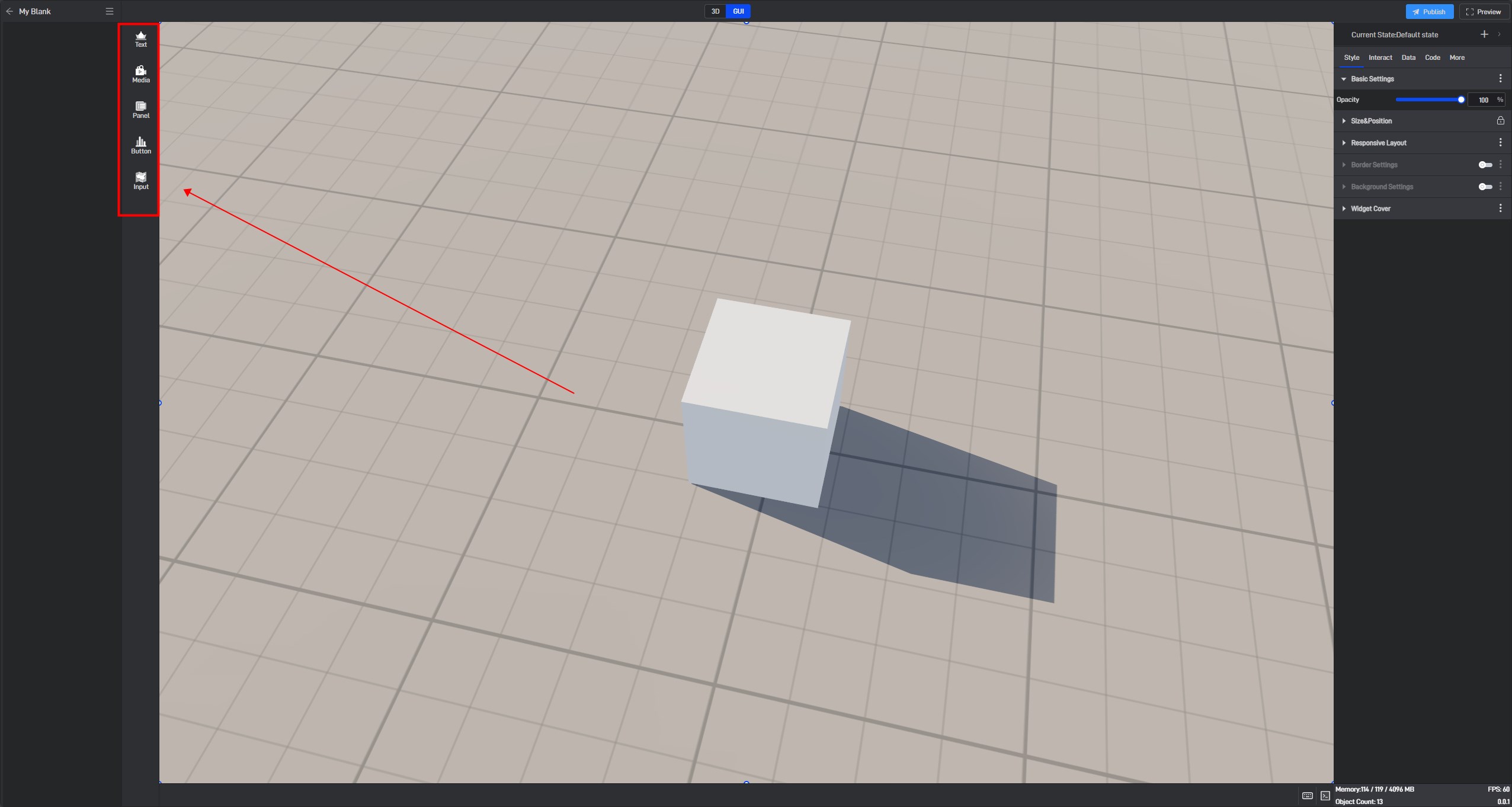
Detailed explanations of all components are provided in the relevant tutorials, so this article won’t go into those details. If you want to learn how to use a specific component, please refer to the corresponding component tutorial.
The basic editing operations for components mainly include “Adding Components”, “Adding Data,” “Deleting Data”, “Setting Styles” ,“Positioning” ,“Grouping” and “Other Settings”. Below, we’ll introduce each of these operations.
1. Adding Components
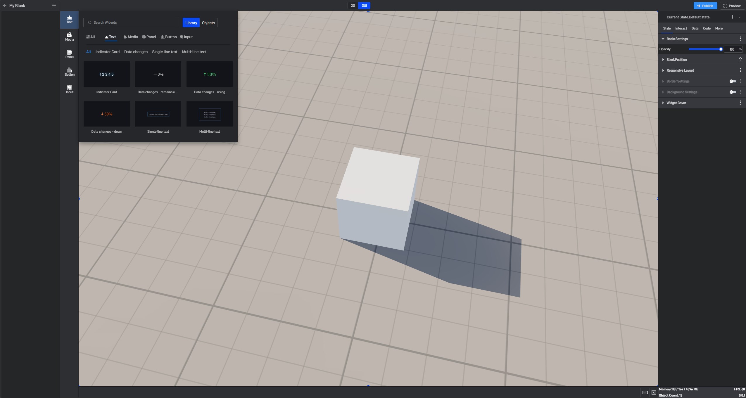
Clicking on a component from the component library will automatically add it to the scene.
Newly added components appear in the center by default, and they are in the default state, with default data and color.
2. Adding Data
When adding data fields to a component, there are generally two methods: Click-to-Select and Drag-and-Drop.
(1) Click-to-Select
Click to select the data, and the software will automatically populate the component’s data settings based on the characteristics of the data.

(2) Drag-and-Drop
Hold down the left mouse button and drag the data directly into the corresponding data setting box of the component.

Tips: No matter which method you use, it’s essential to understand the data settings of the component beforehand; otherwise, adding data may not achieve the desired effect.
3. Deleting Data
When adding data to a component, method (1) may sometimes result in an unsatisfactory recognition. If you need to modify the data after dragging it in, you can click the “x” to delete the data.

4. Setting Styles
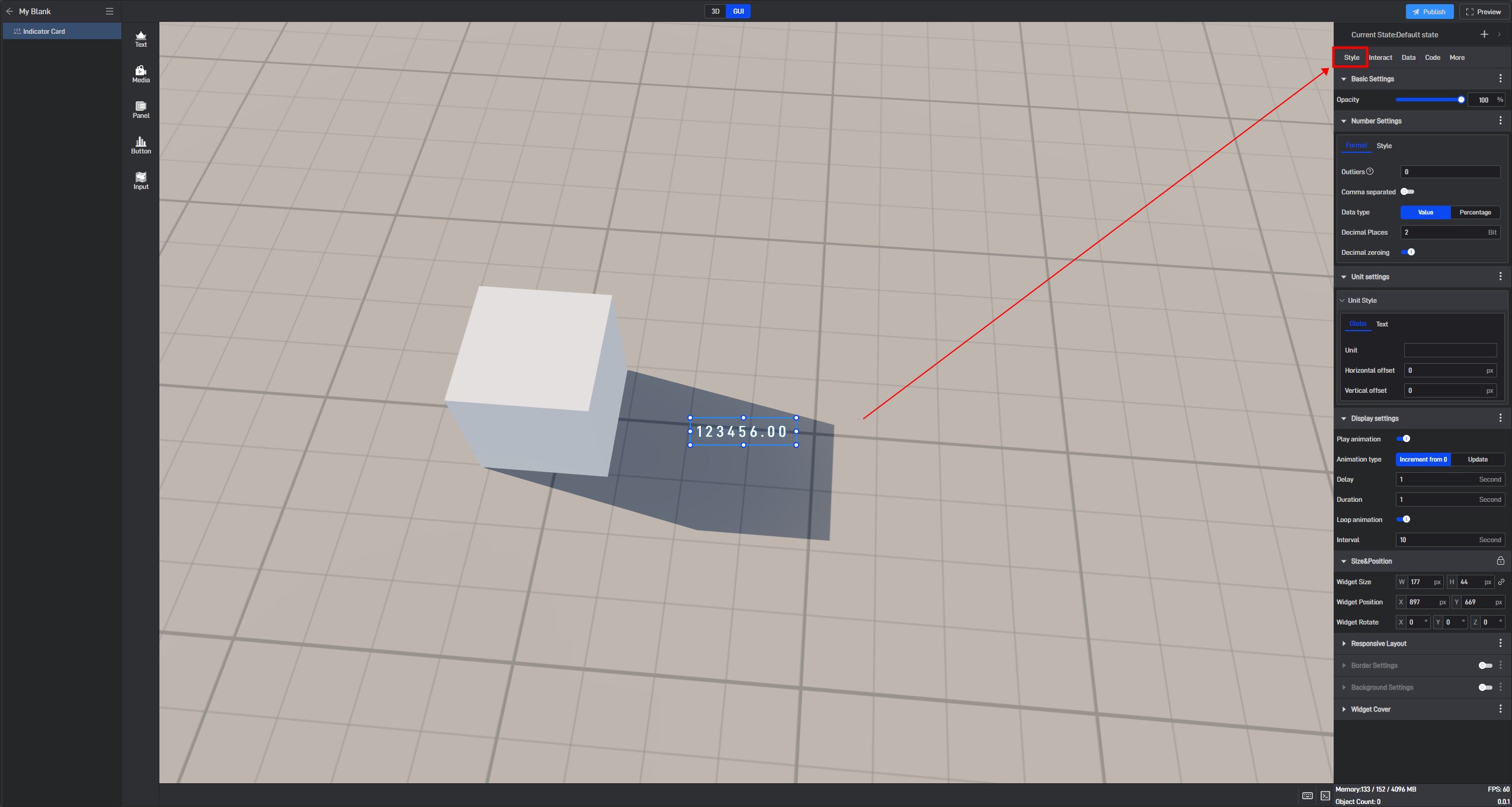
Each component has different style attributes. Click on the component to select it, then click the “Style” menu on the left to set the style for the selected component.
5. Positioning
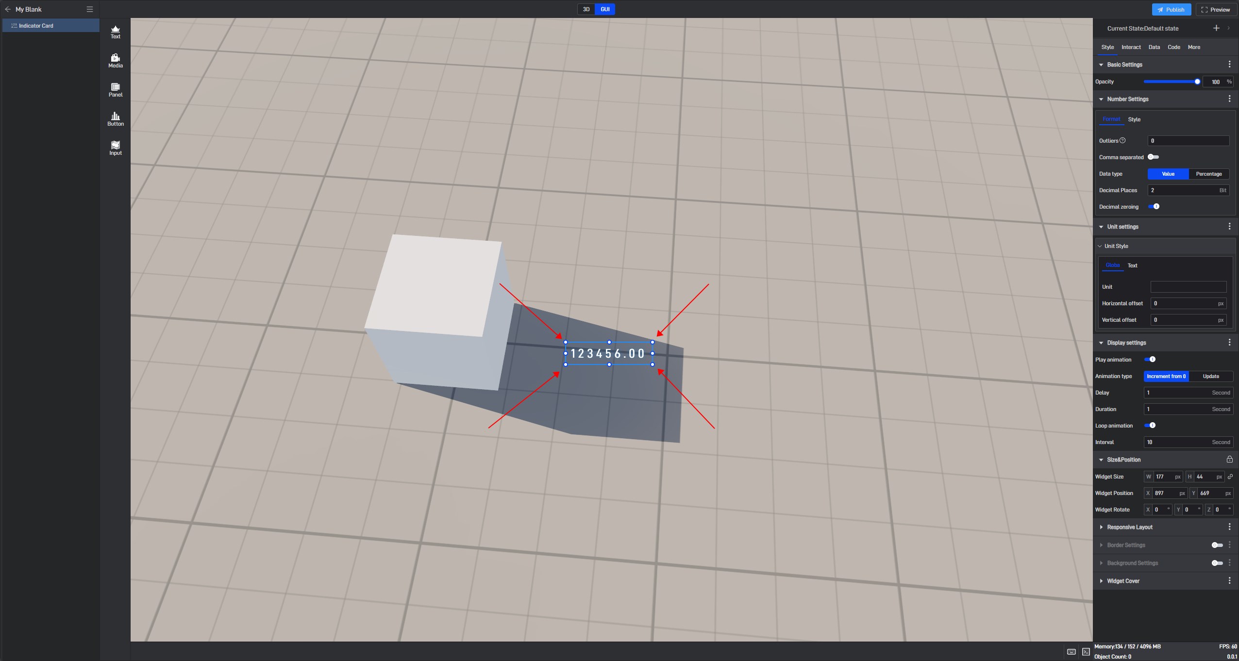
Clicking on a component will allow you to move it. You can resize the component by dragging its border, and holding the** “Shift”** key while dragging will maintain the aspect ratio.
6. Other Settings
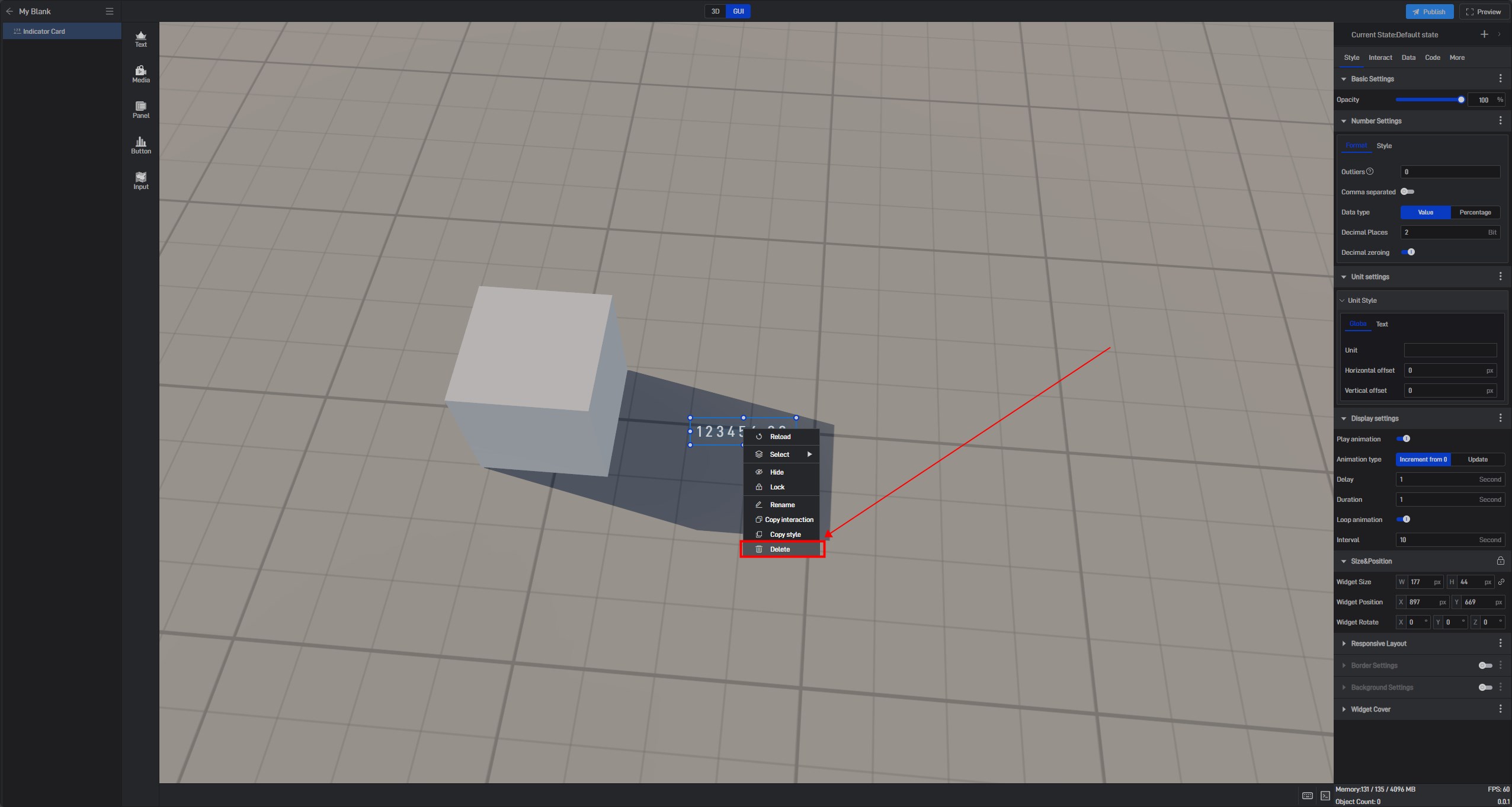
Right-clicking a component also allows you to hide, lock, copy, or delete it.
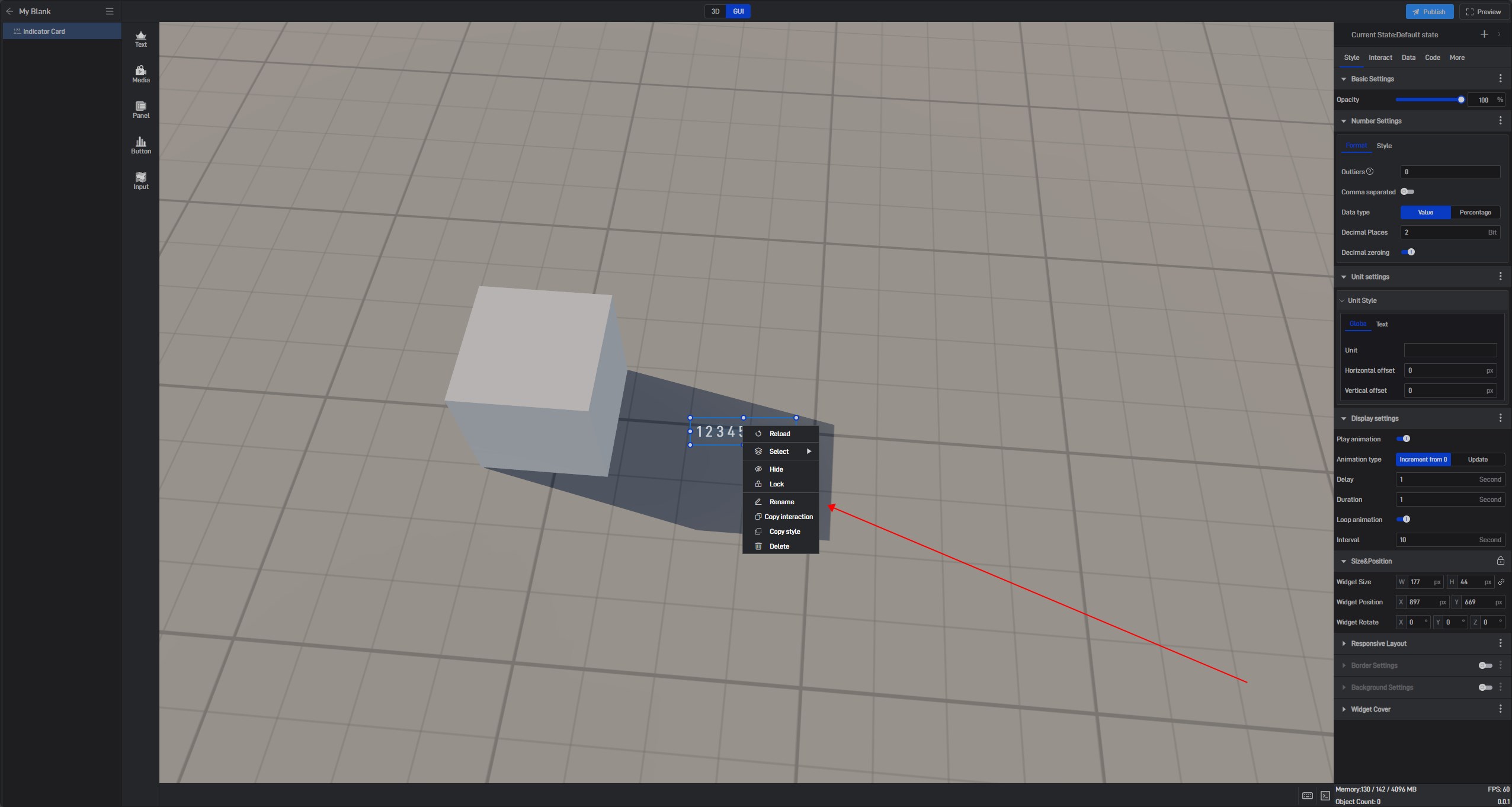
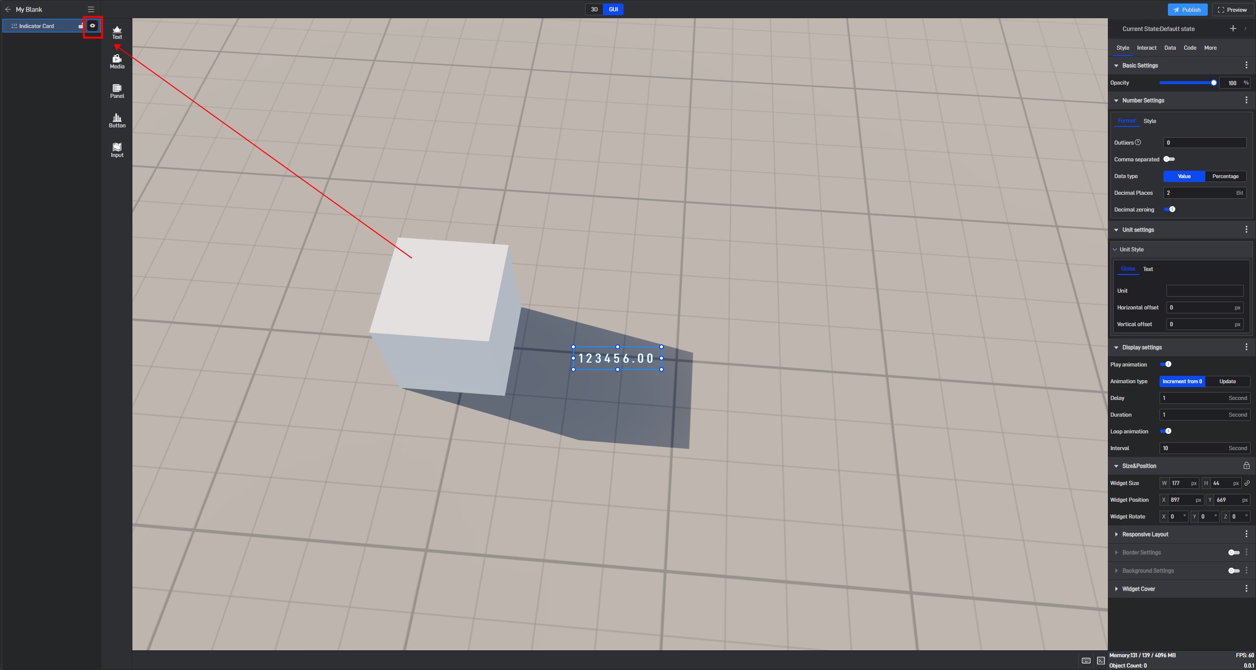
Hide: The component will be hidden. To make it visible again, go to the “Dashboard Layers” list on the left and click to show it. (When a component is selected, its corresponding layer in the left layer list will be highlighted.)
Lock: The component will be locked and cannot be selected or manipulated. To unlock it, go to the “Dashboard Layers” list on the left and click to unlock.

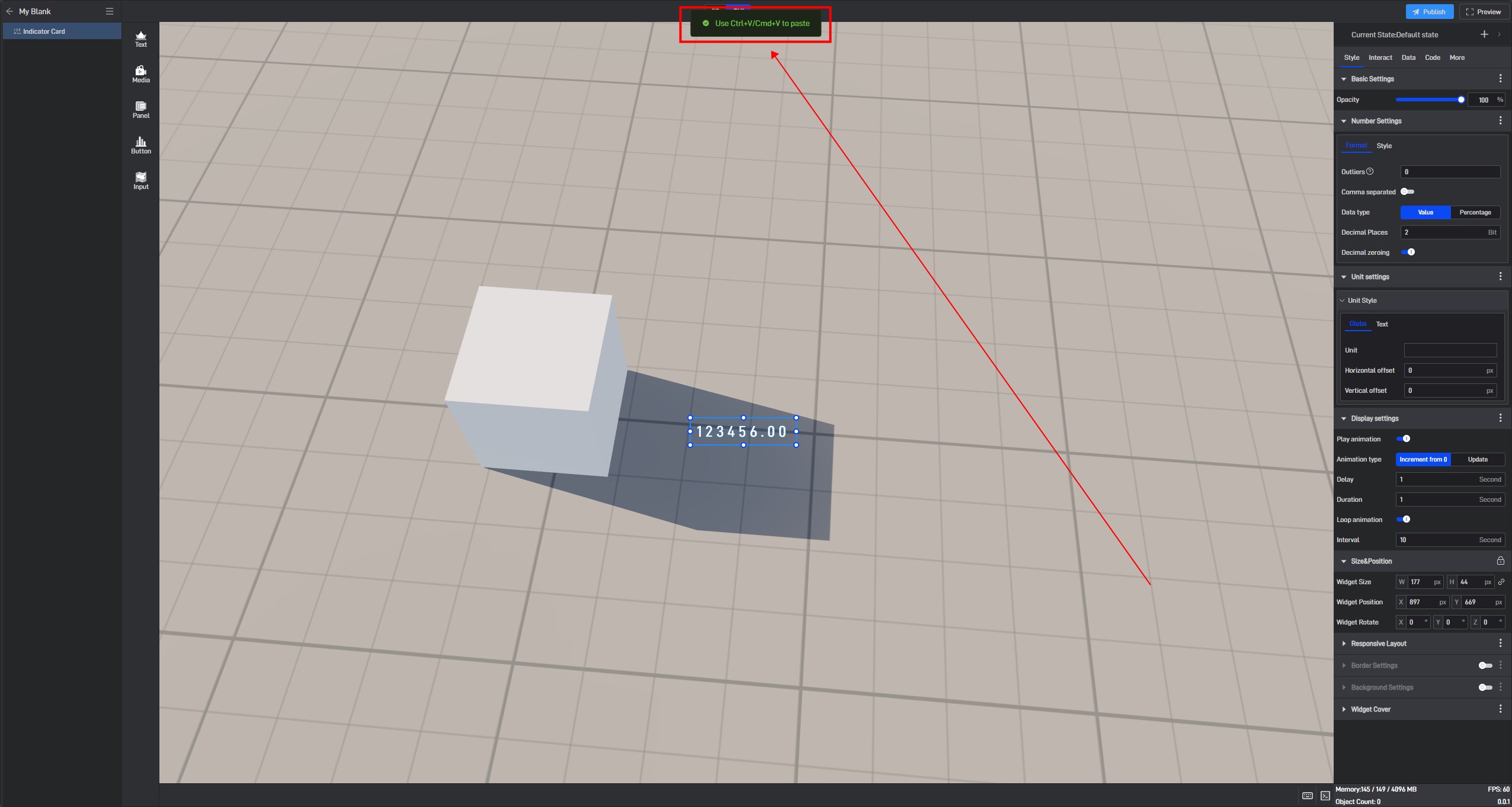
Copy: Use Ctrl+V/Cmd+V to paste.
Delete: The component will be deleted. You can also delete it by selecting the component and pressing the “Delete” key.
Tips: All the above operations support the “Ctrl+Z” undo shortcut and the **”Ctrl+Y” **redo shortcut.
7. Advanced Settings
Each style attribute of a component can open an “Advanced Settings” menu, which appears when you hover the mouse to the right of the attribute name. The menu includes four options: “Sample Code,” “Property animation” and “Reset”.
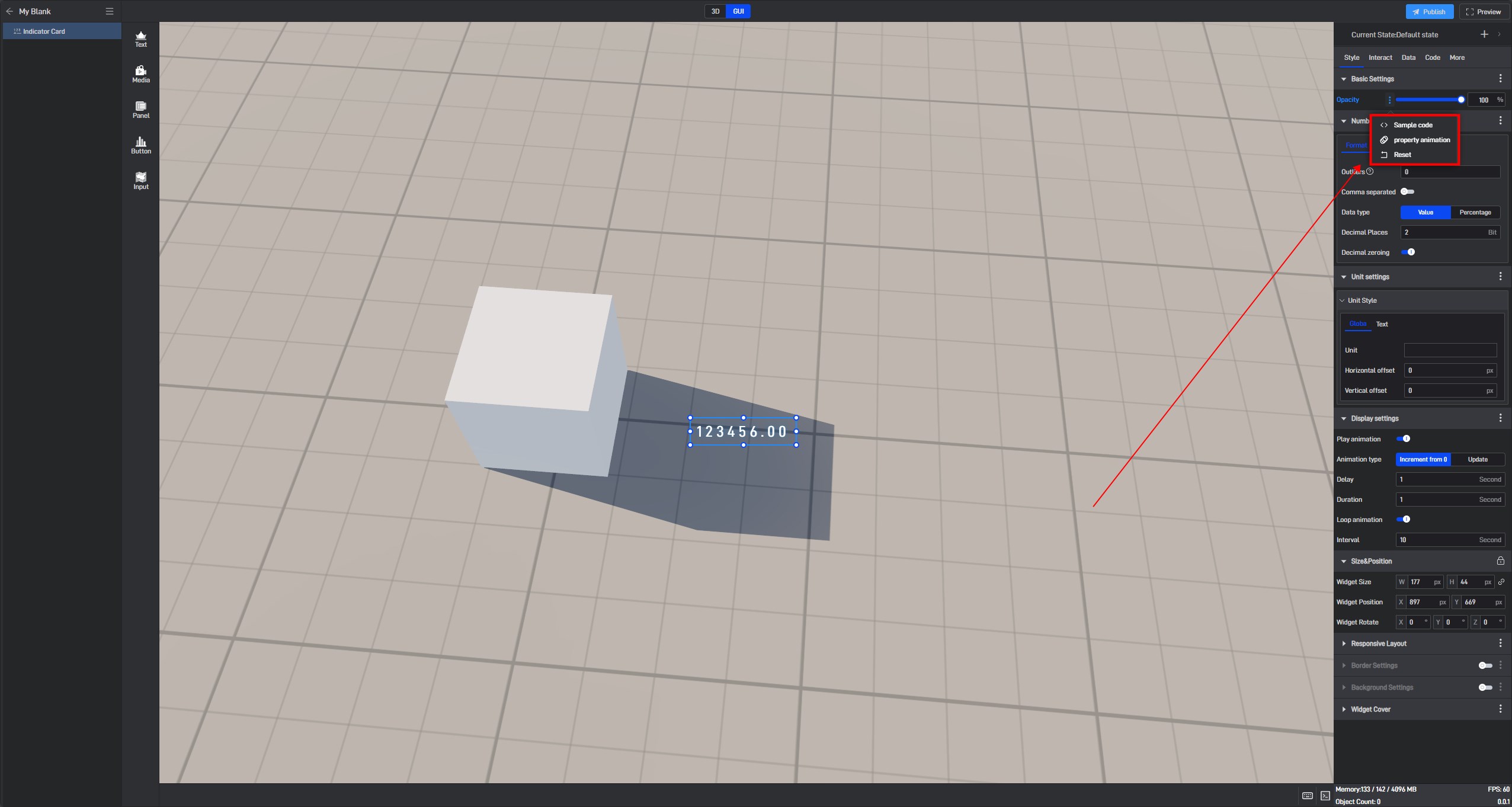
Sample Code: Provides examples for further development, facilitating the writing of JavaScript code for advanced customization.
Property animation: Allows you to set movement animations for components.
Reset: Resets the actions taken above.