Setting Interactions
In Wings Engine, we can achieve desired effects through interactions. Interactions usually refer to triggering a component to perform an action based on a specific trigger condition.
Interactions can be set on both sub-scenes and components. They consist of three elements: name, event, and action.
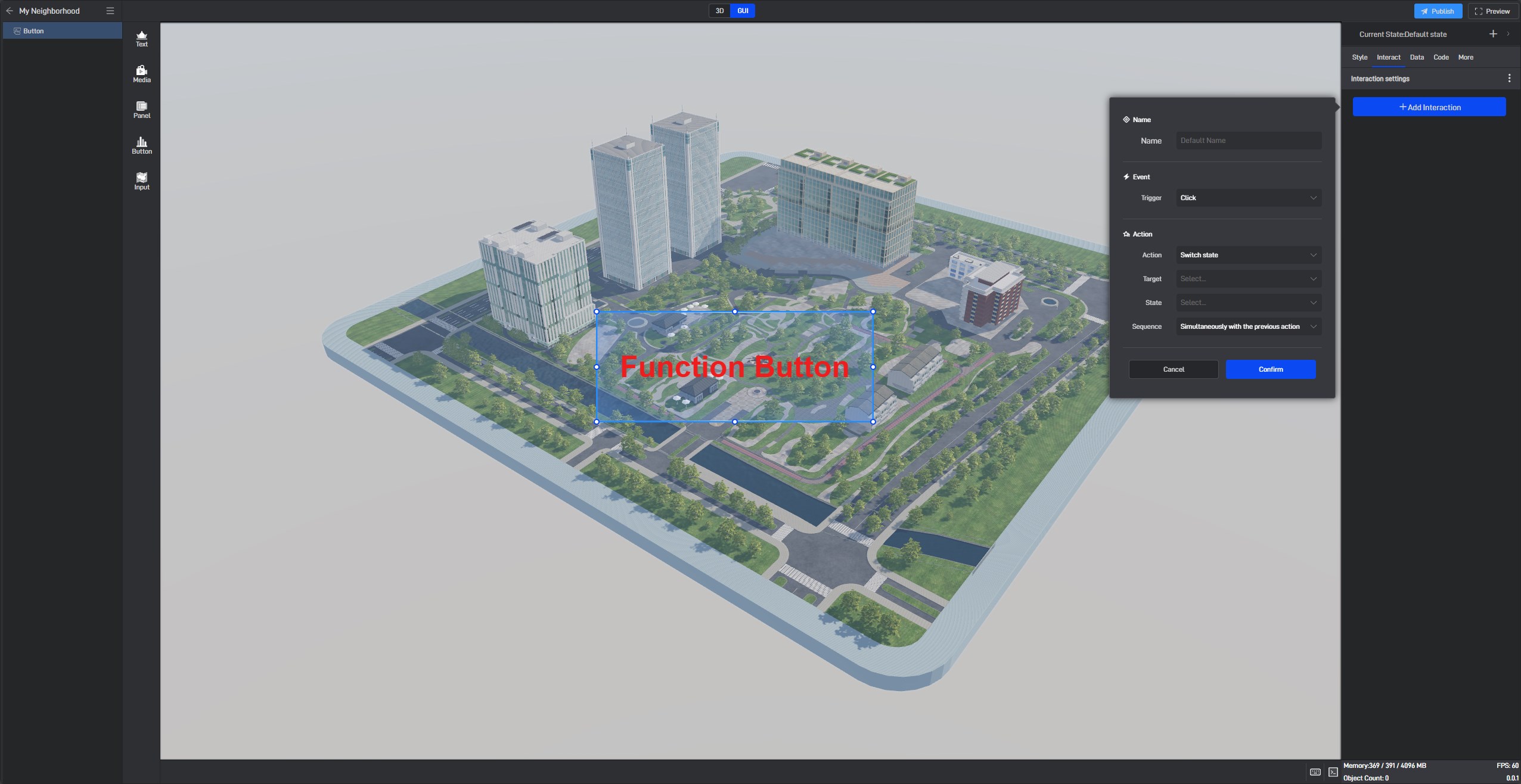
1. Name
When adding an interaction, we recommend setting an easily recognizable name. If you do not set a name, the system will automatically generate one based on the current interaction characteristics. The default name is usually “Event Name + Action Name”.
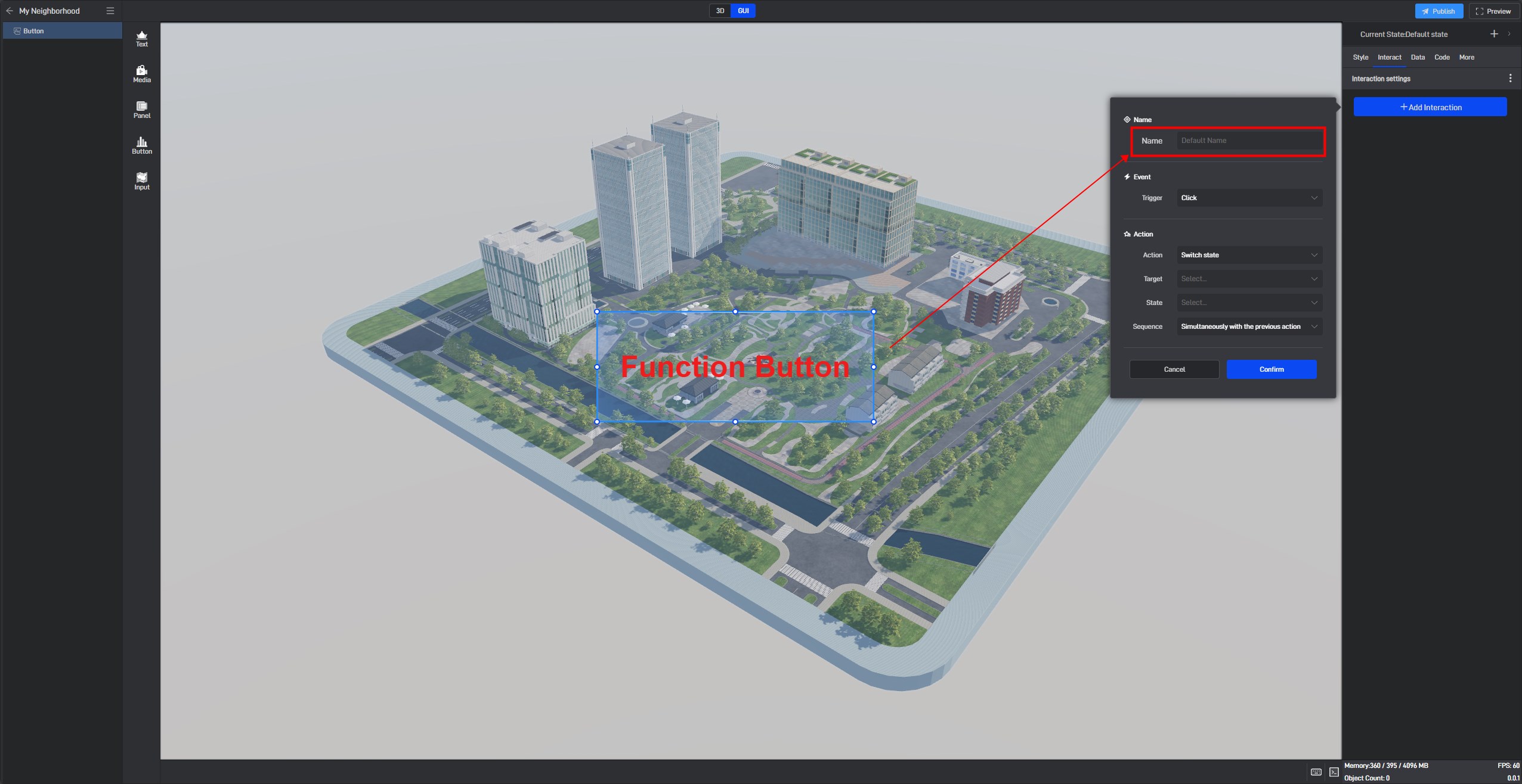
2. Event
An event is the source that triggers the interaction. The currently supported events are as follows:
First type: Mouse operations, including Mouse Enter, Mouse Leave, and click actions. (Set on components)
Second type: Changes within the component itself, including Appear, Disappear, Selected, and Unselected. (Set on components)
Third type: Full-screen playback or page switching.
Fourth type: Data changes.
Fifth type: Events triggered by secondary development.
(1) Interactions Triggered by Mouse Operations
These interactions are set on the triggering component. For example, when clicking component A triggers component B, the interaction is set on component A.
Let’s demonstrate how to set up such an interaction with an example.
We add two single-line text components and an indicator card component to a scene. Suppose we want to give the text component a hover effect (a style change when the mouse hovers over the component) and also want to control the visibility of the indicator card component upon clicking.
Tips: In general, we recommend using buttons because button components do not require additional interactions to set click and hover styles. However, for demonstration purposes, we will use text components.
First, create a new state for the single-line text component. For more information about multiple states, please refer to this tutorial →_→ Multi-State Setup for Components.
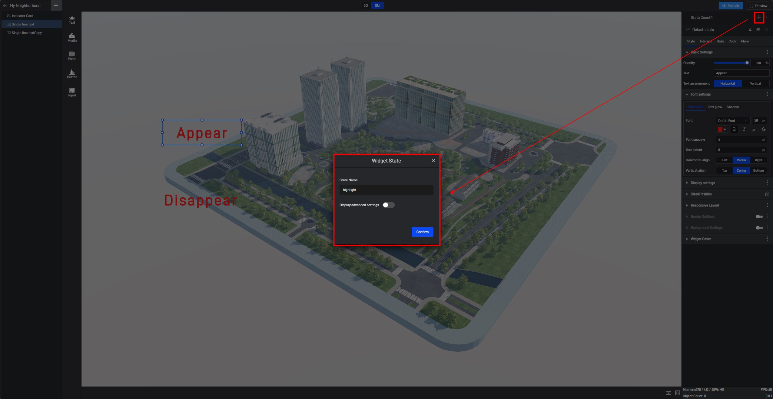
Modify the background color in this highlight state.
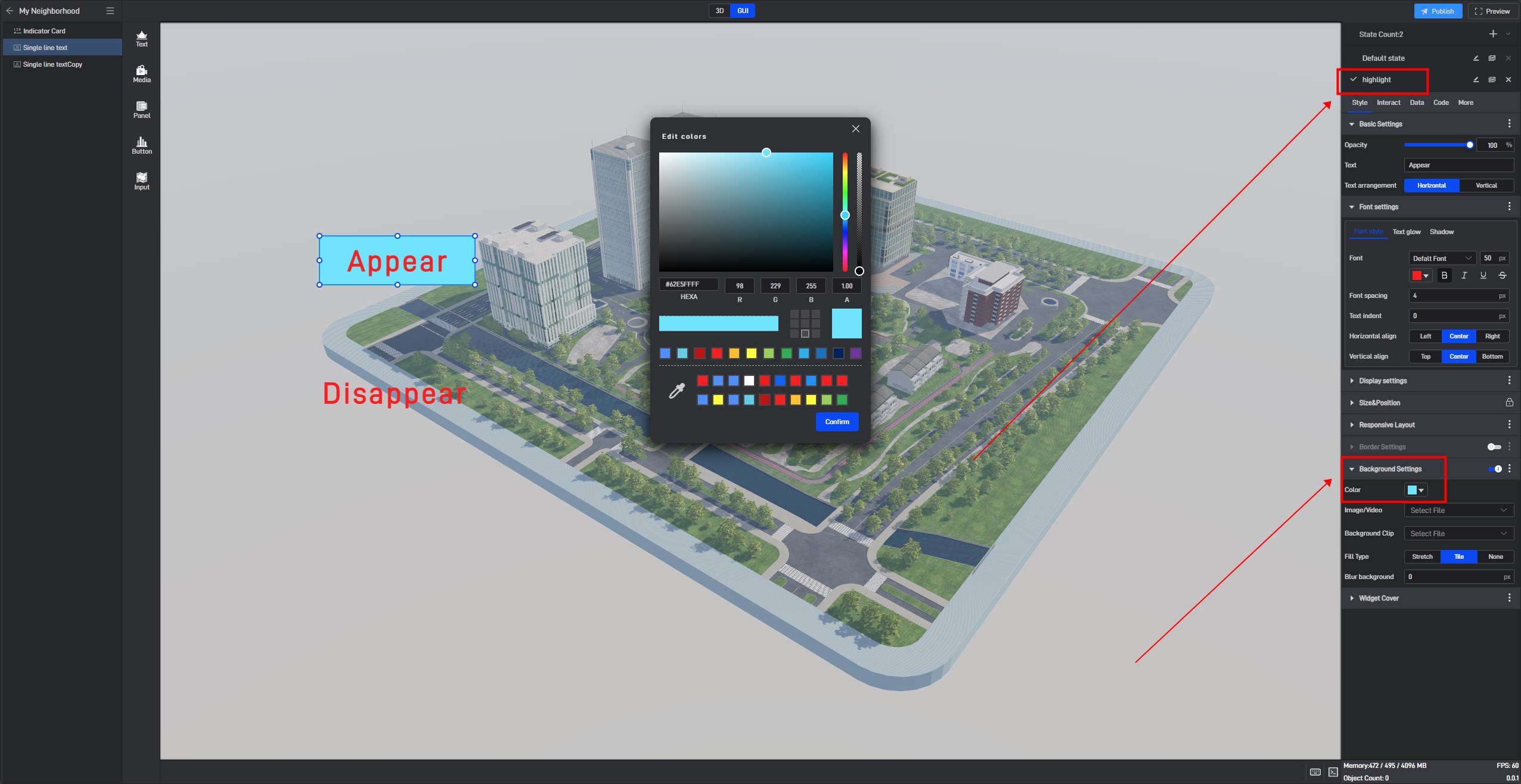
Select the component and switch to the “Interactions” panel on the right side of the interface. Click “Add Interaction”.
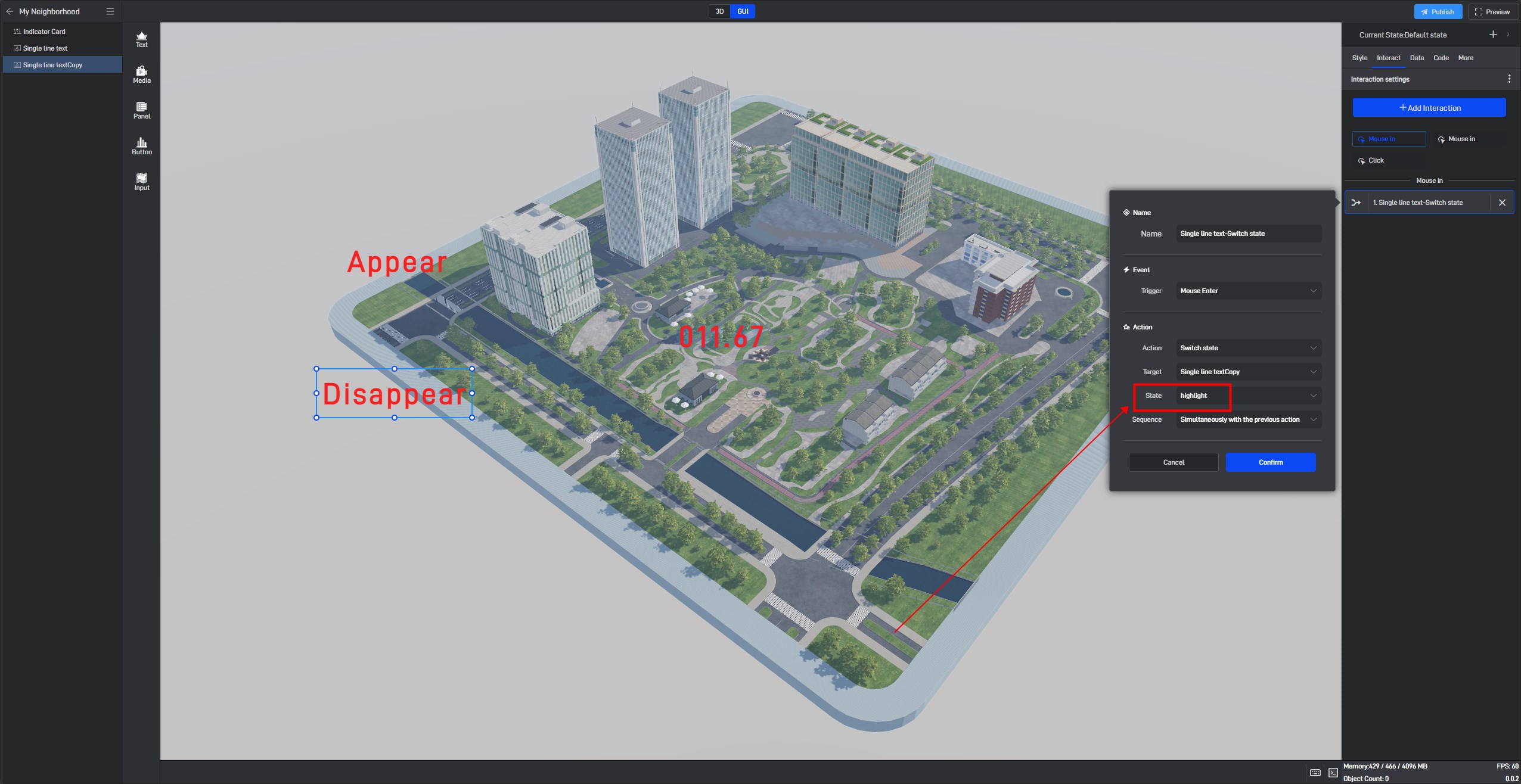
Then, add an interaction that triggers a state change to the highlight state when the mouse hovers over the component.
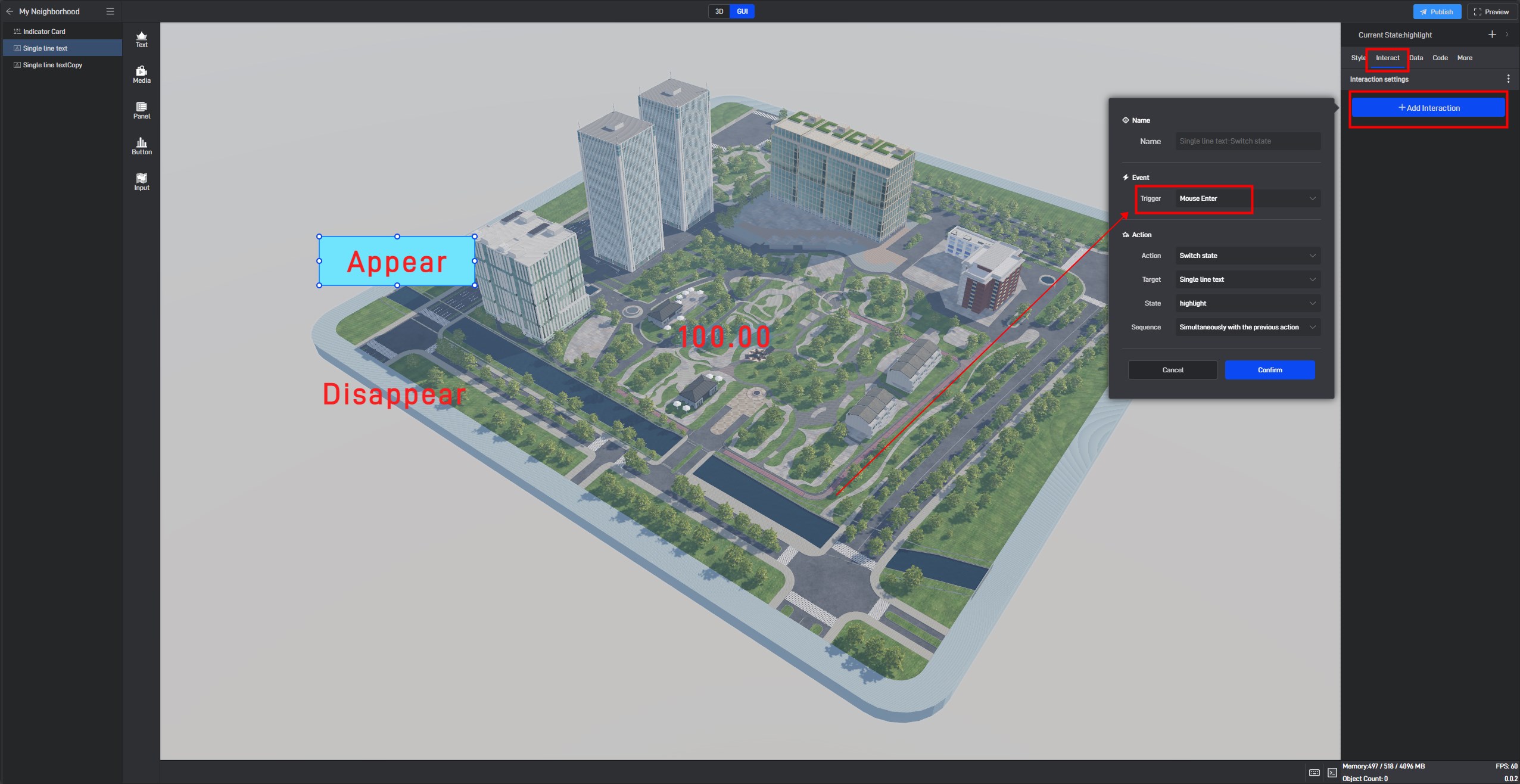
Make sure to set corresponding interactions for both mouse hover and mouse leave; otherwise, the component will remain in the highlight state. Next, add an interaction that switches the component back to the default state when the mouse leaves.
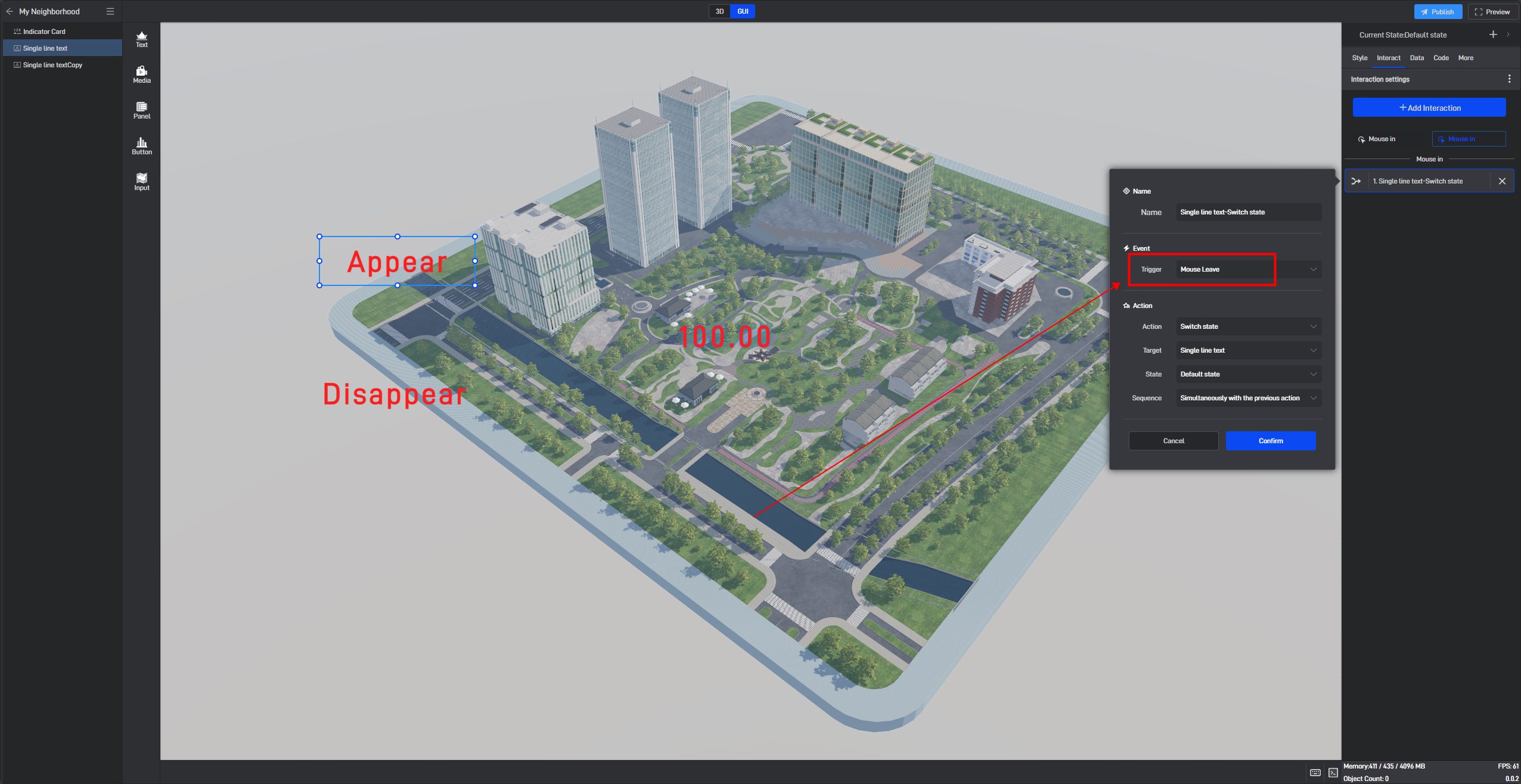
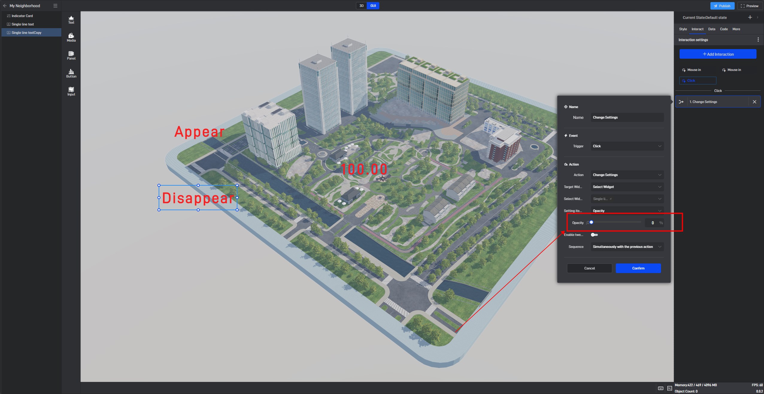
Then, add a click interaction. Here, we modify the target component’s parameter, changing the opacity to 100% (the opacity parameter corresponds to the component’s visibility, with 100% being fully visible and 0% being hidden).
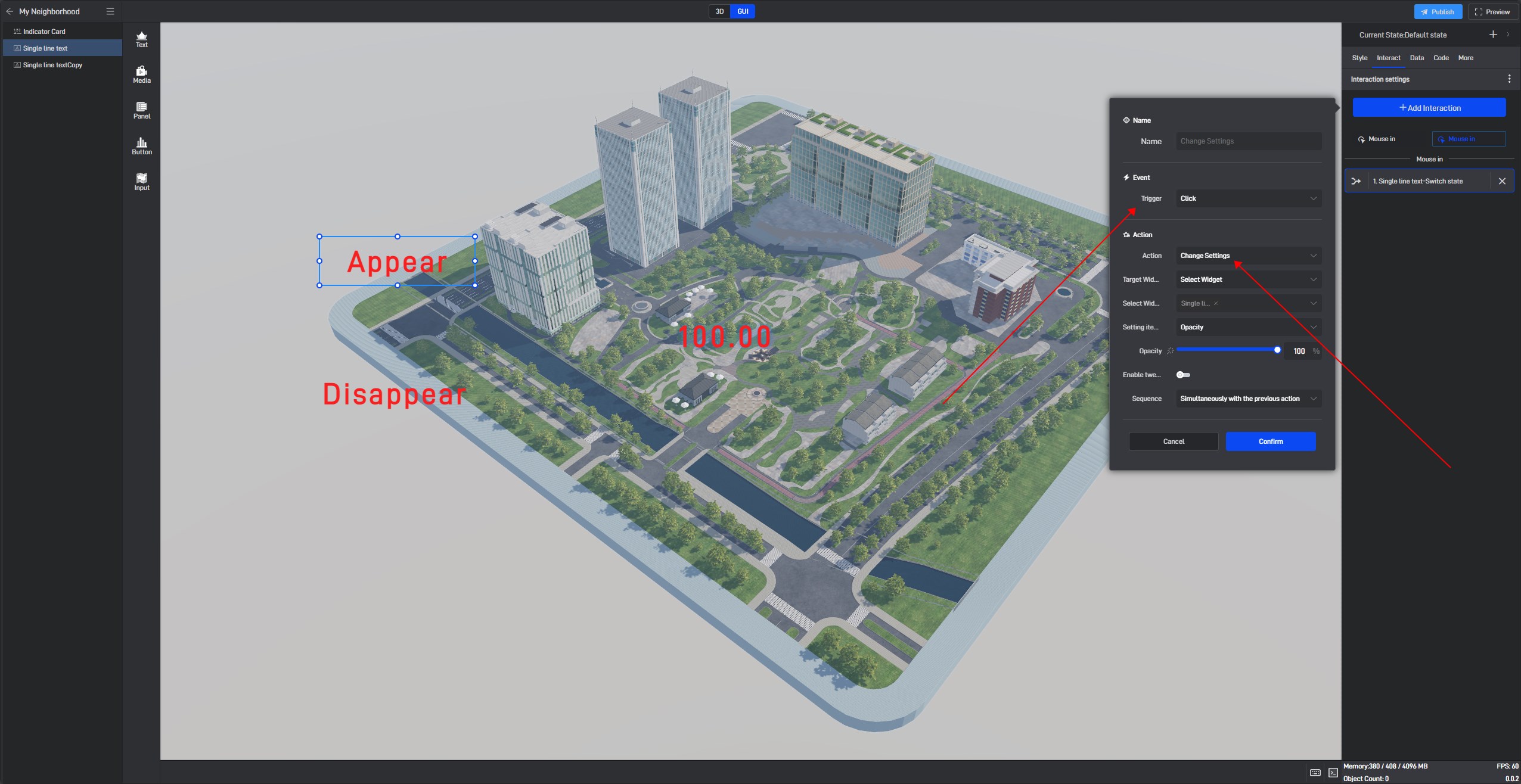
With this, the interaction setup on the “Show” text component is complete. Next, add a “Highlight” state to the “Hide” text component and directly copy the “Show” interaction to “Hide”. Right-click on the component and select “Copy Interaction“.
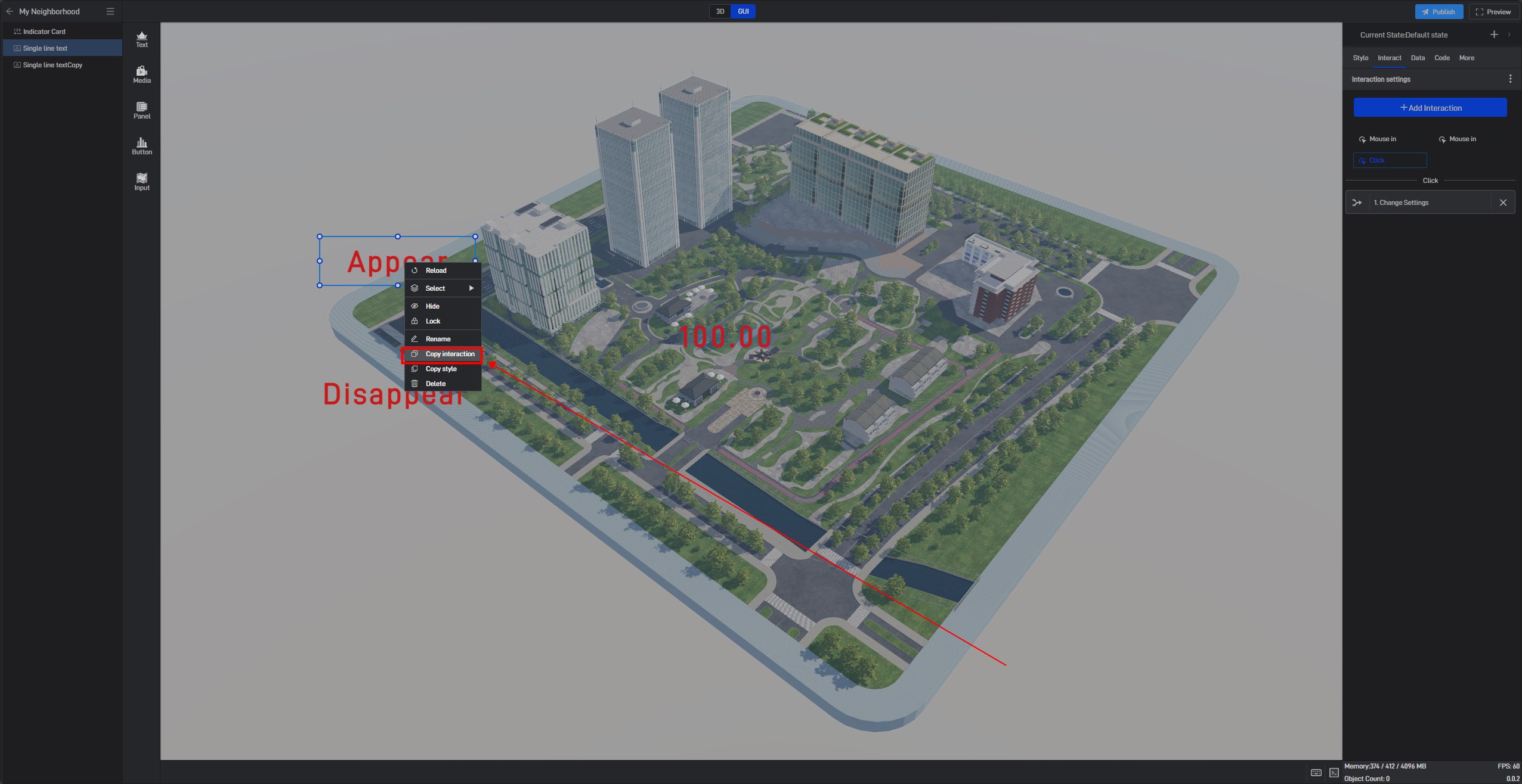
Then, paste the copied interaction onto the **”Hide” **text component using the keyboard shortcut “Ctrl+V”.
Note that while copying and pasting interactions allows you to replicate many interaction settings, some settings may need adjustments due to differences in component identifiers. For instance, you might need to re-select the target state for state transitions.
In the click interaction, change the opacity to 0% to hide the component.
(2) Interactions Triggered by Changes within the Component Itself
These can be divided into two types: interactions triggered by entry and exit, and interactions triggered by selection and deselection.
Entry and exit are mainly used for entry and exit animations of components and are rarely used in other scenarios. Therefore, some components that support animations may have these two interactions by default when added.
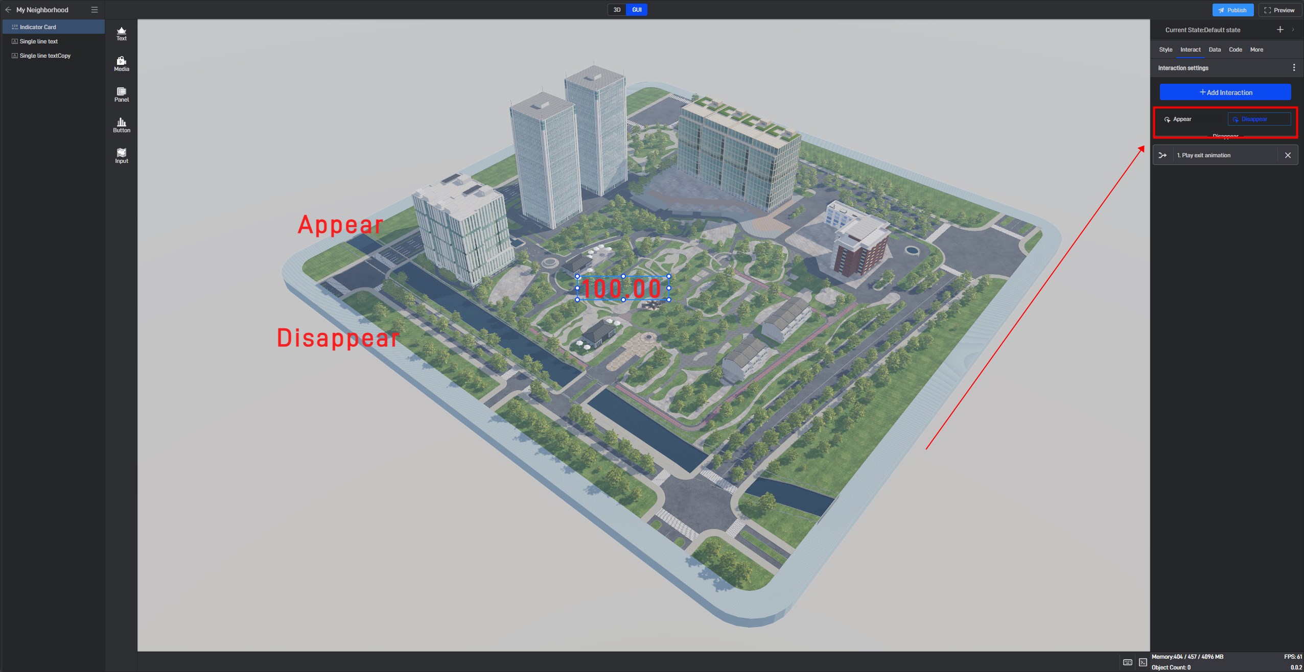
Some components that can be selected have interactions for selection and deselection, such as menus, tables, marker groups, and layered animations.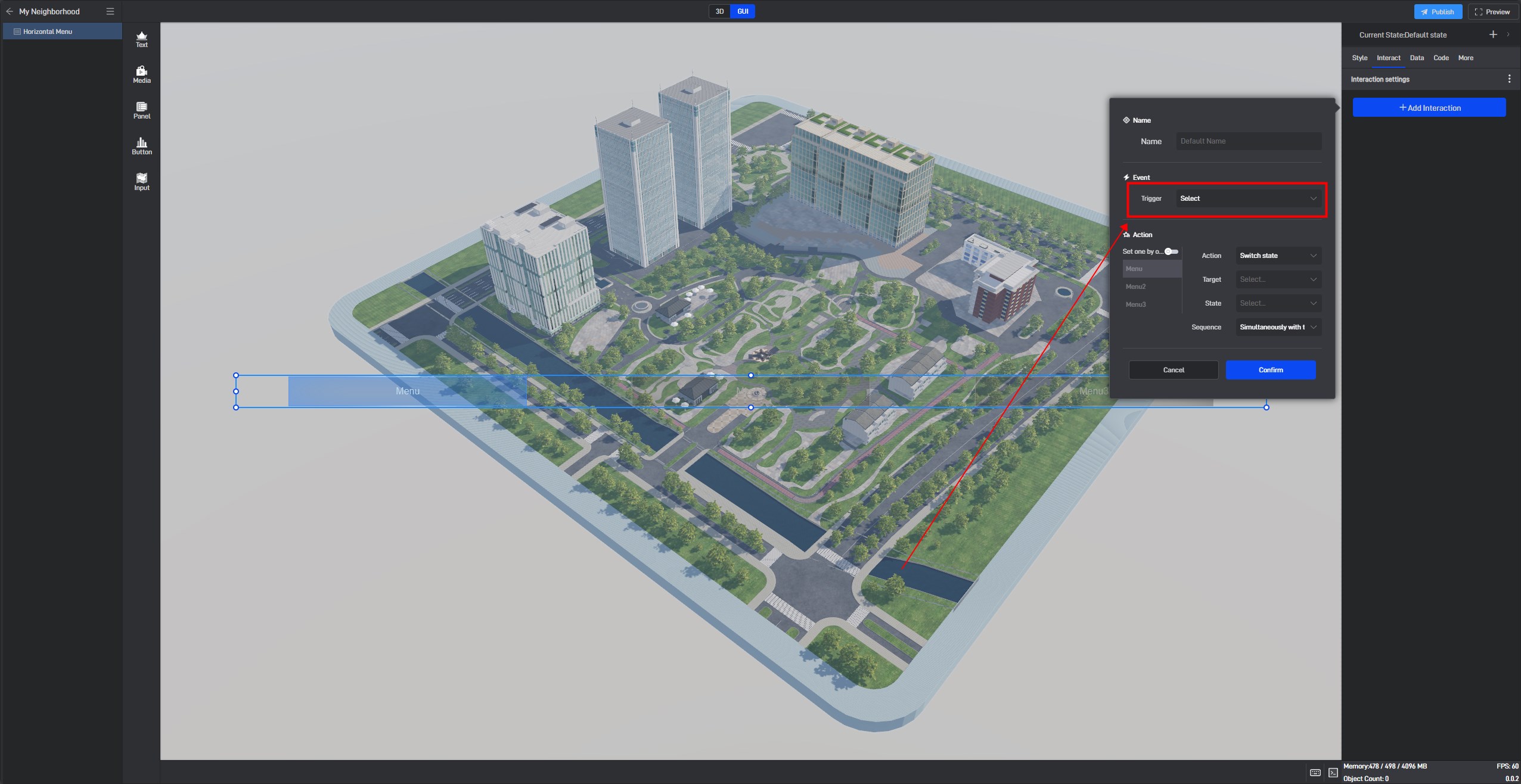
When setting selection interactions for some components, you can specify the exact object to be selected, such as a specific option in a specific layer in a layered animation.
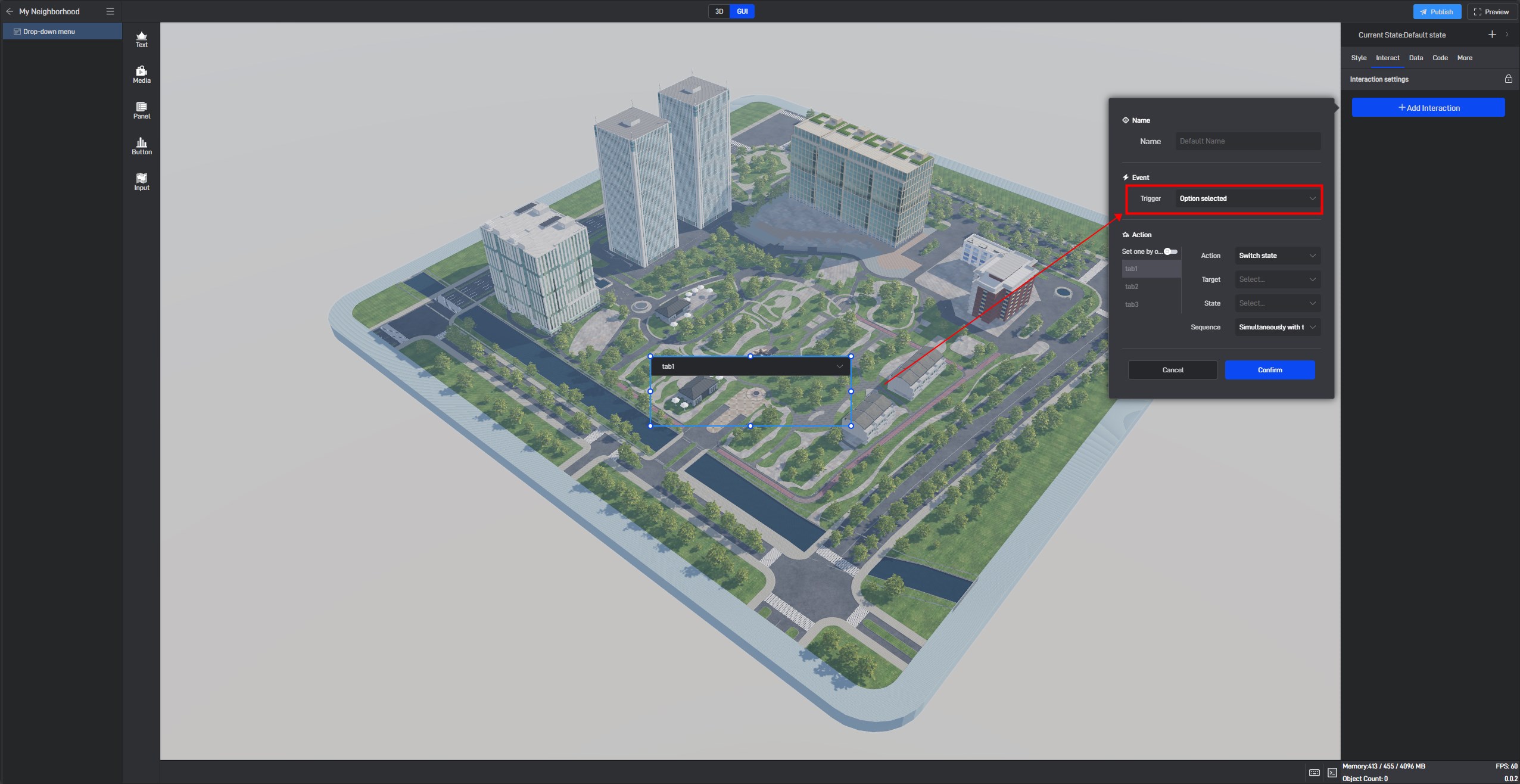
Using a menu as an example, if you want to set up separate interactions for each option, you can enable item-by-item settings here and set up the corresponding interactions individually. The final effect is that selecting a specific option triggers a particular interaction. If no separate settings are made, the interactions for all options will be uniform.
If selecting certain options triggers some interactions and you want them to revert upon deselection, you can add interactions for deselection as needed.

(3) Interactions Triggered by Events in Secondary Development
Interactions triggered by events in secondary development can be set on scenes or components.
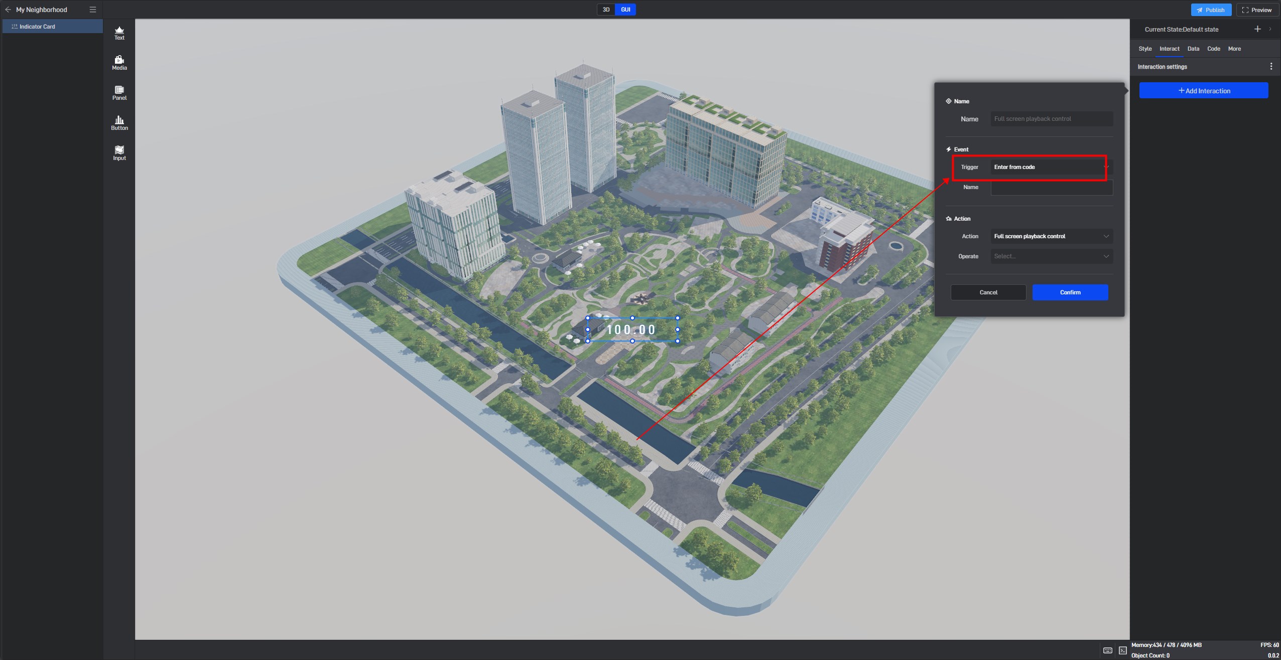
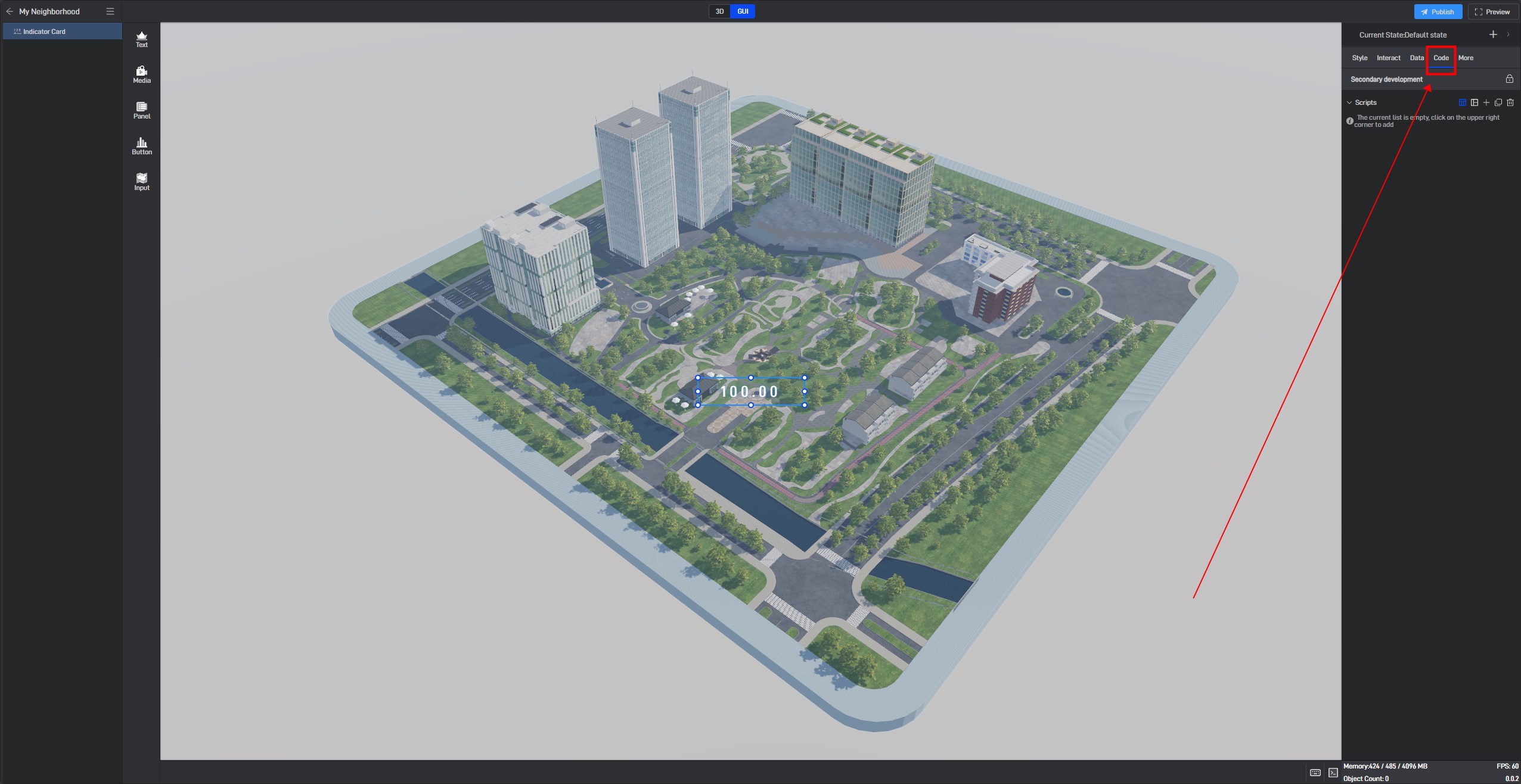
If set on the scene, secondary development code needs to be added to the scene.
If set on the component, secondary development code needs to be added to the component.
For more information on secondary development, refer to this tutorial: Secondary Development.
3. Actions
The ultimate goal of setting up interactions is to perform actions upon triggering.
Currently supported actions include:
(1) State Switch: Used in conjunction with multiple states of components/scenes to switch from one state to another (Tutorial: Multi-State Setup for Components)
(2) Change Settings: You can modify the settings of components/scenes, including styles, data, and code.
(3) Open Link: Open a web link in the browser.
(4) Control Pop-up: Open a pop-up window on the current sub-scene page.
(5) Transmit Event: Transmit an event to secondary development code.
(6) Full-Screen Playback Control: Control entry into or exit from full-screen playback.
(7) Edit Project Parameters: Modify the values of project parameters (Tutorial: Project Parameters).
(8) Trigger Events in Secondary Development.
(9) Custom: Different target components may have unique actions specific to them.
(10) Empty Action.