Group Panel
In the library, we provide you with a wealth of widgets, and in order to reduce the design complexity of your project production process, we preset some styles for these widgets, but we can still modify their styles on this basis.
1. Add widgets
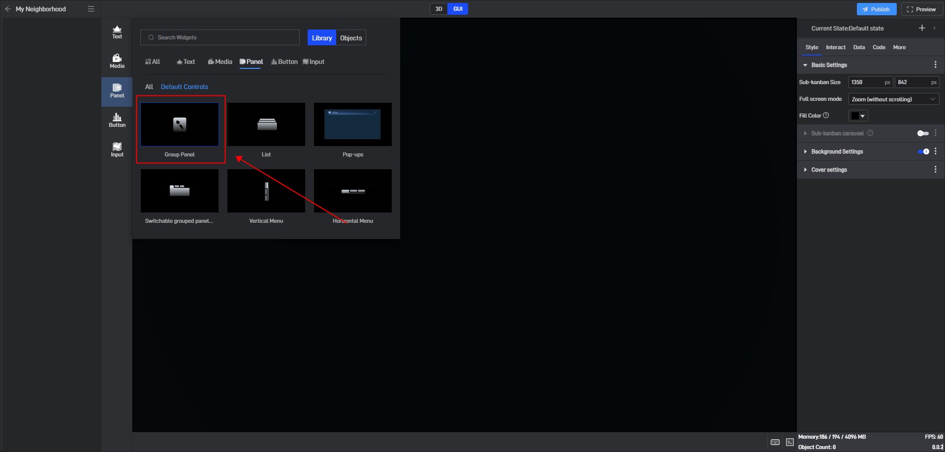
If you are not familiar with widgets, you can find the widget in the widget window and add it:
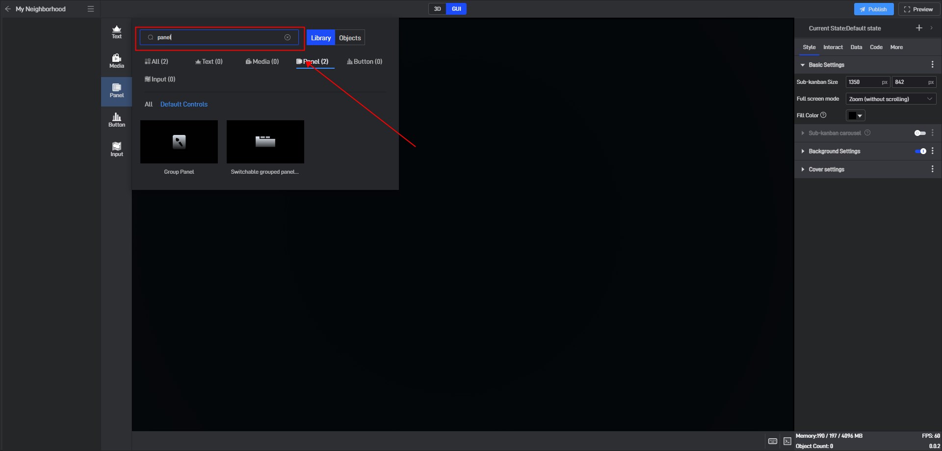
If you are familiar with widgets, you can add widgets by searching, which is more convenient.
Click the search button or press “Ctrl+F” to open the search box, enter the widget name to search, and then click the corresponding widget to add it.
2. Set widget Style
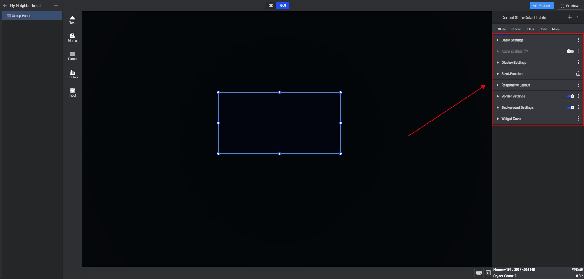
Click to select the widget. In the “Style” settings window on the right, you will see various categories of settings. Each category contains different options, and these categories and options will vary depending on the widget.
2.1 Fixed style settings
Fixed style is the widget style that remains unchanged after setting. This corresponds to the conditional style in Chapter 3.2. The conditional style changes the widget style according to the change of data.
Below we will introduce the specific settings for each setting item.
2.1.1 Basic Settings
| Configuration items | ** Description ** |
|---|---|
| Opacity | A common use of this setting is to combine conditional styles/interactions/multi-states to show and hide widgets. |
| Mouse pass-through | You can pass through this component and operate other components that are blocked by this component. |
| Show scroll bar | It is closed by default. When it is turned on, a scroll bar will be displayed in the panel. |
The opacity of the group panel changes, as shown in the following figure:

2.1.2 Group Panel Operations
The common operations performed when using the group panel are: generate groups, cancel groups, delete groups, some operations within the group panel, and setting the properties of the grouping panel.
The following will explain them one by one:
(1) Generate Groups
There are two ways to generate groups. The first is to put the widgets to be grouped into the group panel.
This method has the following two operation modes:
The first one: Select the group panel layer. New widgets added again will be automatically placed in the group. When widgets are added to a group, they will be placed in the group panel by default.

The second method: directly drag the component into the group panel. When dragging it in, you can place it on the group panel layer (to the bottom layer in the group) or between two layers in the group.

Tips: If the component is not displayed after being dragged into the group panel, you can right-click to reload it.
The second way to generate groups is through the right-click menu.
Select multiple widgets in the canvas, or select multiple layers in the layer, then right-click on any widget or layer, and select “Merge to Group” in the menu. A pop-up window for selecting groups will pop up automatically. Select Merge to a new group panel or an existing group panel as needed, and all selected widgets will be automatically placed in the group panel.
When generating a group, the position and layer order of all widgets remain unchanged.
(2) Cancel groups
Right-click the group on the left canvas or the layer on the right group panel and select “Cancel group” from the menu to cancel the current group. After ungrouping, the positions of the widgets in the group will not change.
(3) Delete groups
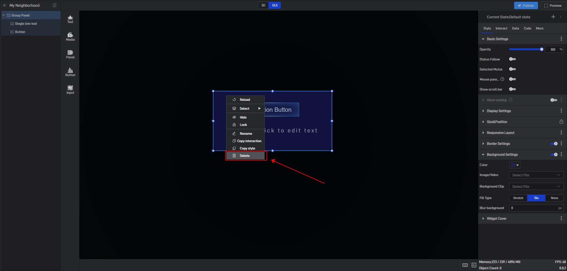
Click to select a group or group panel layer, press the Delete key or right-click and select “Delete” from the menu to delete the group. When deleting a group, all components in the group will be deleted.
(4) Other operations
Drag the group frame to change the size of the group panel, but the position of the widgets in the group will not change during the dragging process.

2.1.3 Allow Scaling
| ** Configuration item ** | Description |
|---|---|
| Magnification | The panel size ratio of the entire dashboard is customized after scaling. The default size is “100%”. |
| Icon to zoom in | Customize the zoom in button image style. |
| Icon to zoom out | Customize the zoom out button image style |
| Button Size | Customize the button size. The default size is “15”. |
| Button Color | Configure the button display color. |
| Button Position | The button position can be set to: “Upper right”, “Upper Left”,** “Lower Right”**, “Lower Left”. |
| Button Offset | The default value of the custom button offset compared to the X/Y axis is “5px”. |
The group panel turns on the zoom effect, as shown below:

2.1.4 Display Settings
| ** Configuration item ** | Description |
|---|---|
| Play animation | The animation will take effect only after this button is turned on. |
| Animation type | The animation can be set to “Anticlockwise” or “Clockwise”. |
| Delay | The delay time after the animation takes effect. The default delay is “1 second”. |
| Duration | You can set the duration of a single scroll, the default duration is “1 second”. |
| Loop playback | When this button is not turned on, the animation will only play once when the full screen is started; after this button is turned on, the animation will be played in a loop according to the interval time. |
2.1.5 Size & Position
You can adjust the size and position of the widget by directly clicking and dragging it, or by entering the width, height, X coordinate, and Y coordinate values directly.
| Configuration items | ** Description ** |
|---|---|
| Widget Size | The width and height of the widget are measured in pixels (px). |
| Widget Position | The X and Y coordinates of the widget represent the distance from the top-left corner of the widget to the left edge and the top edge of the page, respectively. |
| Widget Rotate | The X and Y coordinates of the widget represent the distance from the top-left corner of the widget to the left edge and the top edge of the page, respectively. |
Size & Position Parameters for Group Panel widget, as shown in the figure below:

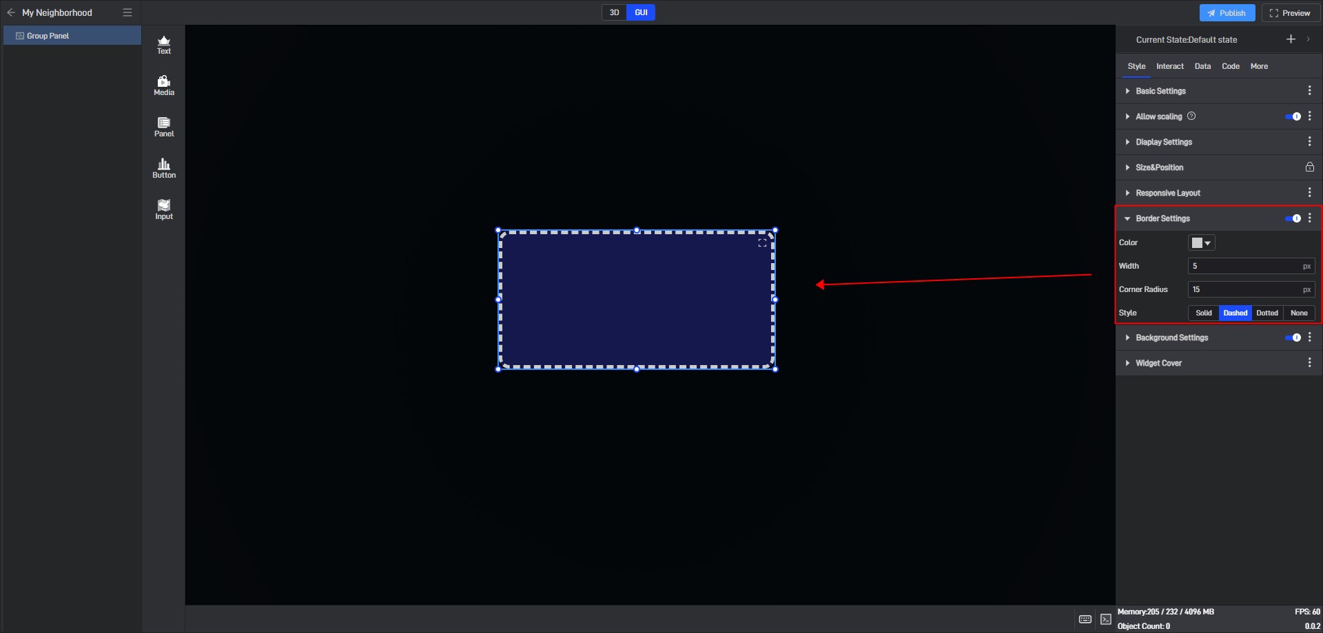
2.1.6 Border Settings
The border style will only be displayed and configurable for the widget once the **”Border Settings” **option is enabled.
| Configuration items | ** Description ** |
|---|---|
| Color | Configure the color of the widget’s border separately. |
| Width | The thickness of the border can be adjusted, with the default width set to “1px”. |
| Corner Radius | Border shape, the default radius is “0px”. |
| Style | Choose from four border styles: “Solid”, “Dashed”, “Dotted”, and “None”. |
The border style of Group Panel is as shown below:
2.1.7 Background Settings
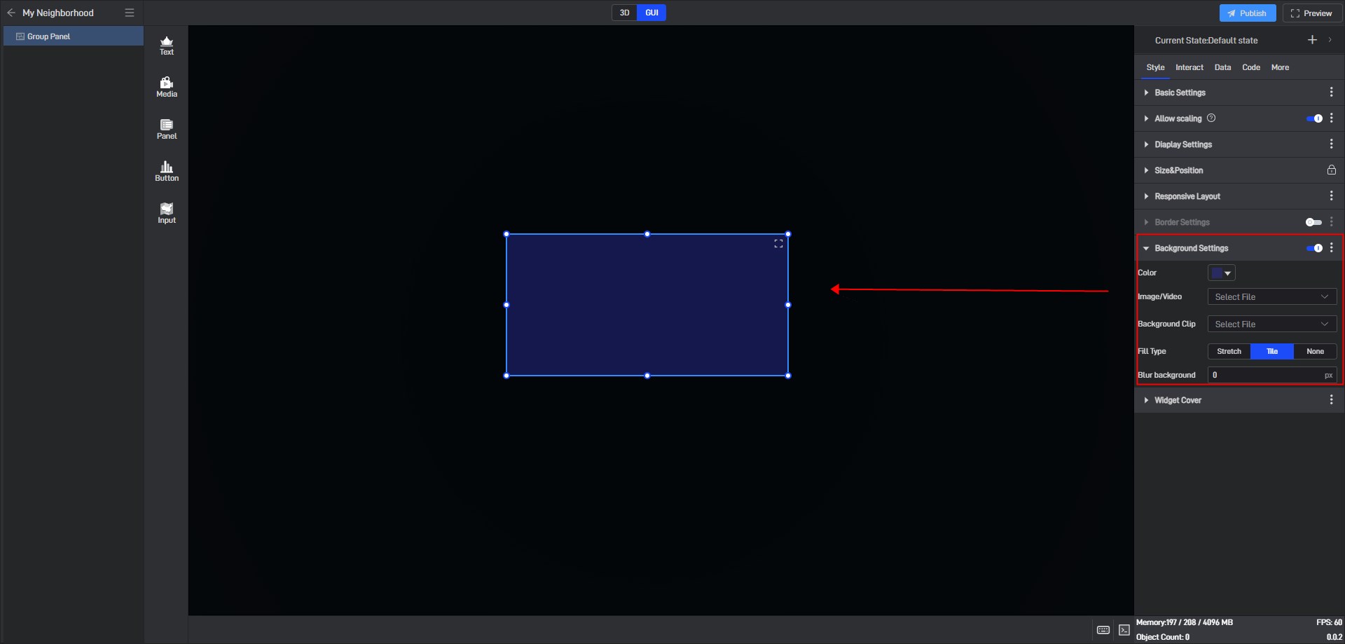
By default, widgets have no background color. To set a background color, you first need to enable the “Background Settings” option.
| Configuration items | ** Description ** |
|---|---|
| Color | Configure the background color of the widget separately. |
| Image/Video | Add local images or videos to serve as the widget’s background. |
| Background Clip | After adding a local image or video, you can crop it. |
| Fill Type | When the background is filled in “Stretch”, the image will be stretched or compressed according to the size of the target area to completely cover the area; when the background is filled in “Tile”, the image will be spread over the entire area in its original size and proportion. |
| Blur background | Blur or soften the background, with the default blur level set to “0px”. |
Tile fill background color, as shown below:
2.2 Conditional style settings
Conditional styles are styles that widgets change according to data conditions.
Almost all setting items can be set with conditional styles, but different setting items have slightly different conditions when setting conditional styles. There are two specific ways:
Method 1: Set in the extended settings menu
The conditional setting method for most setting items is method 1. The specific steps are as follows:
Take the “Opacity” setting item in “Basic Settings” as an example:
Click to select the component and move the mouse over the setting item. You will see three dots (extended setting button) appear on the right side of the setting item name.
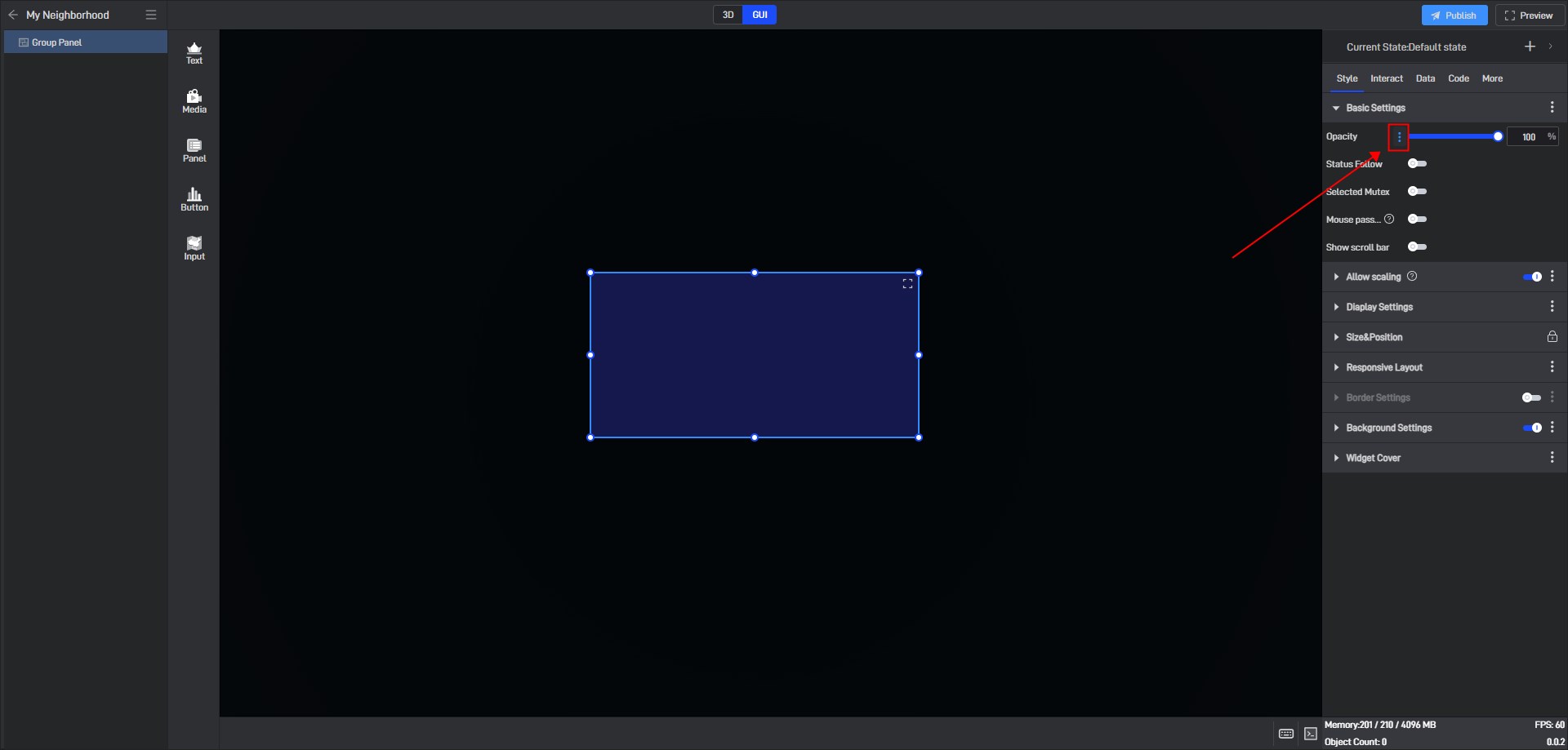
Click these three dots to open the extended settings window, and the first option is “Conditional Style”.
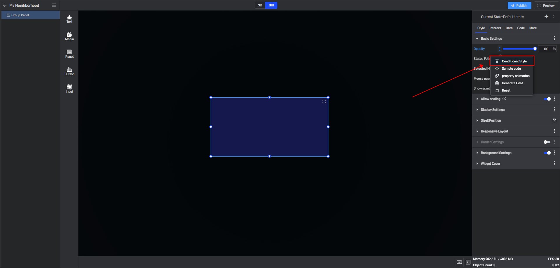
Click “Conditional Style” to open the conditional style settings window.
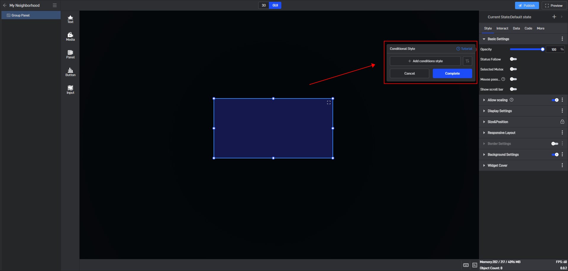
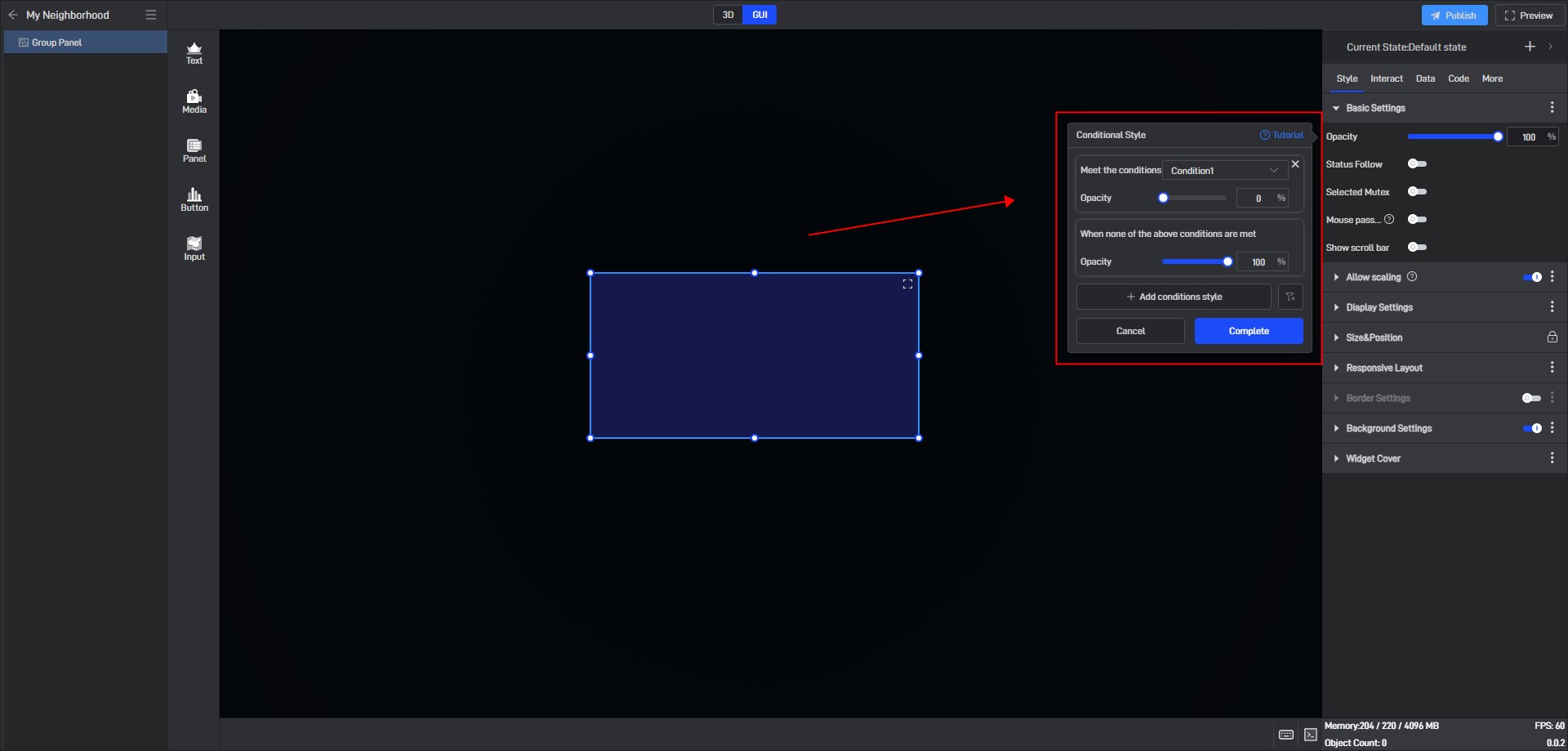
Click “+ Add conditional style” and select the data condition to be triggered (the optional data condition here must be an existing data condition).
According to the current settings, we can set the opacity value when condition 1 is met, and the opacity value when none of the conditions are met.
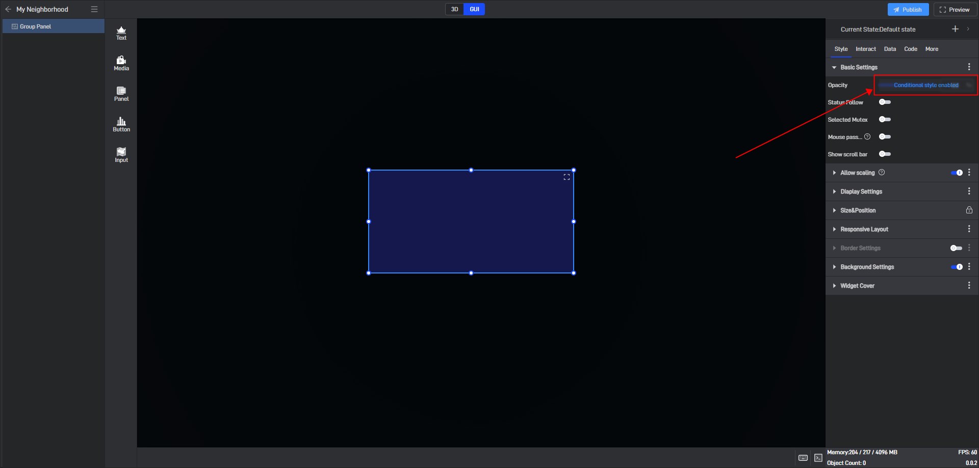
After the settings are completed, a prompt “Conditional style enabled” will appear in the setting item.
Method 2: Set directly in the setting item
Some setting items have conditional settings that are directly displayed in the setting item. In this case, you can set them directly outside. However, the conditional style of multi-line text can only be set through method 1.
2.3 Set styles by data fields
The essence of all setting item modifications is to modify the values, so all setting items can be controlled through data fields, and the dynamic data field function is required here.
Still taking the “Opacity” setting in “Basic Settings” as an example:
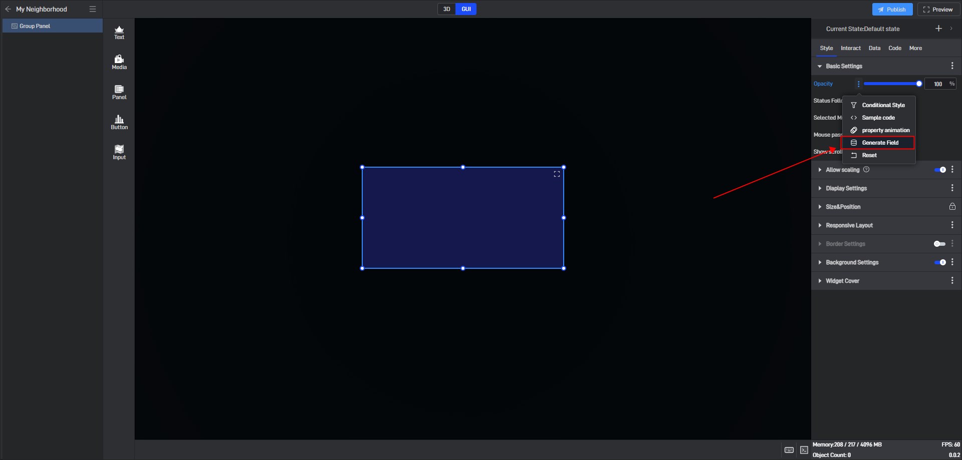
Open the extended settings window and click the option “Generate Field”.
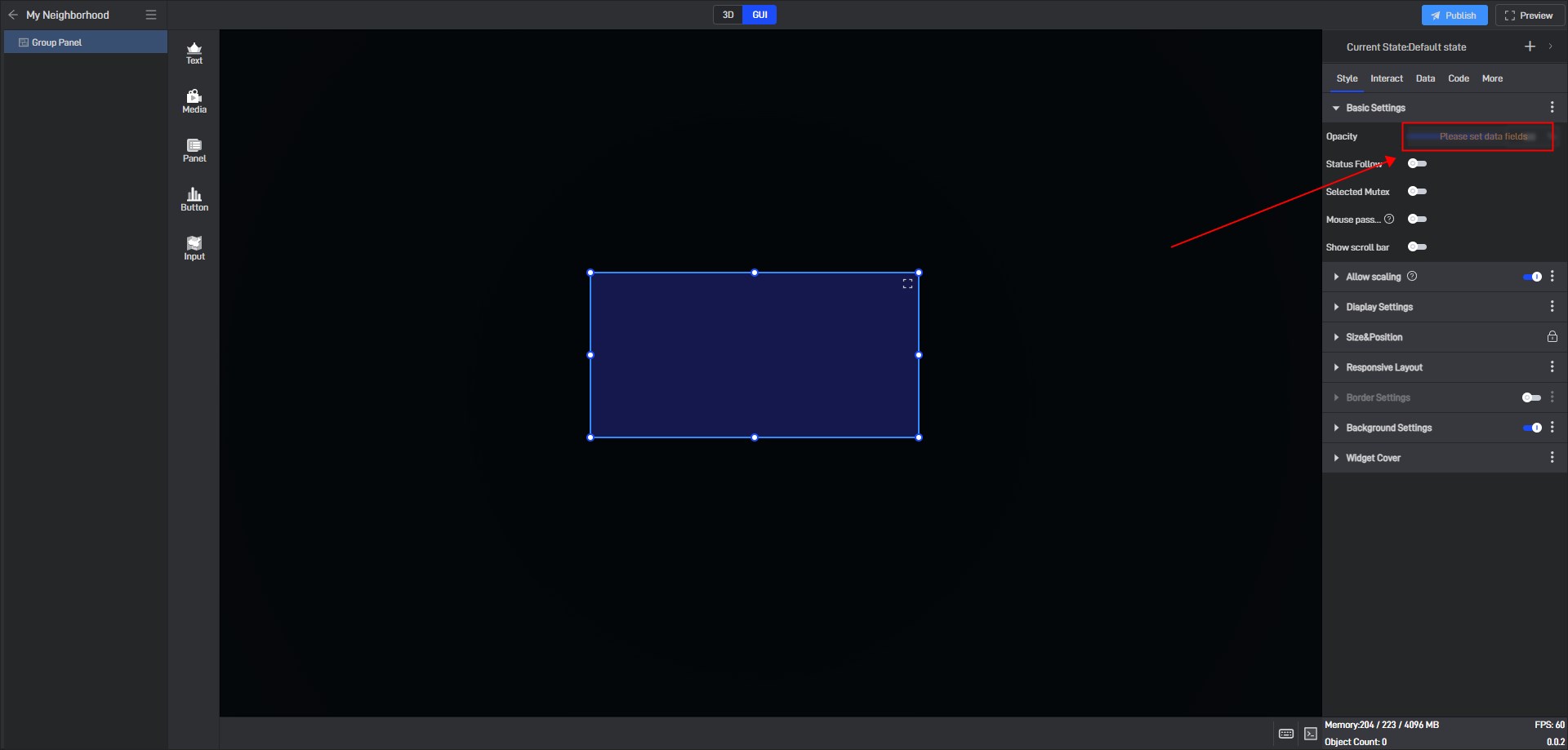
After clicking, a prompt “Please set data fields” will appear in the setting item.
Switch to the “Data” setting interface. You can see that a new “Dynamic Data Fields” setting item has been added to the interface, and an associated field has been generated for the “Opacity” setting item just selected.
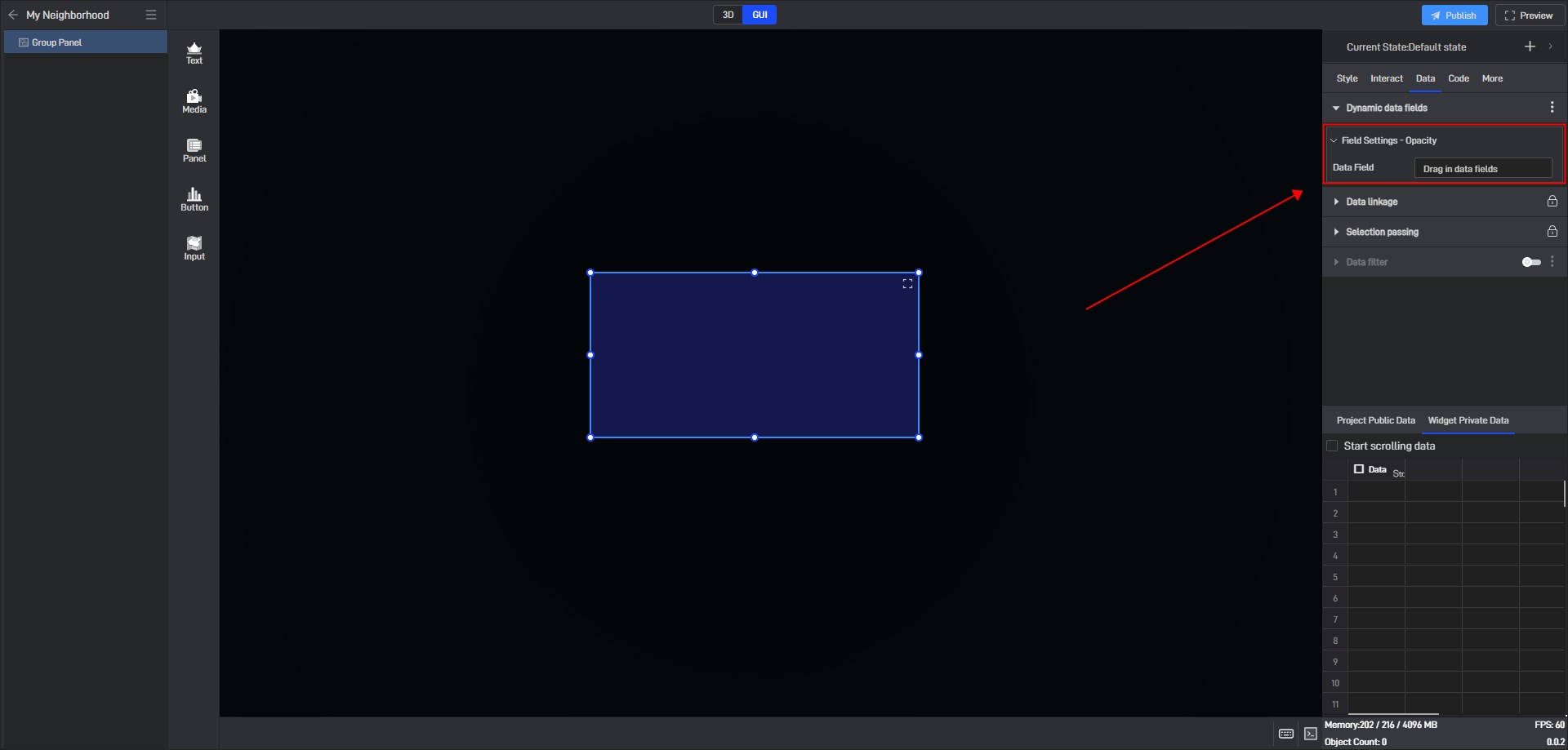
Next, you just need to add a data field here, and you can control the opacity through data.
Add a data with a value of “0” to the data field, and you can see that the opacity value is changed to “0” through the dynamic data field, making the component hidden.

3. Set interaction
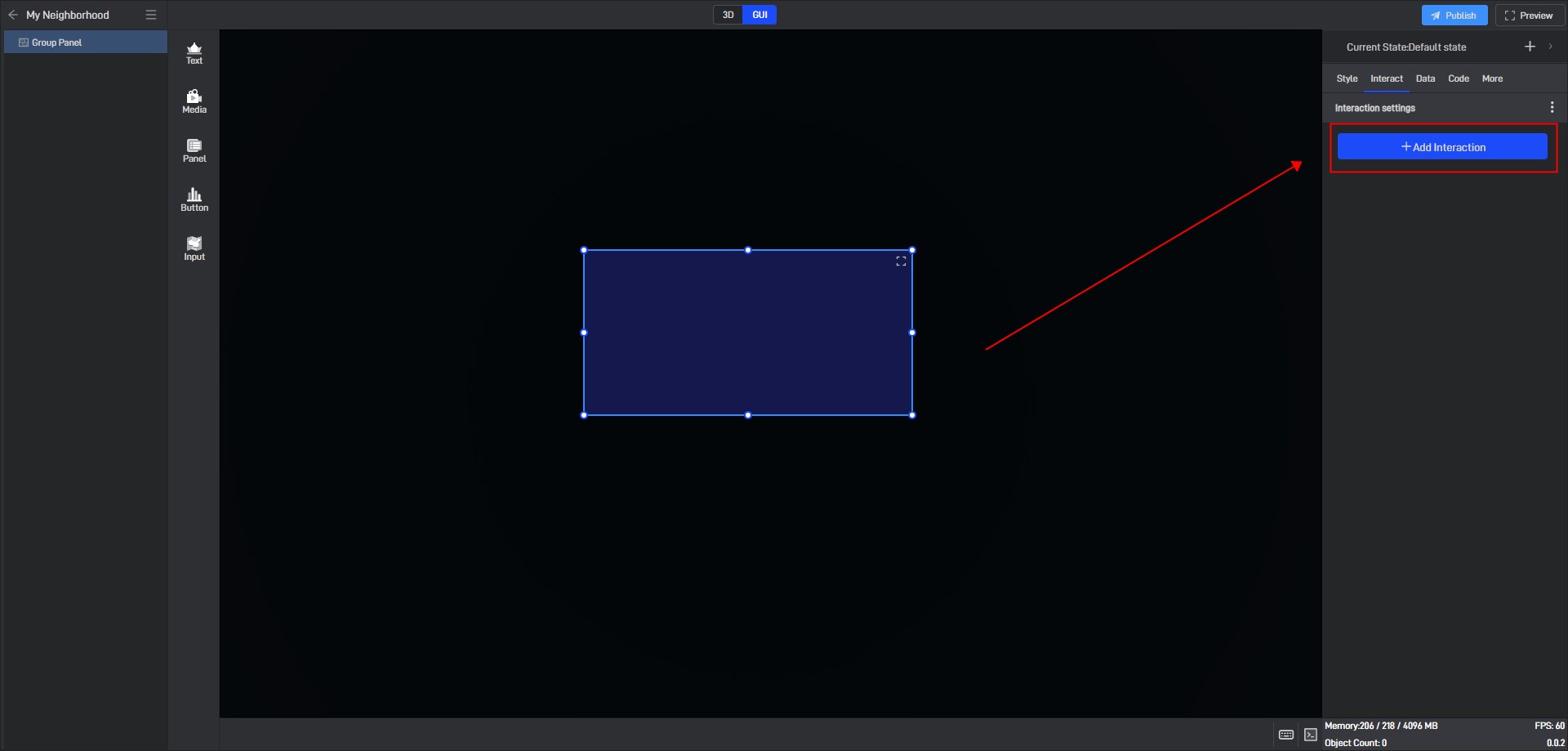
Click to select a widget, and in the “Interact” setting window on the right, you can add or delete interactions for the current widget.
4. Secondary Development
Click on the widget to select it, and in the right-side “Code” settings window, you can configure secondary development settings for the widget.
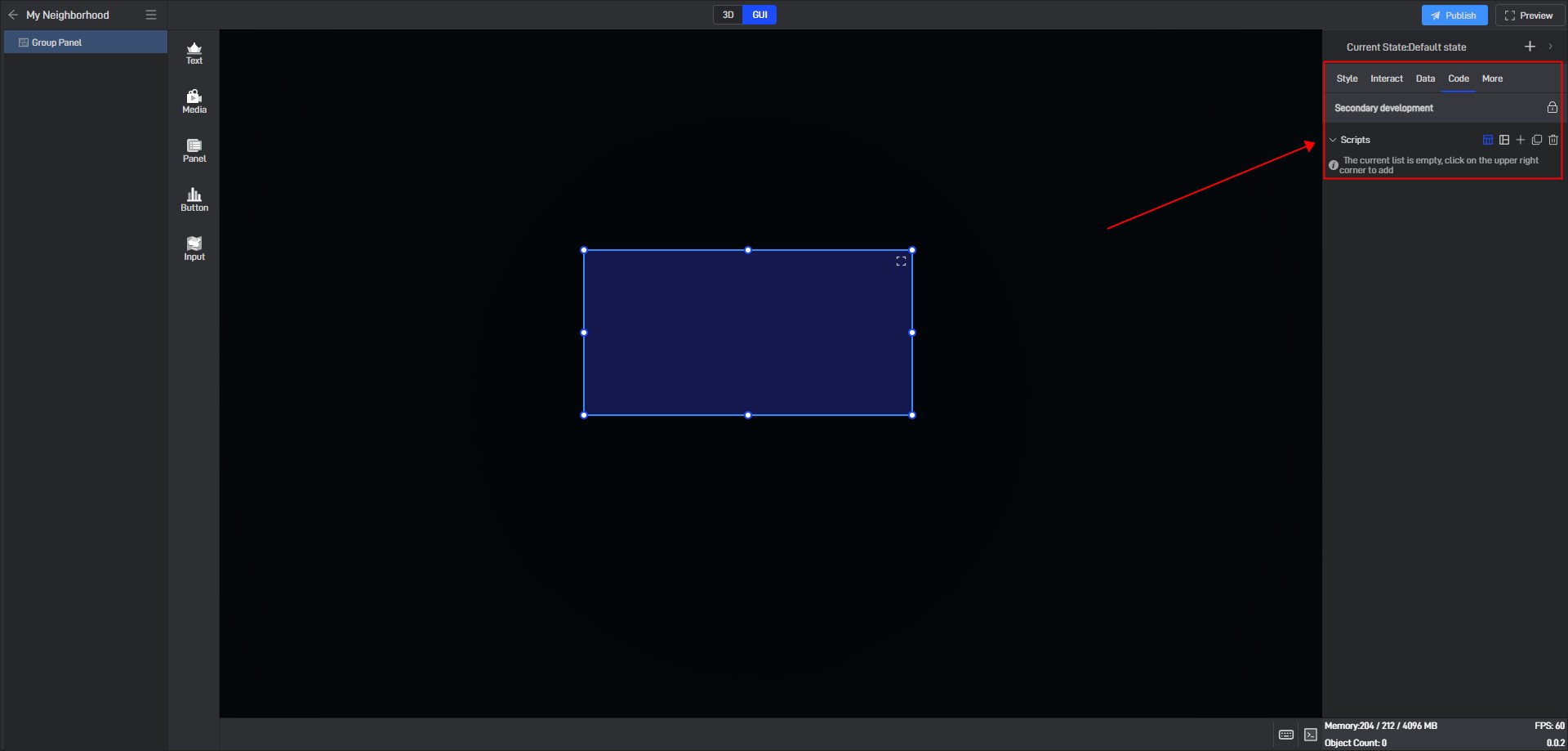
Secondary development needs to be achieved by loading JavaScript script files.
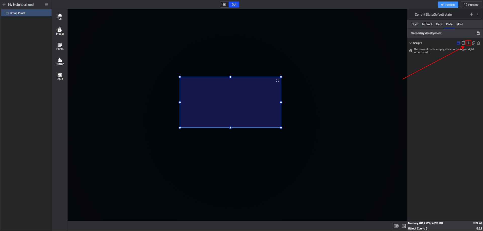
Click “+” to add settings. Multiple scripts can add multiple settings.
During the secondary development process, we can control the style of the widget. If we want to control a certain setting item, we can first view the secondary development code example of the setting item in the style.
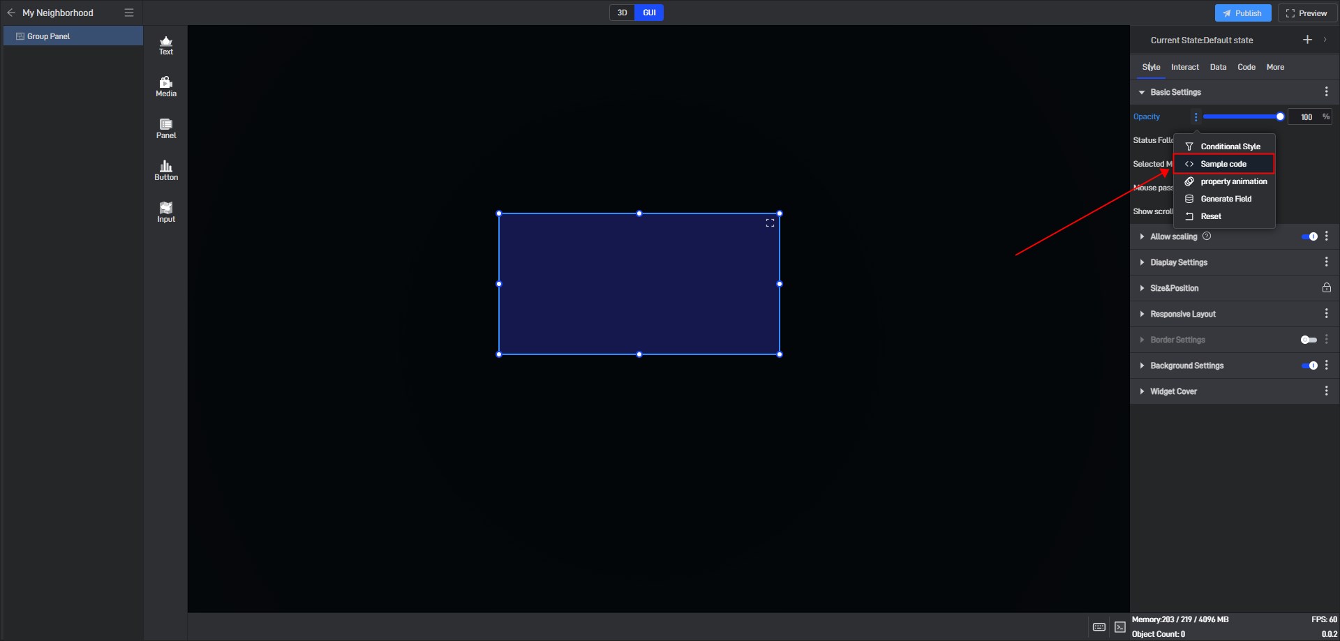
Take the “Opacity” setting item as an example:
Open the pop-up window of the extended settings and click “Sample code”.
You can see the secondary development code sample for this setting item.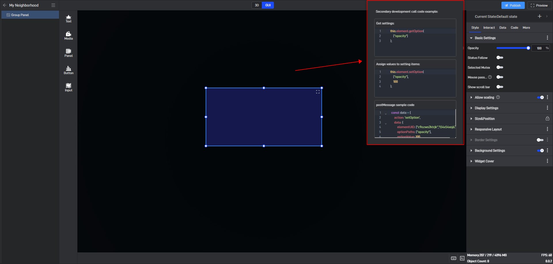
Here is a simple secondary development example:
Secondary development function: widgets automatically move to the right
Sample code:
1 | /** |
Click “Select File” to add the JavaScript file.

5. Set up multi-state switching
5.1 Add states
Each widget has a default state property, which contains all the above settings.
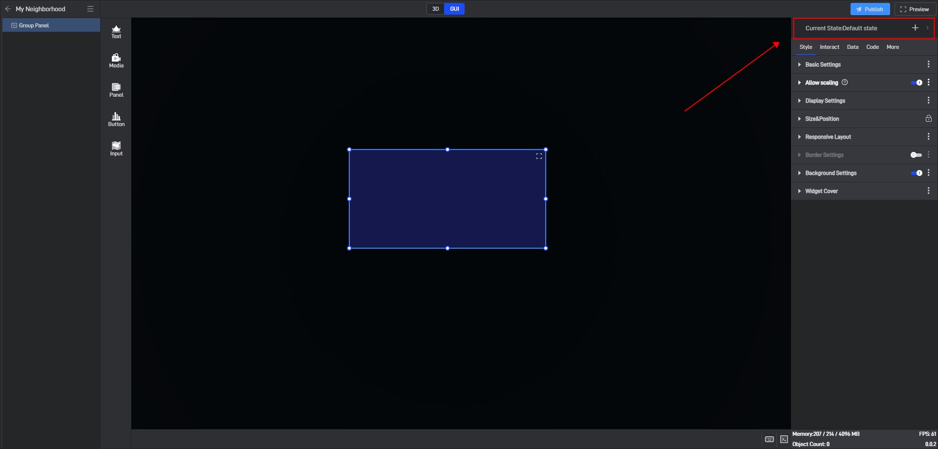
But we can also add multiple states, so that each state will contain all the above settings, and these states are independent of each other.
We can add new states in the following two ways:
(1) Create a new state
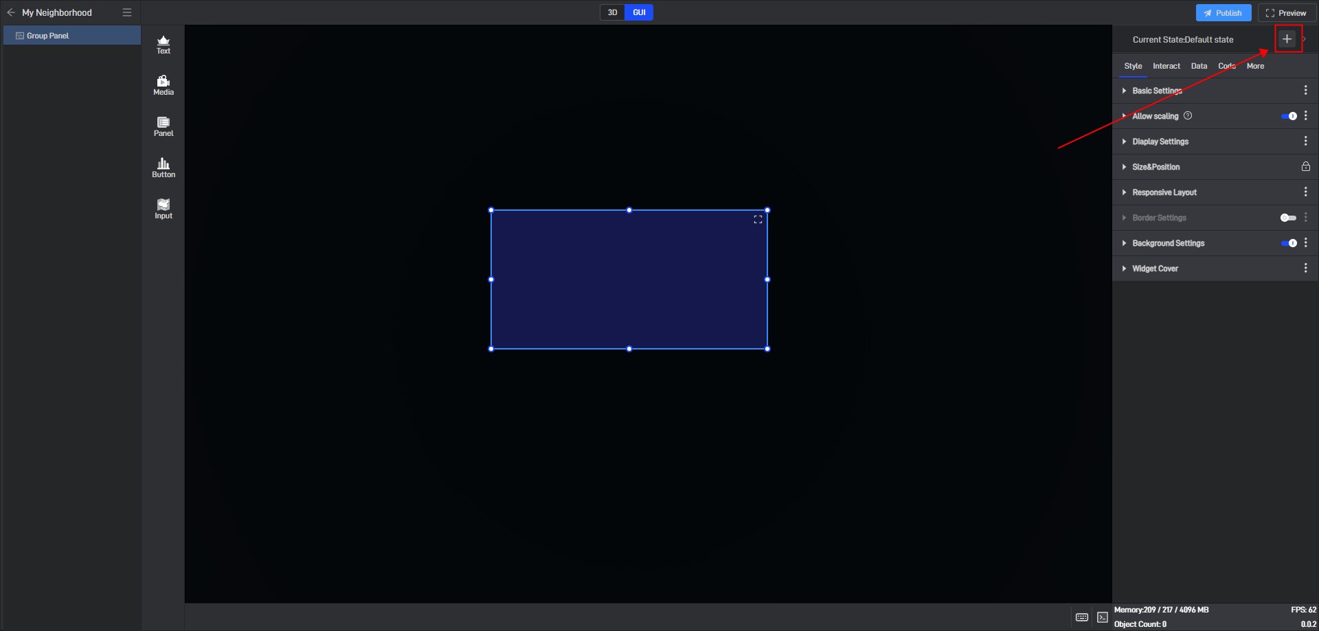
Click the “+” in the upper right corner to add a new widget state.
In the state setting window, we can set the name of the state.
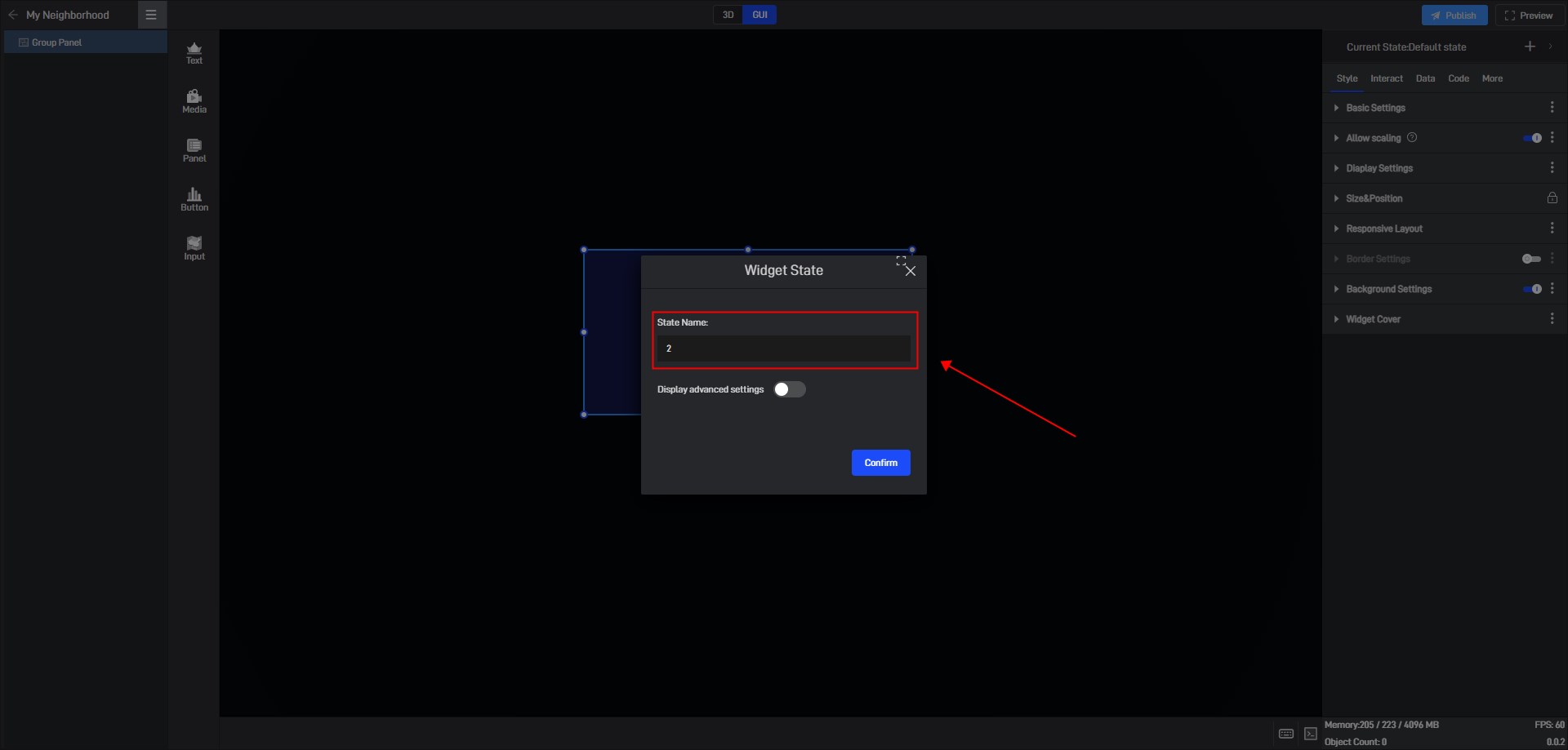
By default, all new states are kept consistent with the default state.
We also open the advanced settings in the window to set the follow object of the new state.
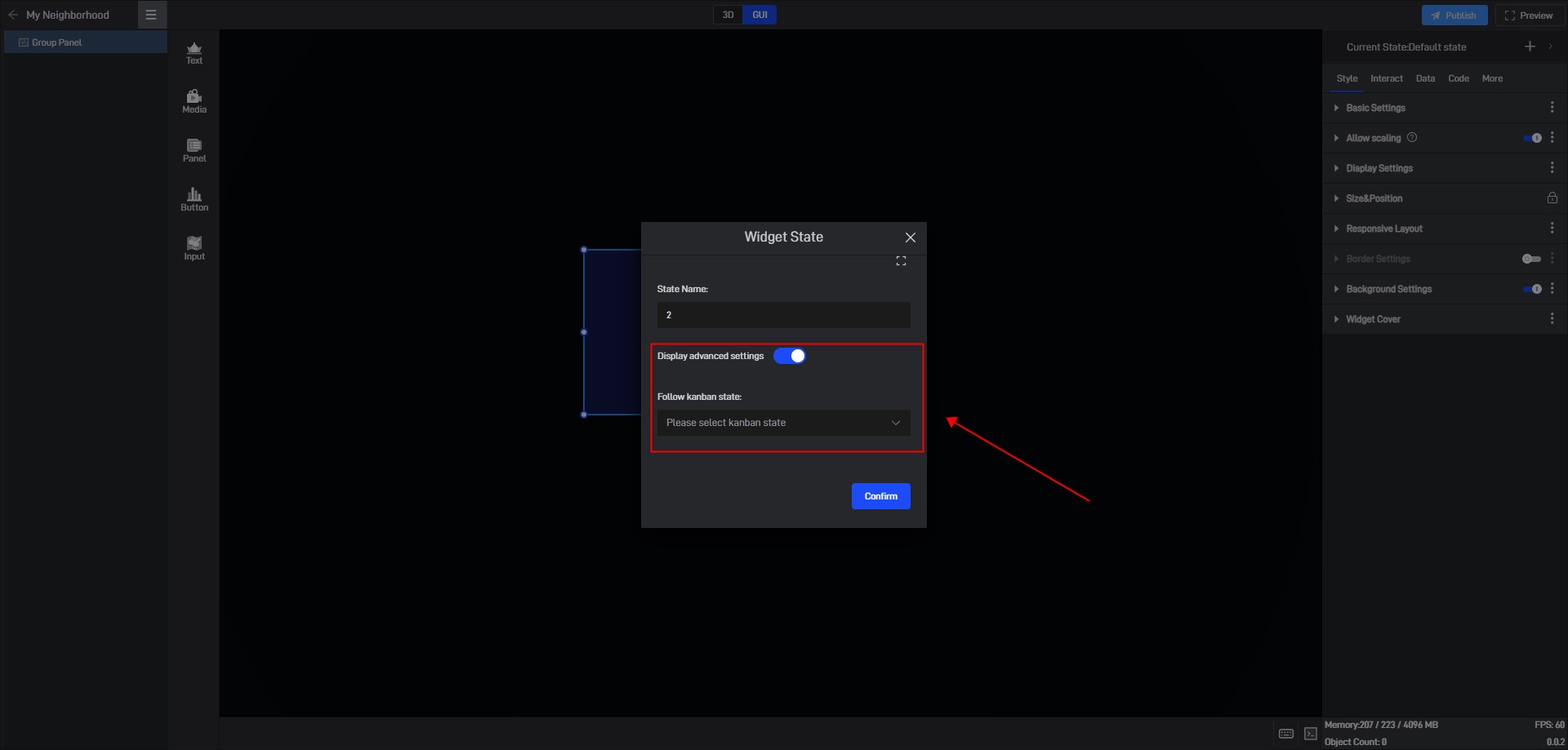
(2) Copy an existing state
Click the state name in the upper right corner to expand the state list. After expanding, you can see all the states of the current widget.
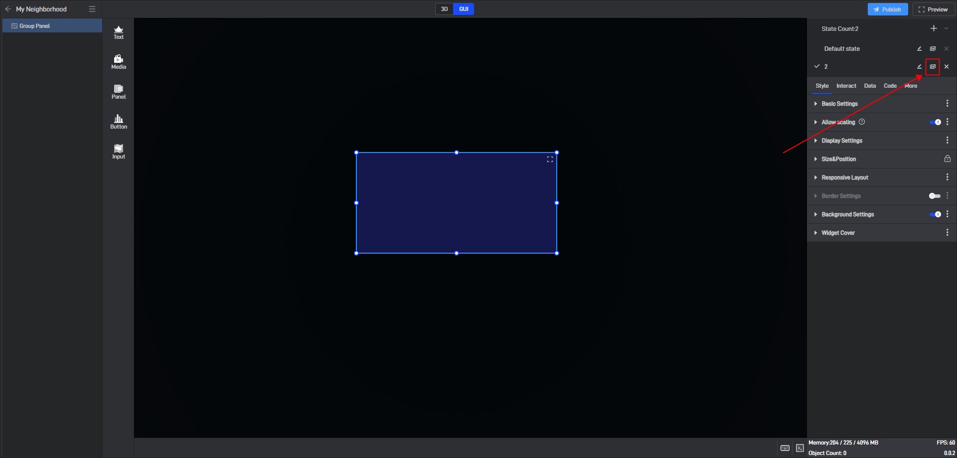
In this state list, we can rename, copy and delete the state.
Click the copy button on the right side of the state name to copy the current state to a new state. All settings of the copied new state will be consistent with the copied object state.

5.2 Switch states
When editing a project, we can manually switch widget states by clicking on different states in the state list.

Switching widget states through click interactions usually involves clicking other widgets to switch the state of the current widget, so the interaction is set on other widgets rather than on the current widget. For example, clicking a button switches the display and hide states of the current widget.
First, set a hidden state for the widget (the default state is considered as the visible state).
Click “+” to create a new “Hidden” state, and then change the widget opacity to “0%” in this state.
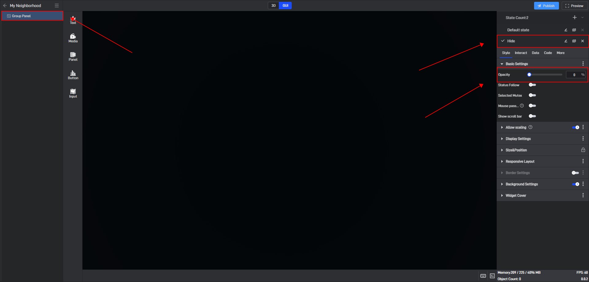
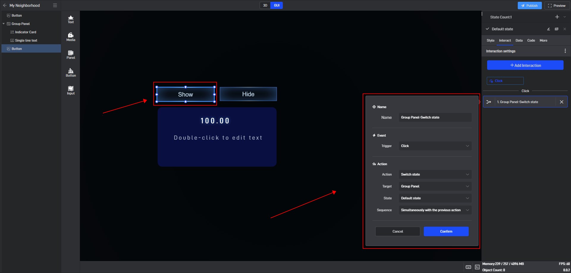
Add a “Show” button and a “Hide” button.
Add an interaction to the “Show” button , and switch the widget to the default state (show state) after clicking.
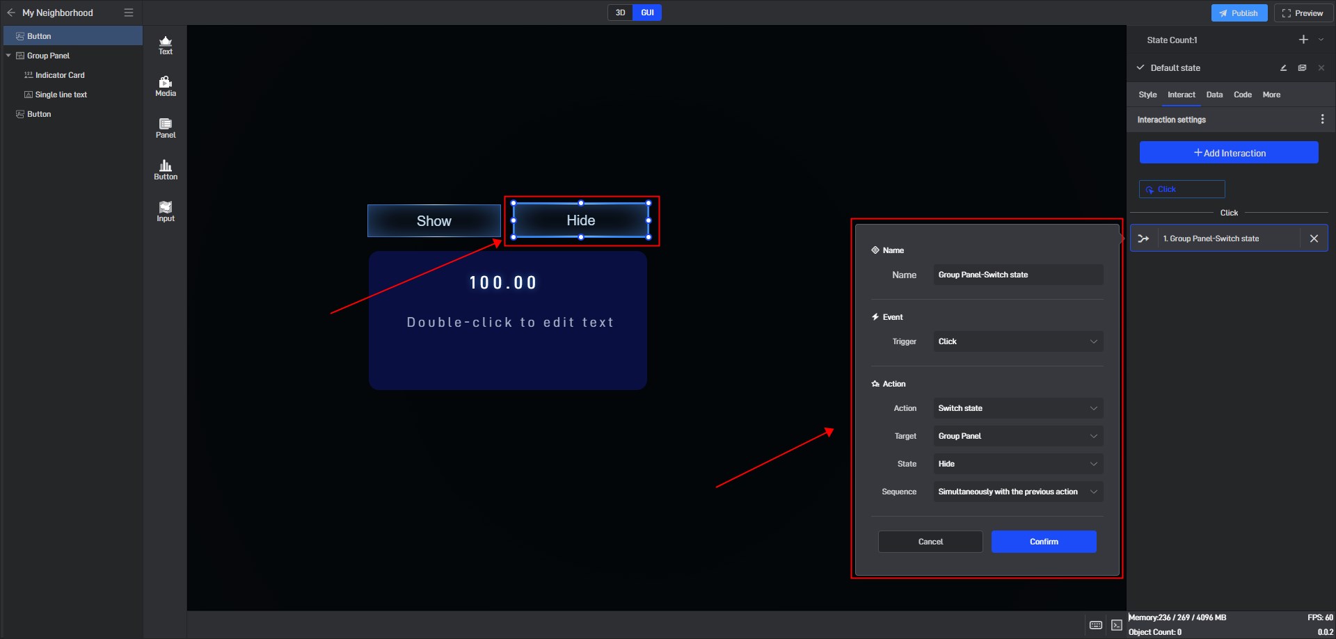
Add an interaction to the “Hide” button to switch the widget to the hidden state after clicking.
This achieves the effect of switching the display/hide of components by clicking the button.

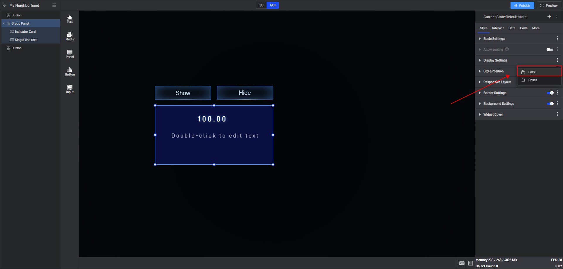
5.3 Locked state
In the style settings, some settings have a lock icon on them, which means that this setting item in all current states has been locked to the default state, which means that if this setting item is modified, this setting item in all states will be modified uniformly.
This is a function that allows you to uniformly modify the same setting items in multiple states in a widget’s multiple states.
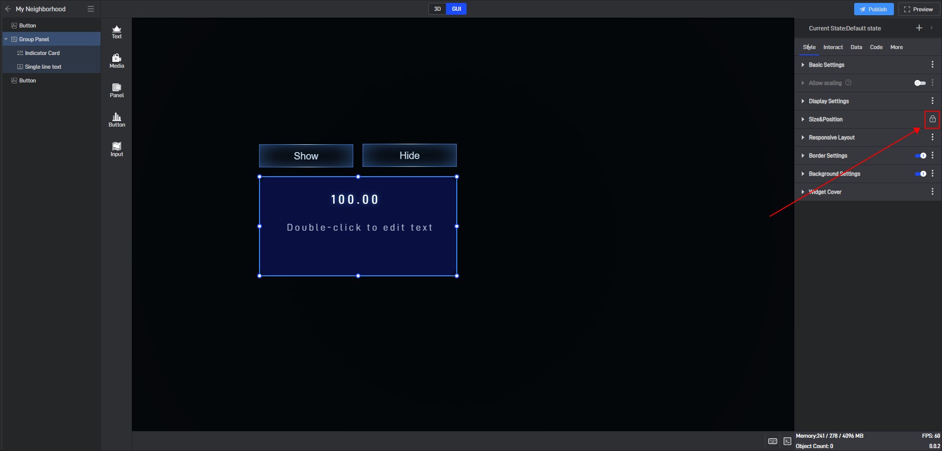
If you don’t want to lock it, you can click to unlock it, and then this setting item in all states will be unlocked.
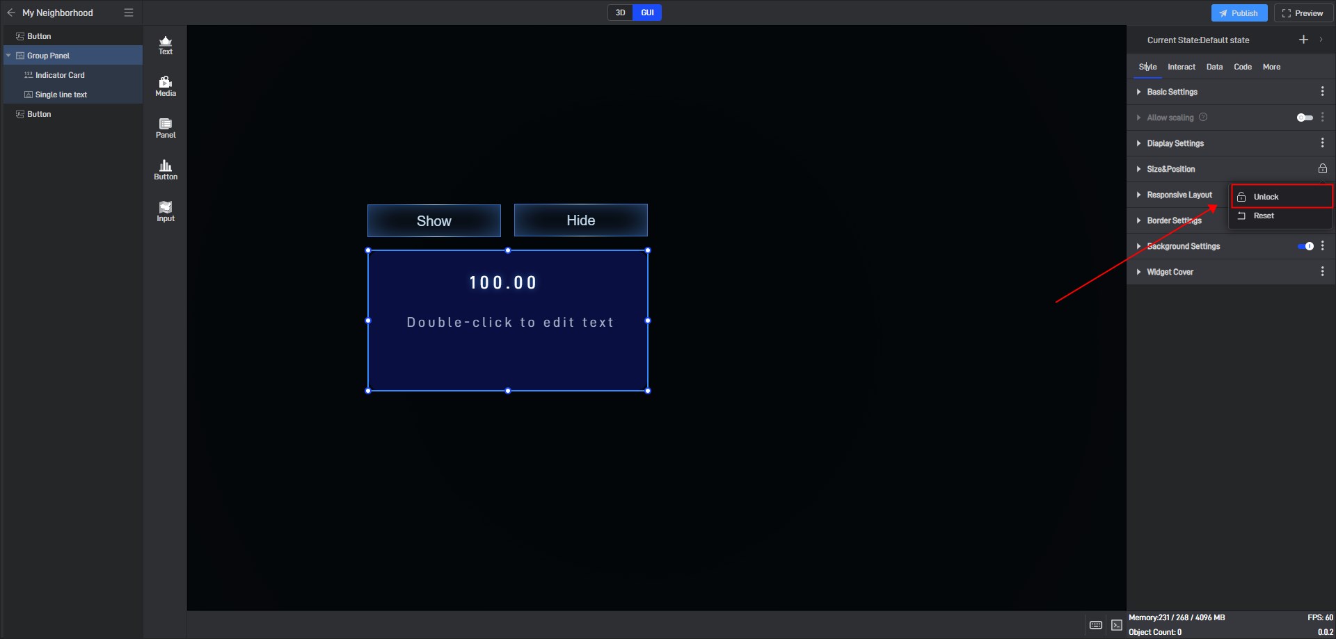
If you want to lock other settings, you can click the three dots on the right side of the setting item and then lock it.
