Single-line Text
In our component library, we offer a wide range of components. To simplify the design process during project development, we have preset some styles for these components. However, you can still modify their styles based on these presets.
During the process of using the component, we can set it up according to the following steps:
1. Add Components
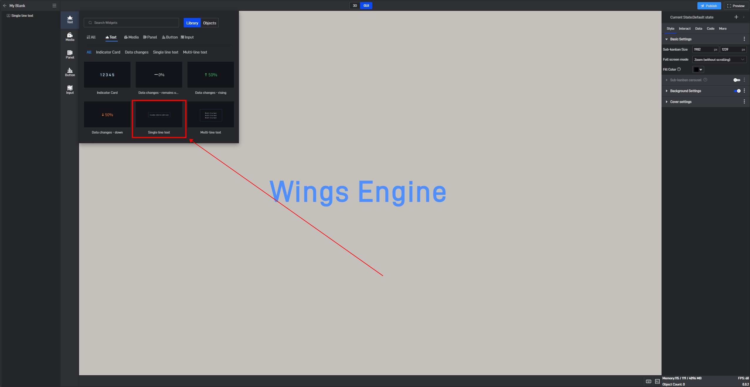
If you are not very familiar with the components, you can find the component through the Components window and then add it, as shown in the image below:
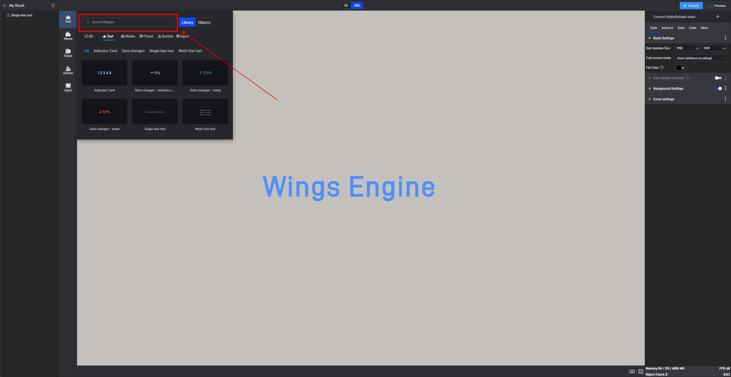
If you are more familiar with the components, you can open the search box by pressing Ctrl+F on your keyboard and search for the component you want to add.
2. Binding Data
Different components are suitable for different data formats. If the data source format does not meet the component’s requirements, the content will not display correctly.
The Single-line Text component displays sample text by default, and you can double-click it to edit directly.

2.1 Generating Text Data
Open the “Text” settings’ extended settings window and click the third option, “Generate Data Field“.
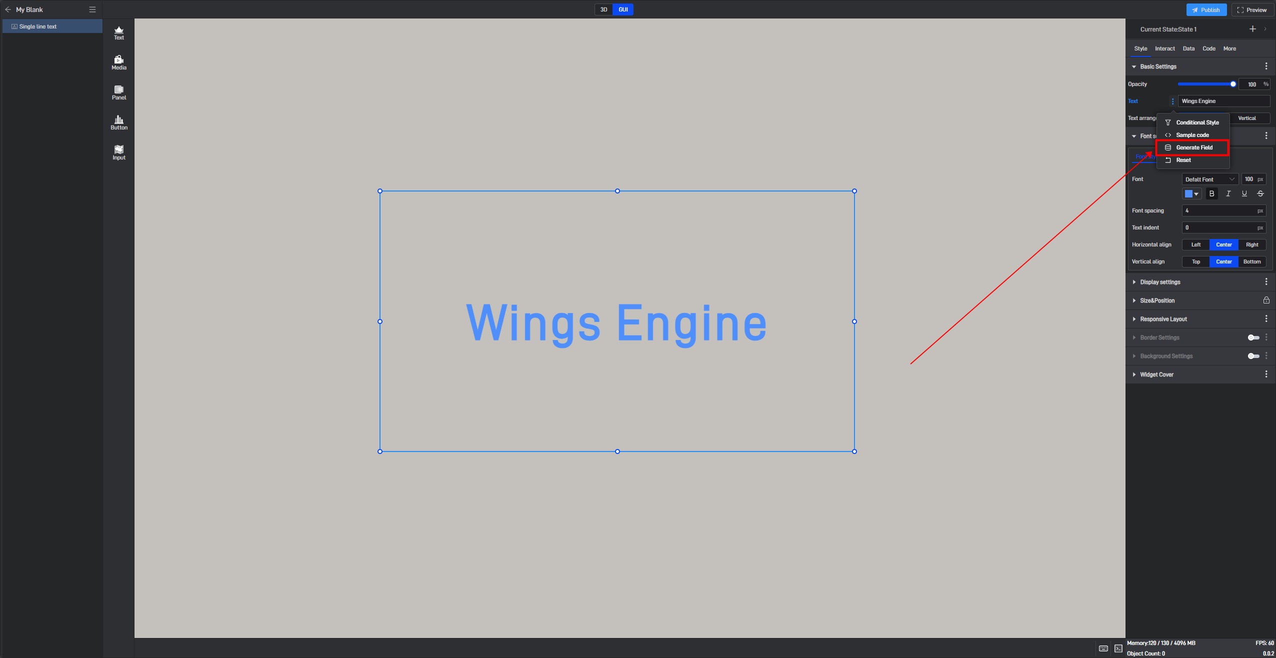
After clicking, a prompt saying “Please set data field” will appear in this setting item.
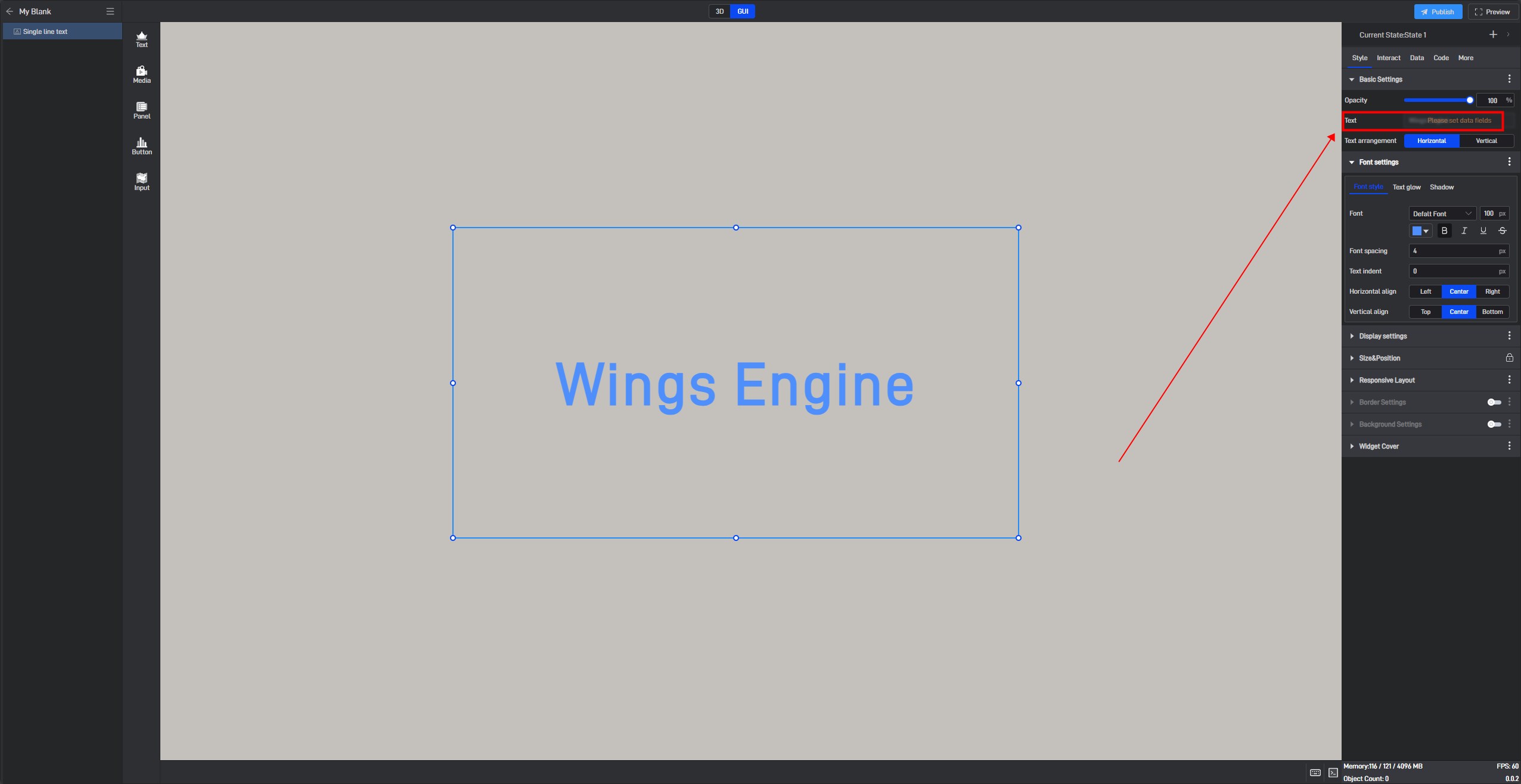
Switch to the “Data” settings interface. At this point, you will see a newly added “Dynamic Data Field“ setting item, and a related field has been generated for the previously selected “Text” setting item.
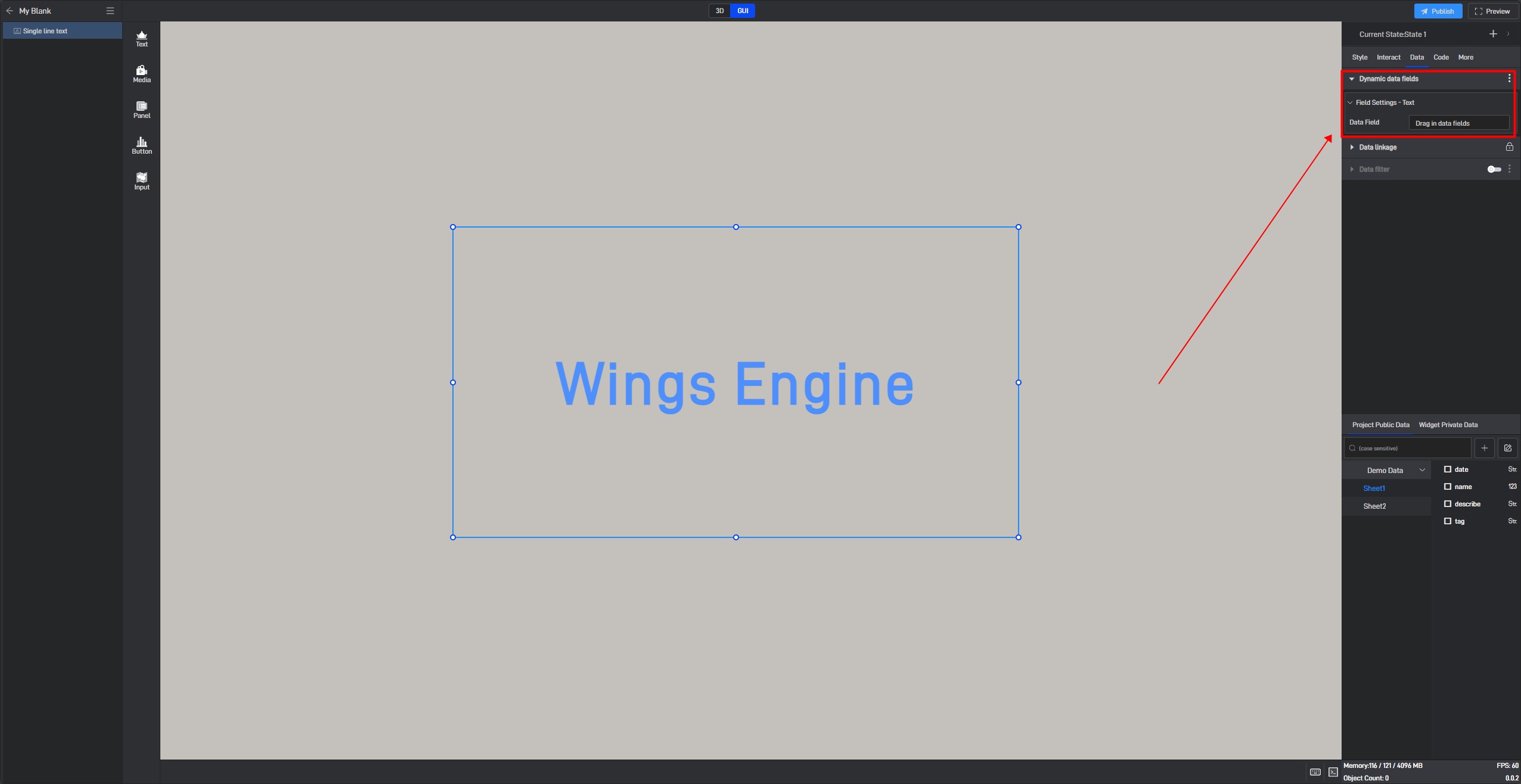
Adding a data field here allows you to control the display of text through data. Sample data is as follows:
| Origin |
|---|
| New York |
| Washington |
| San Francisco |

Enable “Data Filtering” to set text filter conditions.
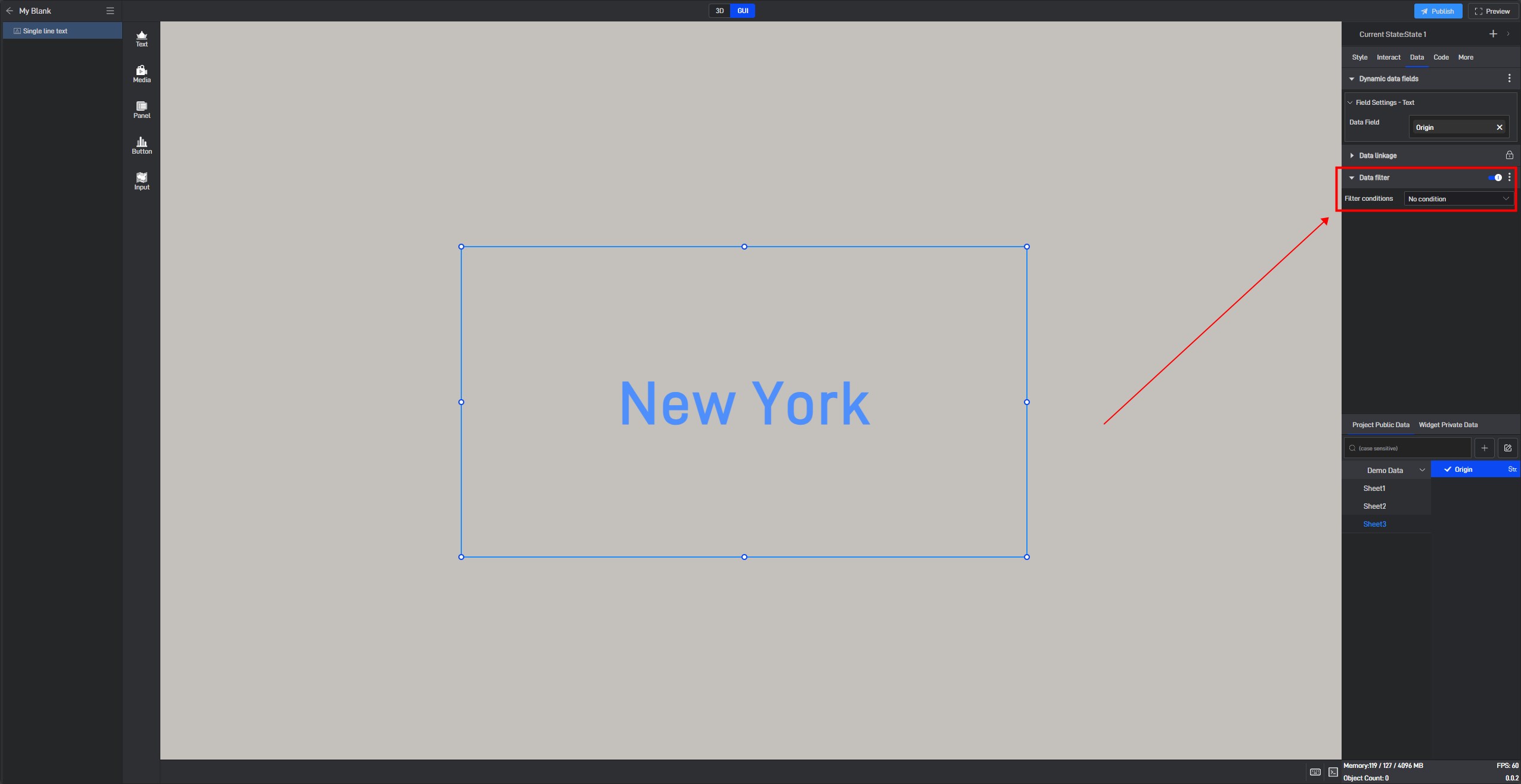
Based on the set filter row number, the text will display the content of the corresponding row.

3. Set Component Styles
Click to select the component, and in the right-side “Style” settings window, you will see various categories of settings. Each category contains different settings, which may vary depending on the component.
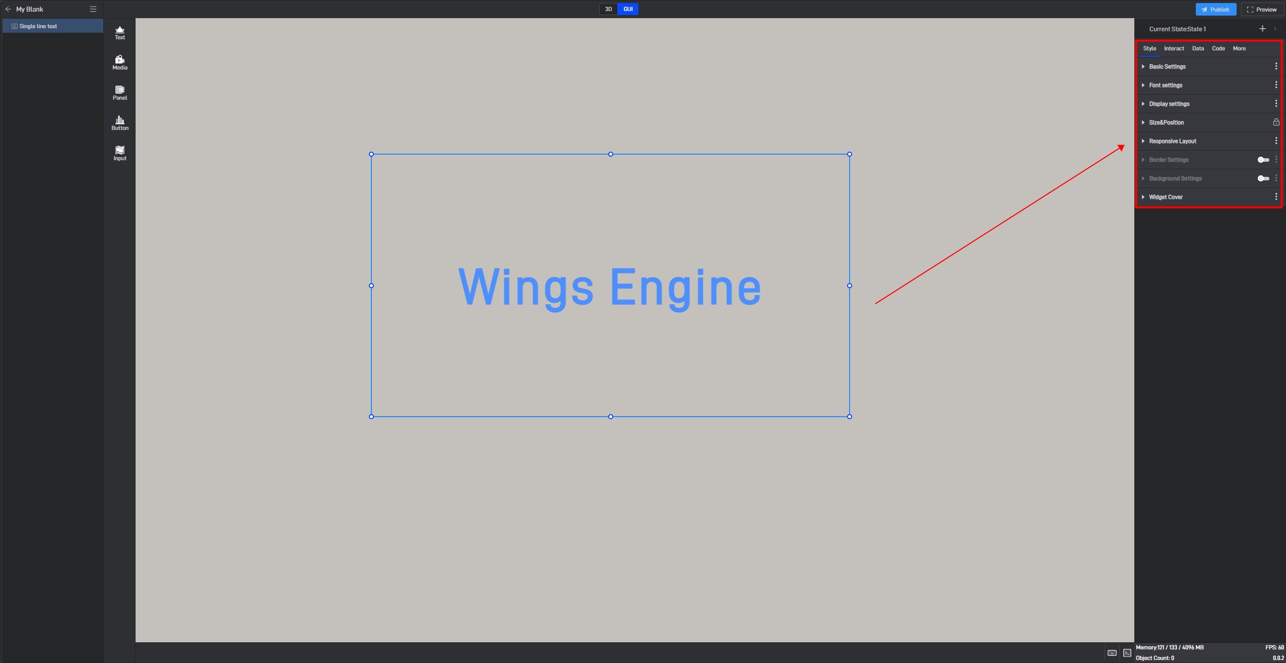
3.1 Fixed Style Settings
Fixed styles refer to the component styles that remain constant once set, in contrast to conditional styles discussed in Section 3.2, which change based on data variations.
Next, we will provide a detailed introduction to each of these settings.
3.1.1 Basic Settings
| ** Configuration item ** | Describe |
|---|---|
| Opacity | A common use of this setting is to combine conditional styles/interactions/multi-states to show and hide widgets. |
| Text | The multi-line text component will display its content, with the default showing “Double-click to modify text “ . |
| Text Alignment | There are two alignment options: “Horizontal” and “Vertical” . |
Transparency changes of the Single-line Text, as shown in the figure below:

3.1.2 Font Settings
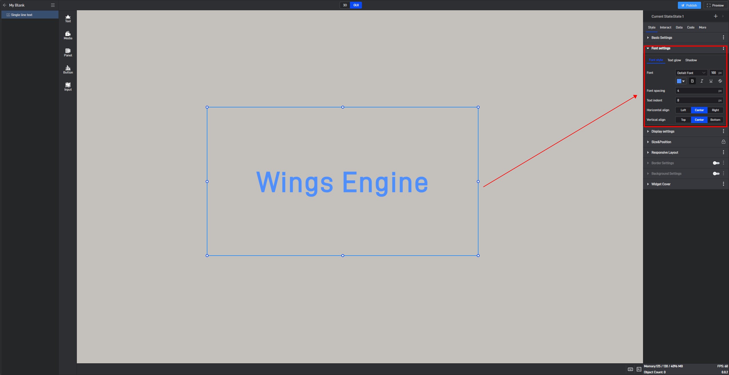
(1) Style
| ** Configuration item ** | Describe |
|---|---|
| Font | Configure the style of the text font. |
| Font Spacing | The distance between fonts, with a default spacing of “4px” . |
| Text Indentation | Indents the text to the right by a certain distance, with a default indentation of “0px” . |
| Horizontal Alignment | You can choose from three horizontal alignment options: “Left Align”, “Center Align” and “Right Align” . |
| Vertical Alignment | You can choose from three vertical alignment options: “Top Align” ,“Center Align” and “Bottom Align” . |
Single-line Text font style, as shown below:
(2) Glow
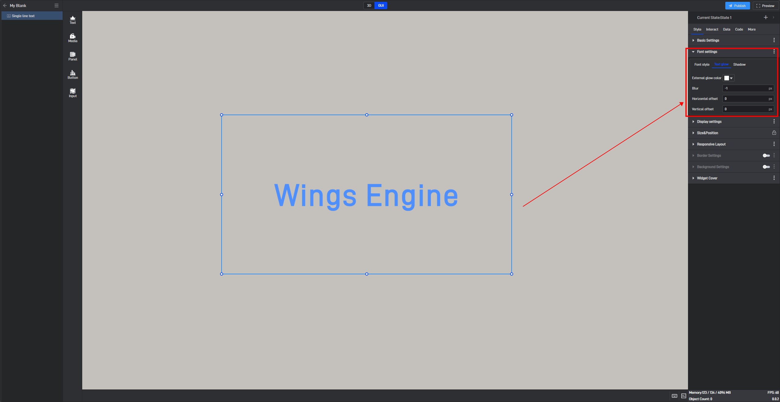
| ** Configuration item ** | Describe |
|---|---|
| Outer Glow Color | Configures the halo color that appears around the text. |
| Outer Glow Blur | Customizes the blur degree of the halo color around the text, with a default of “-1px”. |
| Horizontal Glow Offset | The offset of the glow effect on the horizontal direction, with a default offset of “0px”. |
| Vertical Glow Offset | The offset of the glow effect on the vertical direction, with a default offset of “0px”. |
Single-line Text font glow style, as shown below:
(3) Shadow
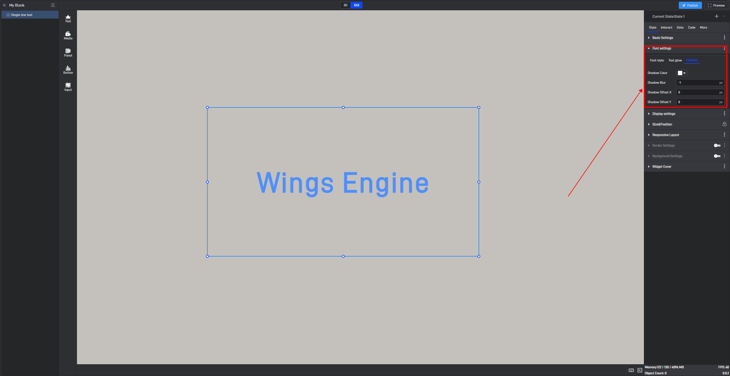
| ** Configuration item ** | Describe |
|---|---|
| Shadow Color | Configures the shadow or gradient effect added around or below the text. |
| Shadow Blur | Customizes the blur degree of the shadow or gradient effect added around or below the text, with a default of “-1px”. |
| Horizontal Shadow Offset | The offset of the shadow or gradient effect in the horizontal direction, with a default offset of “0px”. |
| Vertical Shadow Offset | The offset of the shadow or gradient effect in the vertical direction, with a default offset of “0px”. |
Single-line Text shadow style, as shown below:
3.1.3 Display Settings
Set the display format for the data within the component here.
| ** Configuration item ** | Describe |
|---|---|
| Play Animation | This button must be enabled for the component animations to take effect. |
| Animation Type | You can set the animation to either “Scrolling” or “Blinking” type. |
| Easing Method | You can select from 10 different easing methods in the dropdown menu. |
| Delay | The delay duration before the animation starts, defaulting to “1 second”. |
| Duration | The playback duration of the animation, defaulting to “1 second”. |
| Loop Animation | When this button is not enabled, the animation plays only once when entering fullscreen; when enabled, the animation will loop according to the interval time. |
| Interval | Customizable setting for the animation loop interval, defaulting to “10 seconds”. |
Single-line Text Scrolling, as shown below:

Single-line Text Blinking, as shown below:

3.1.4 Size & Position
You can adjust the size and position by directly clicking and dragging the components, or by directly entering the width, height, X coordinate, and Y coordinate.
| ** Configuration item ** | Describe |
|---|---|
| Widget Size | Refers to the width and height of the component, measured in pixels (px). |
| Widget Position | Refers to the X and Y coordinates of the component. The X coordinate is the distance from the left edge of the page to the left edge of the component, while the Y coordinate is the distance from the top edge of the page to the top edge of the component. |
| Widget Rotation | In three-dimensional space, rotation can be input as any value, with the values corresponding to the angle of rotation around the X and Y axes. |
Single-line Text: Size & Position parameter diagram, as shown below:

3.1.5 Border Settings
After enabling the **”Border Settings” **button, the border style will be displayed in the component, and you will be able to configure the overall border style of the component.
| ** Configuration item ** | Describe |
|---|---|
| Color | Configure the color of the component’s border individually. |
| Width | The thickness of the component’s border, with the default width set to “1px”. |
| Corner Radius | The shape of the border, with the default radius set to “0px”. |
| Style | Select from four border styles: “solid” , “dashed” , “dotted” , and “none”. |
Single-line Text border style, as shown in the image below:

3.1.6 Background Settings
By default, components have no background color. If you need to set a background color, you must first enable the “Background Settings” option.
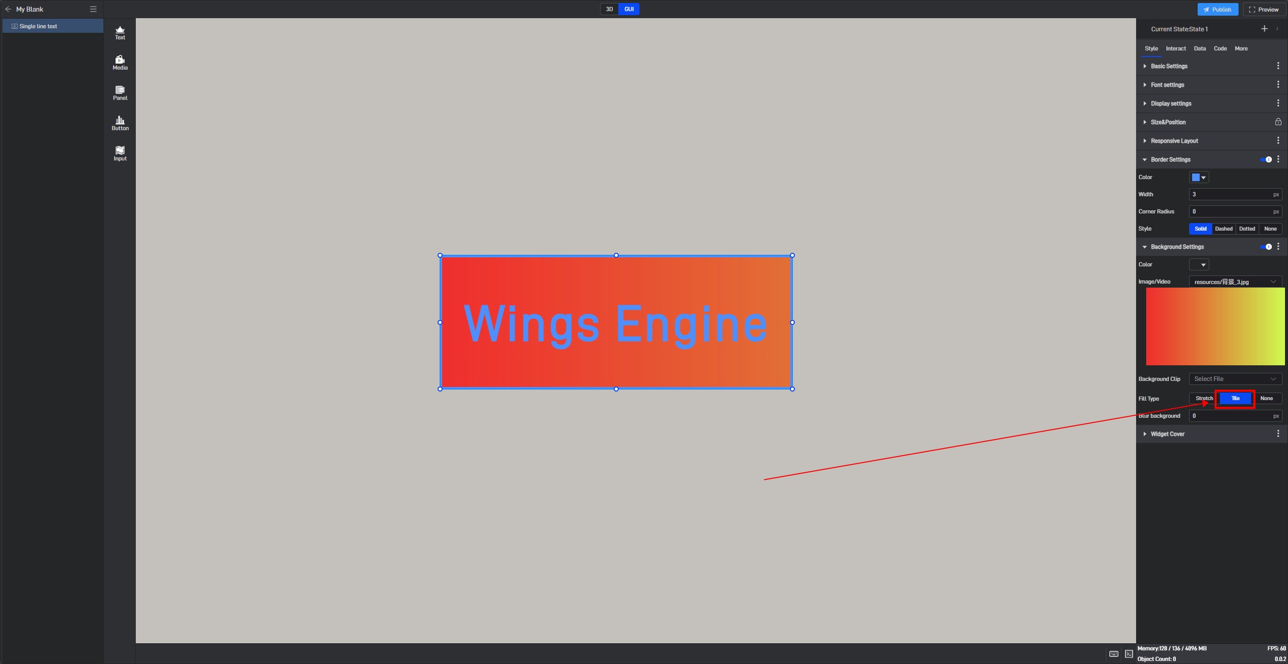
| ** Configuration item ** | Describe |
|---|---|
| Color | Configure the color of the component’s background separately. |
| Image/Video | Add a local image or video here to serve as the component’s background. |
| Background Clip | Crop the local image/video after adding it. |
| Fill Type | In “Stretch Fill” mode, the image will be stretched or compressed to completely cover the target area based on its size; in “Tile Fill” mode, the image will be tiled across the area while maintaining its original size and proportion. |
| .9. Png | Turn on this button to enable .9 scaling. |
| Edit .9 | Drag the blue pixel borders to edit and specify the area that can be stretched. |
| Blur Background | Make the background blurry or out of focus, with the default blur level set to “0px”. |
Single-line Text use .9 fill background style, as shown in the following image:

Single-line Text fill background style, as shown below:
3.2. Conditional Style Settings
Conditional styles refer to the styles of a component that change based on data conditions. (For more information on setting data conditions, please refer to the tutorial: Data Condition).
Almost all setting items can be set with conditional styles, but different setting items have slight differences when setting conditional styles. There are two specific methods:
Method 1: Set in the Extended Settings Menu
Most setting items use Method 1 for conditional settings. The specific steps are as follows:
Take the “Opacity” setting item in “Basic Settings” as an example:
Click to select the component, move the mouse over the setting item, and you will see three dots (extended settings button) appear on the right side of the setting item name.
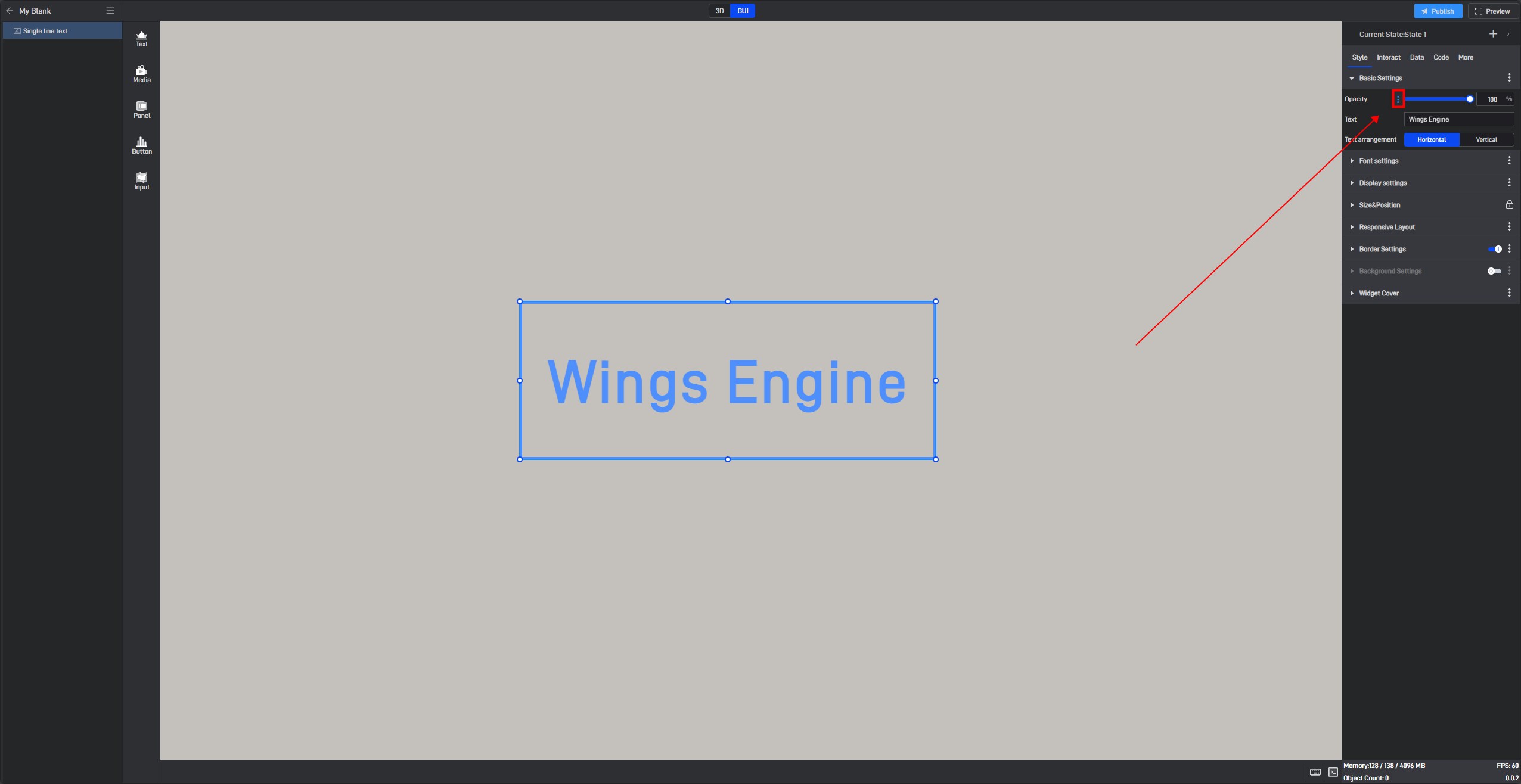
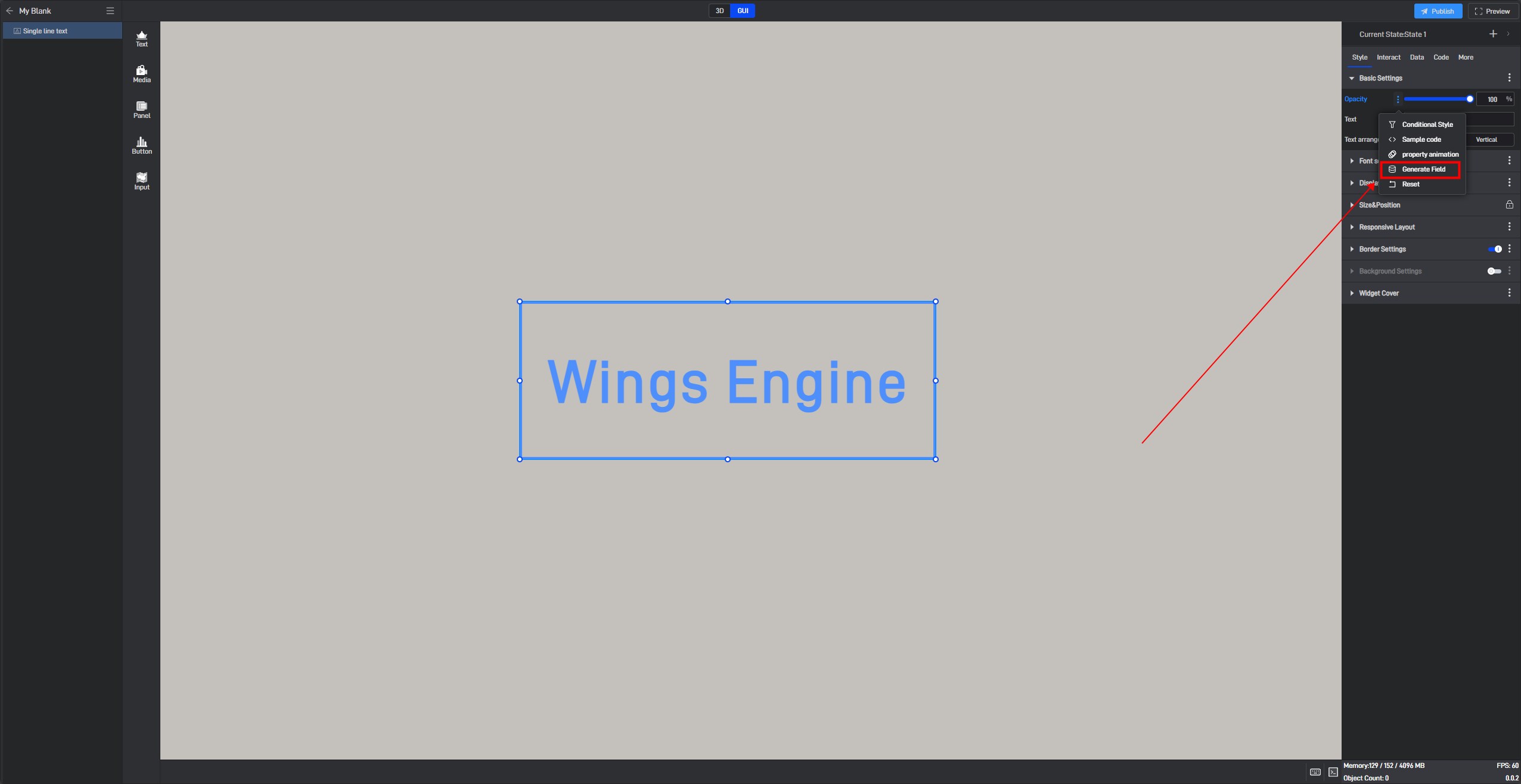
Click these three dots to open the extended settings window, where the first option is “Conditional Style” .
Additionally, you can open the extended settings window by right-clicking the setting item.
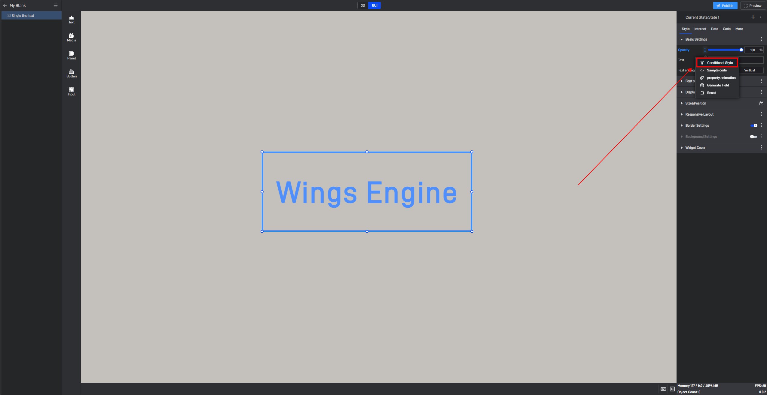
Click “Conditional Style” to open the conditional style settings window.
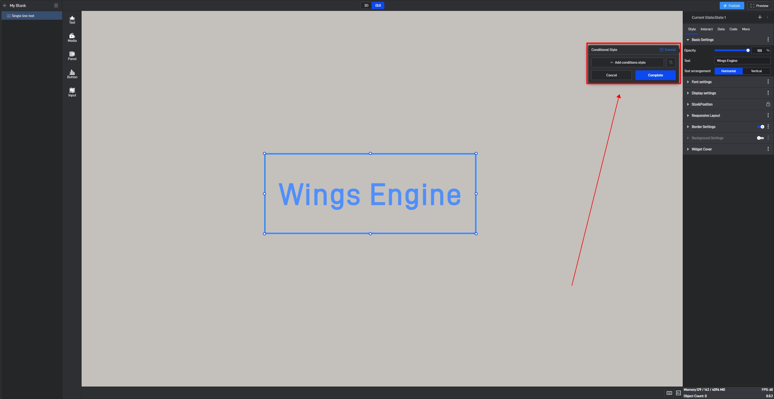
Click “+ Add Conditional Style” ,then select the data condition that needs to be triggered (the selectable data conditions must be existing data conditions).
Based on the current setting item, we can set the opacity value when Condition 1 is met, as well as the opacity value when no conditions are met.
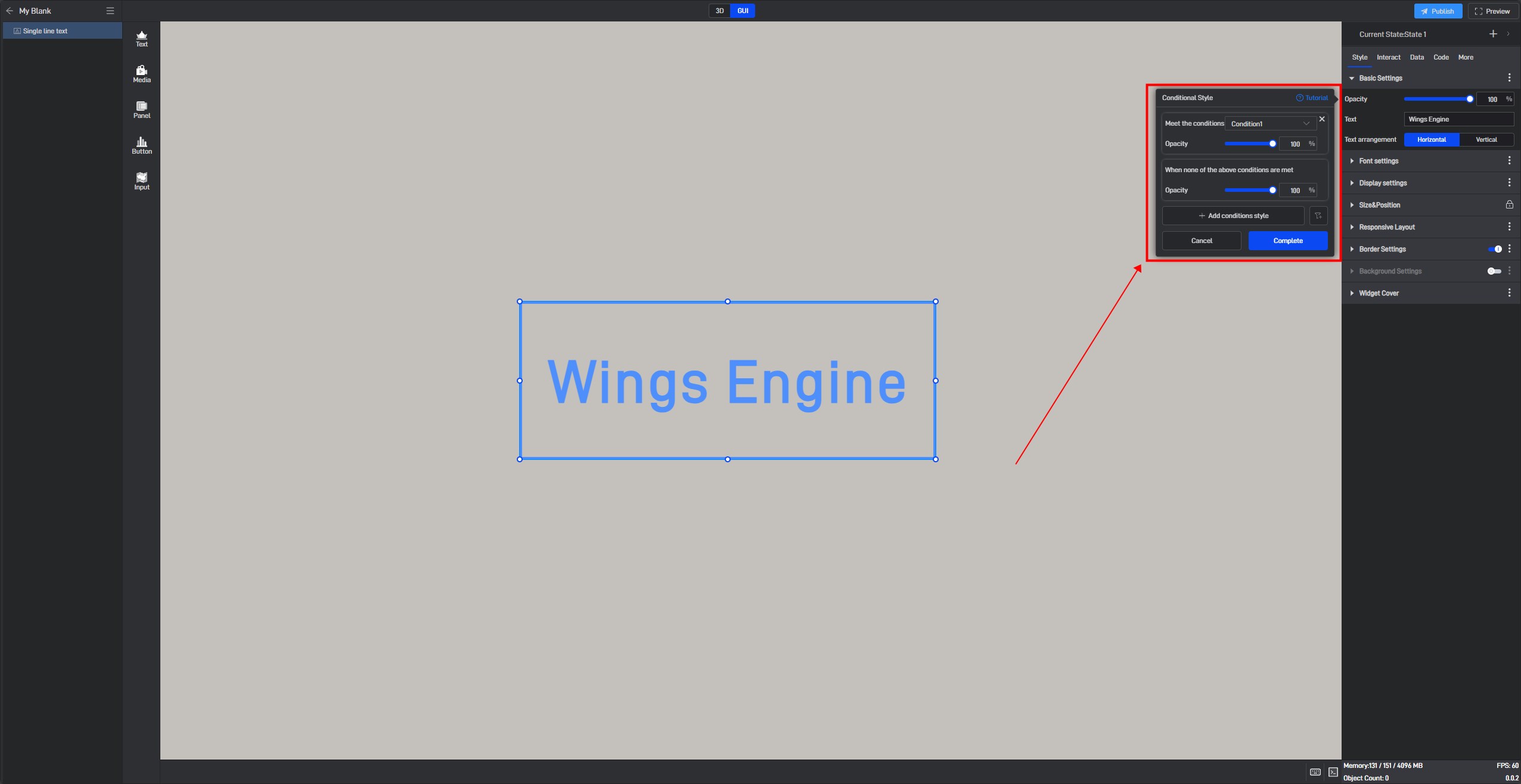
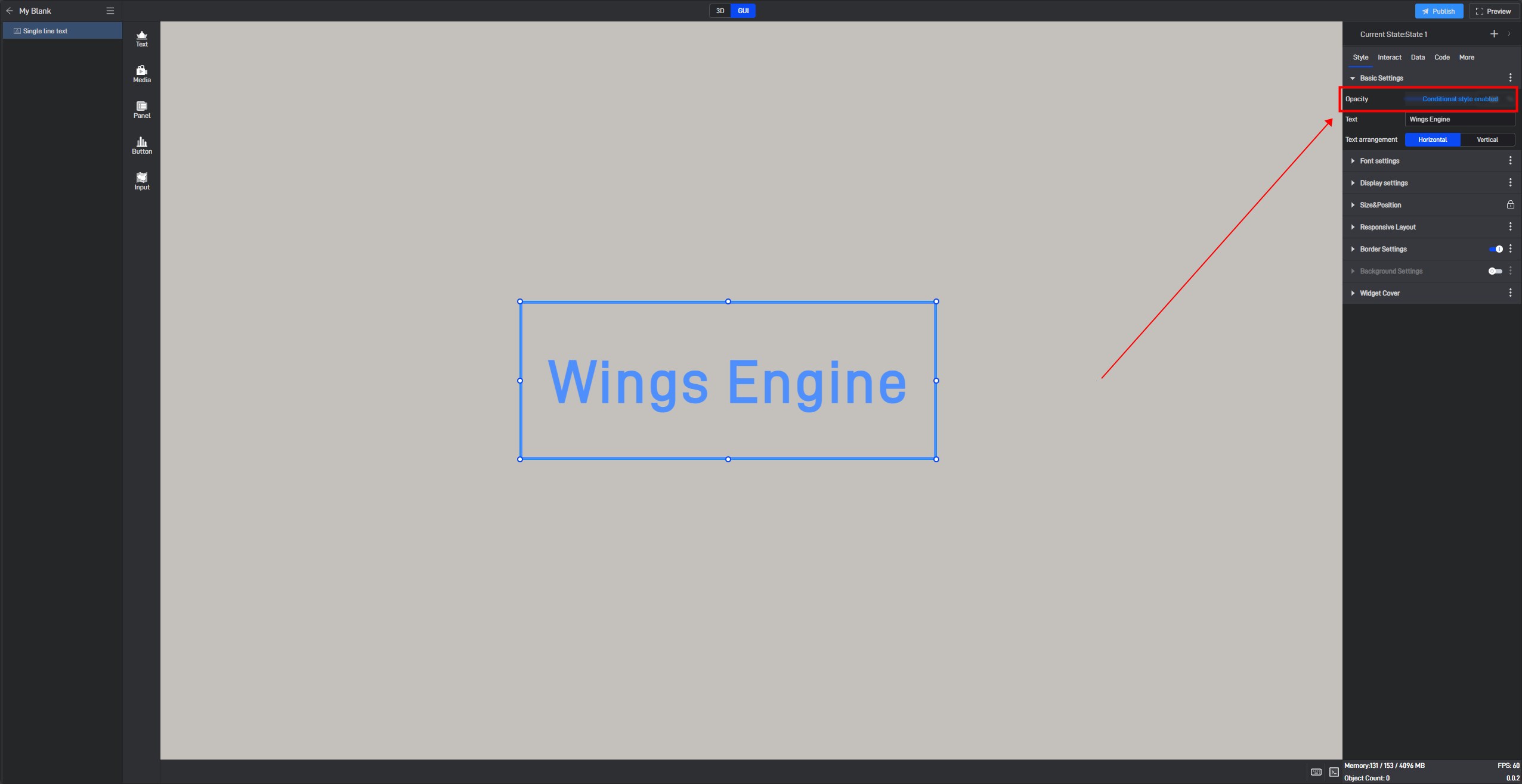
After setting, the setting item will show a “Conditional Style Enabled” prompt.
Method 2: Directly Set in the Setting Item
Some setting items’ conditional setting methods are displayed directly within the setting item and can be set directly in that setting item. However, the conditional style for the basic single-line text can only be set using Method 1.
3.3 Setting Styles via Data Fields
All modifications to setting items are essentially value changes, so all setting items can be controlled through data fields. The dynamic data field function is needed here.
Still taking the “Opacity” setting item in “Basic Settings” as an example:
Open the extended settings window and click the third option, “Generate Data Field”.
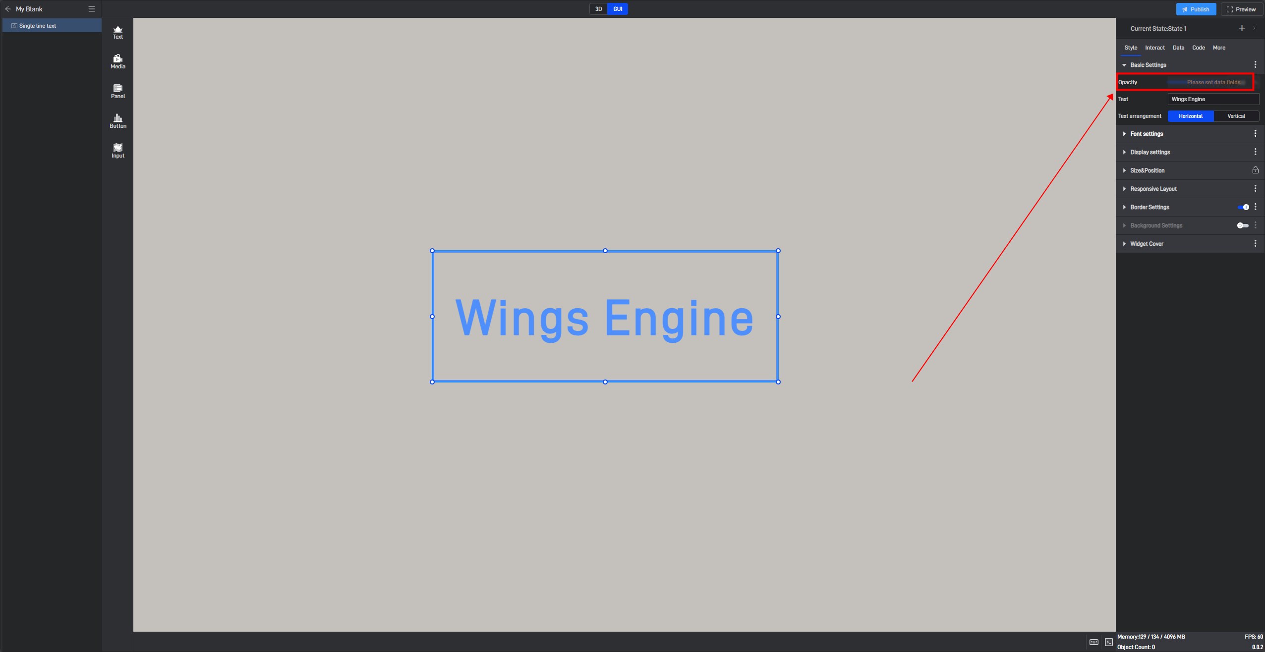
After clicking, a prompt saying “Please set data field” will appear for this setting item.
Switch to the “Data” settings interface. At this point, you will see a newly added “Dynamic Data Field” setting item, and a related field has been generated for the previously selected “Opacity” setting item.
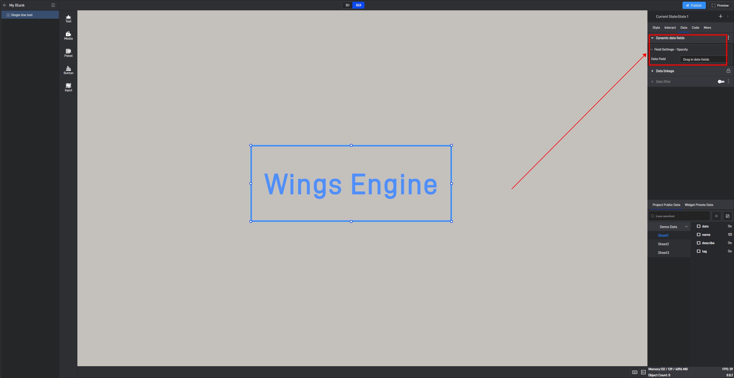
Next, simply add a data field here, and you can control the opacity through data.
Adding a data value of “0” to the data field will change the opacity value to “0” via the dynamic data field, thereby hiding the component.

4. Set interaction
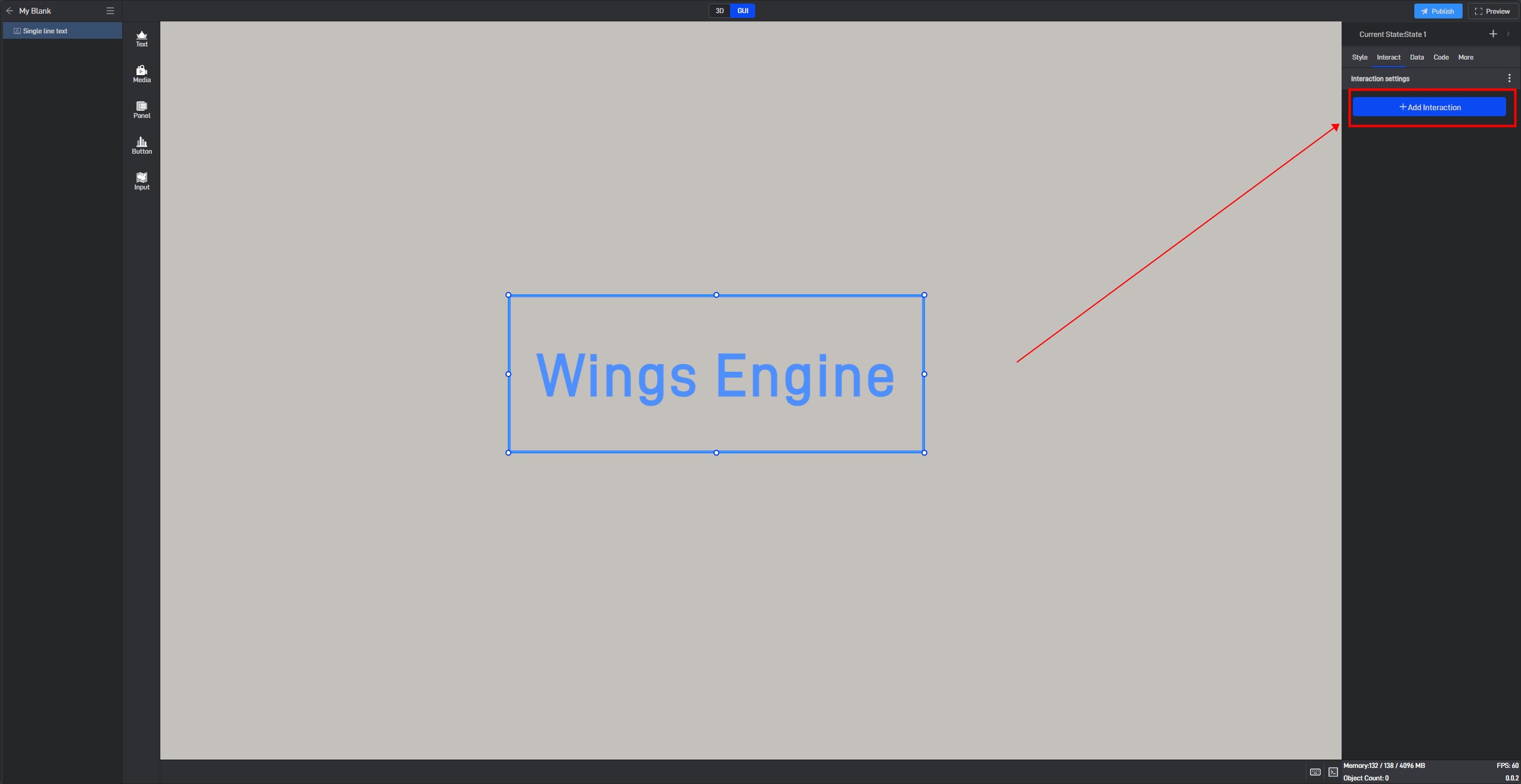
Click to select a widget, and in the “Interact” setting window on the right, you can add or delete interactions for the current widget.
5. Secondary Development
Click on the widget to select it, and in the right-side “Code” settings window, you can configure secondary development settings for the widget.
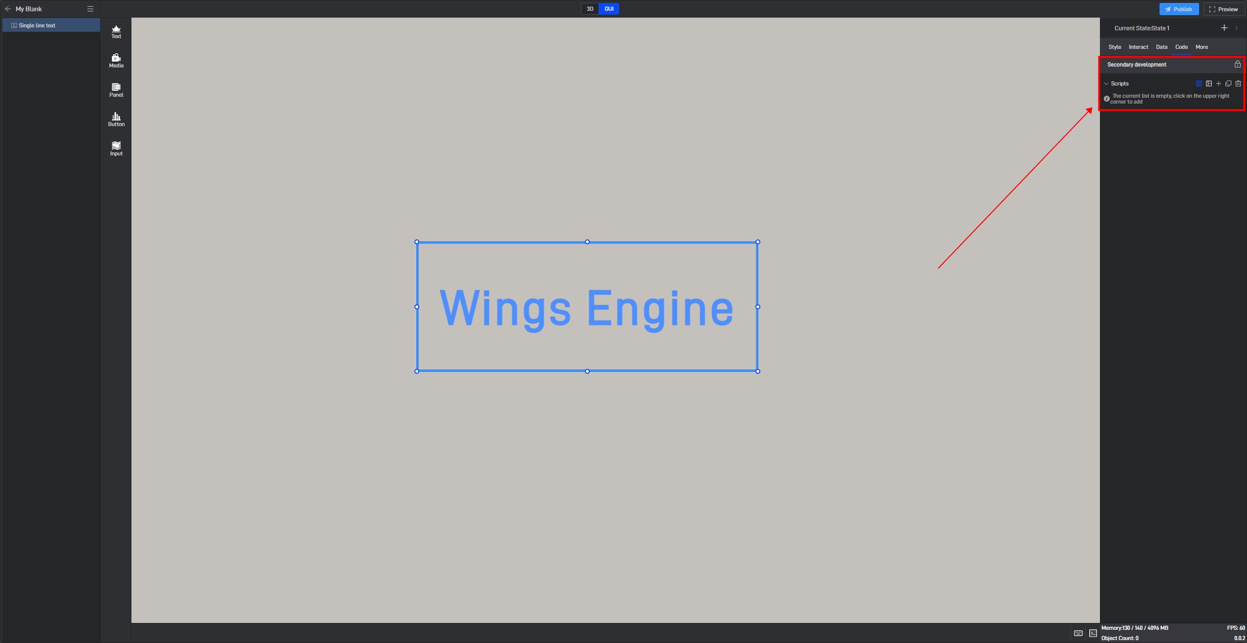
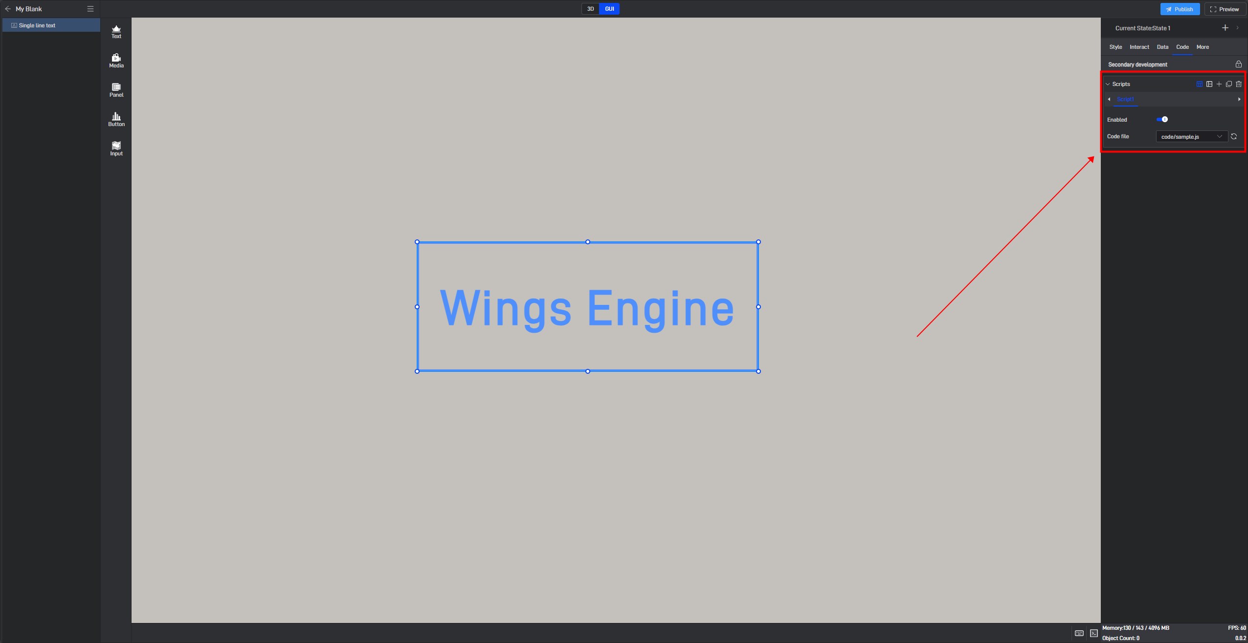
Secondary development needs to be achieved by loading JavaScript script files.
Click “+” to add settings. Multiple scripts can add multiple settings.
During the secondary development process, we can control the style of the widget. If we want to control a certain setting item, we can first view the secondary development code example of the setting item in the style.
Take the “Opacity” setting item as an example:
Open the pop-up window of the extended settings and click “Sample code”.
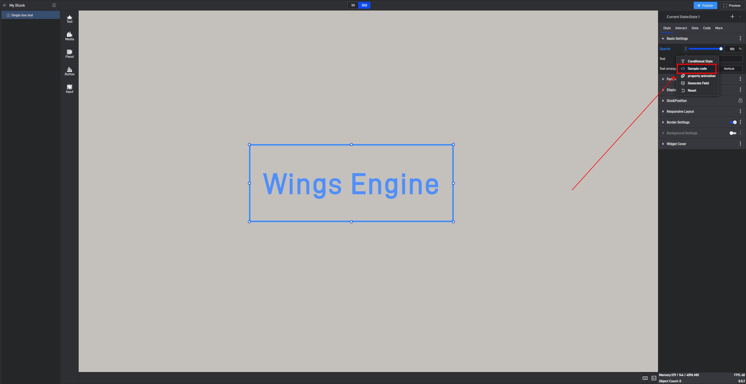
You can see the secondary development code sample for this setting item.
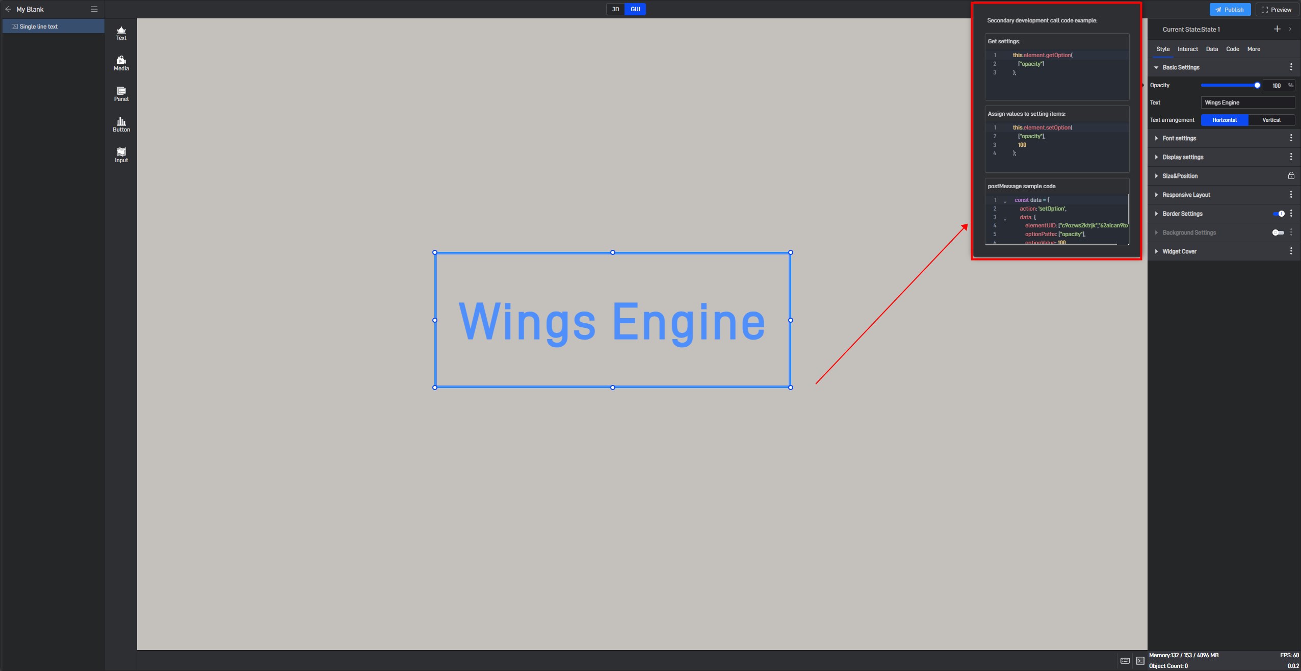
Here is a simple secondary development example:
Secondary development function: widgets automatically move to the right
Sample code:
1 | /** |
Click “Select File” to add the JavaScript file.

6. Set up multi-state switching
6.1 Add states
Each widget has a default state property, which contains all the above settings.
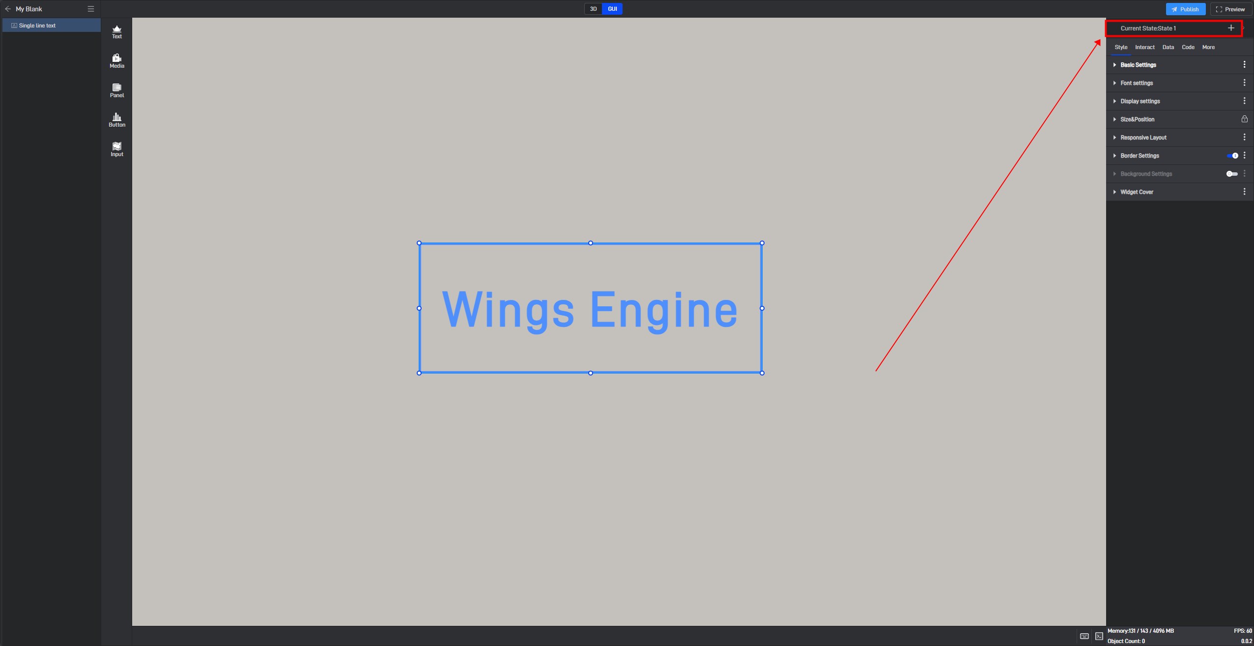
But we can also add multiple states, so that each state will contain all the above settings, and these states are independent of each other.
We can add new states in the following two ways:
6.1.1 Create a new state
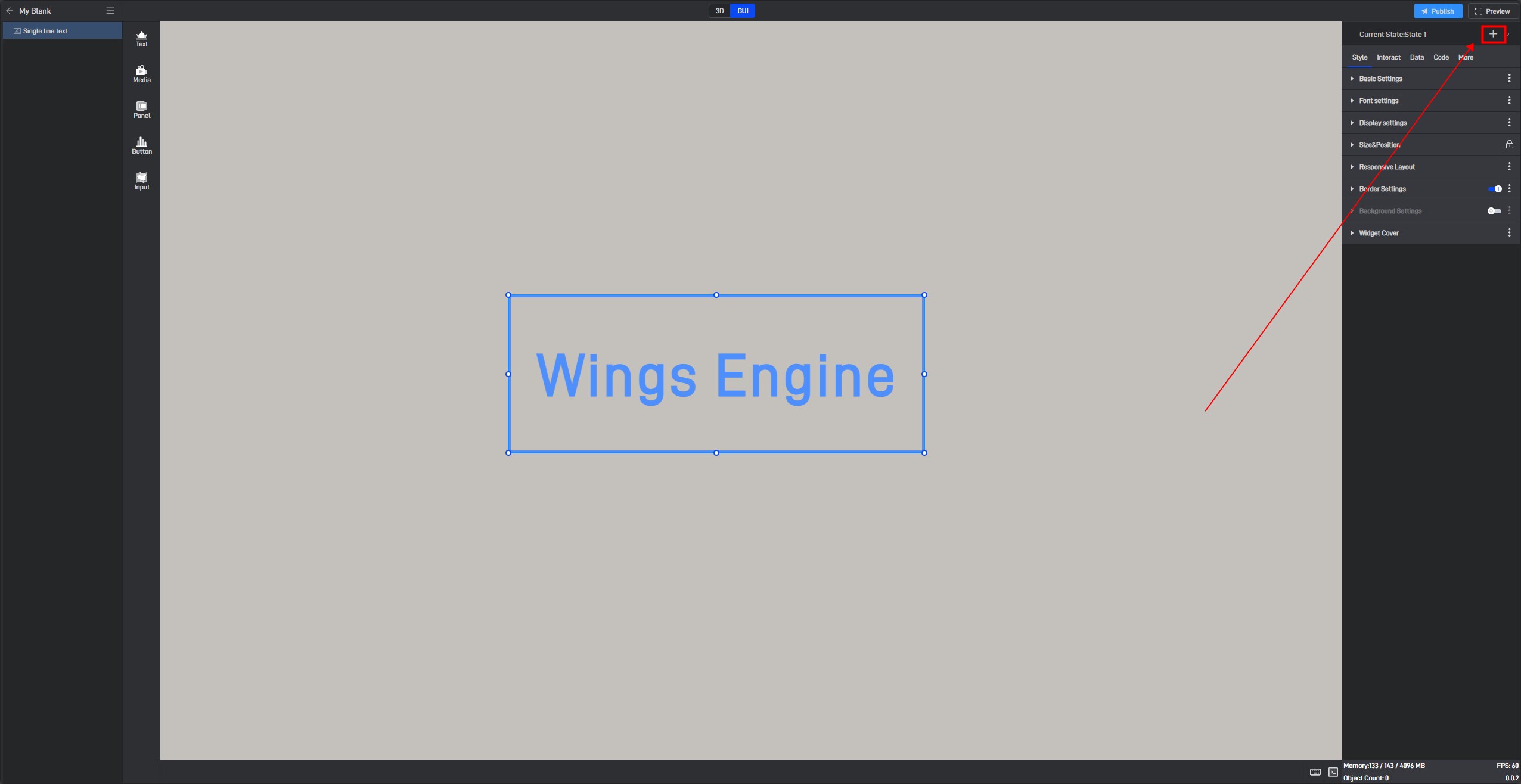
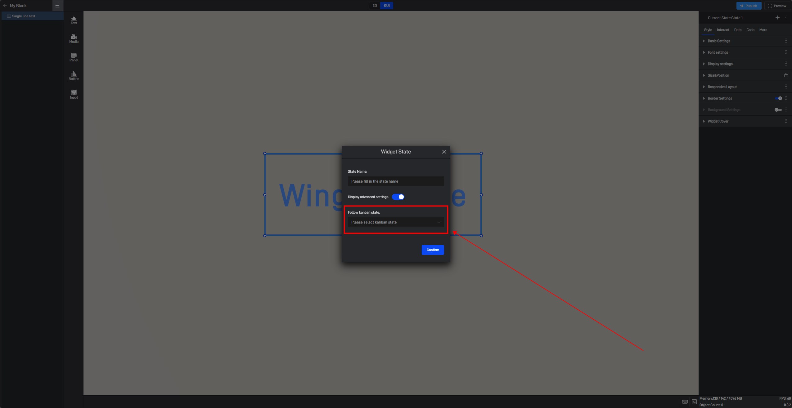
Click the “+” in the upper right corner to add a new widget state.
In the state setting window, we can set the name of the state.
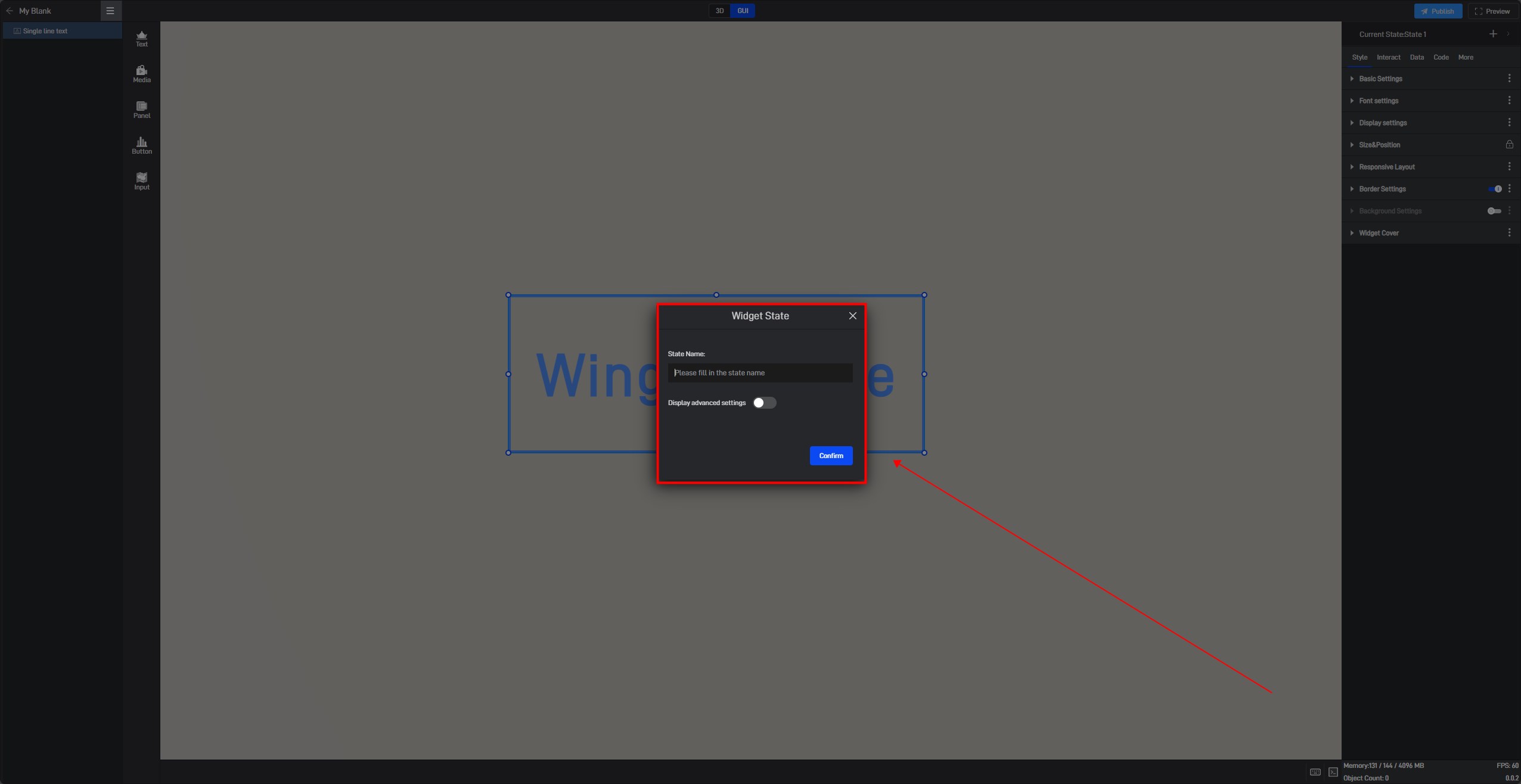
By default, all new states are kept consistent with the default state.
We also open the advanced settings in the window to set the follow object of the new state.
6.1.2 Copy an existing state
Click the state name in the upper right corner to expand the state list. After expanding, you can see all the states of the current widget.
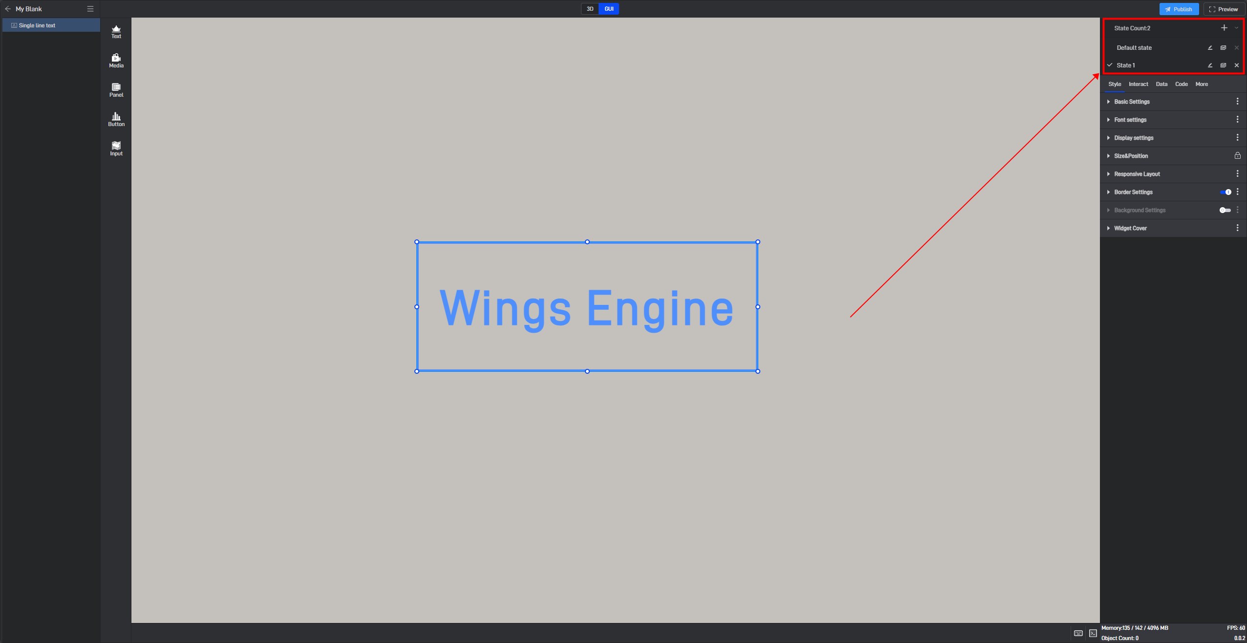
In this state list, we can rename, copy and delete the state.
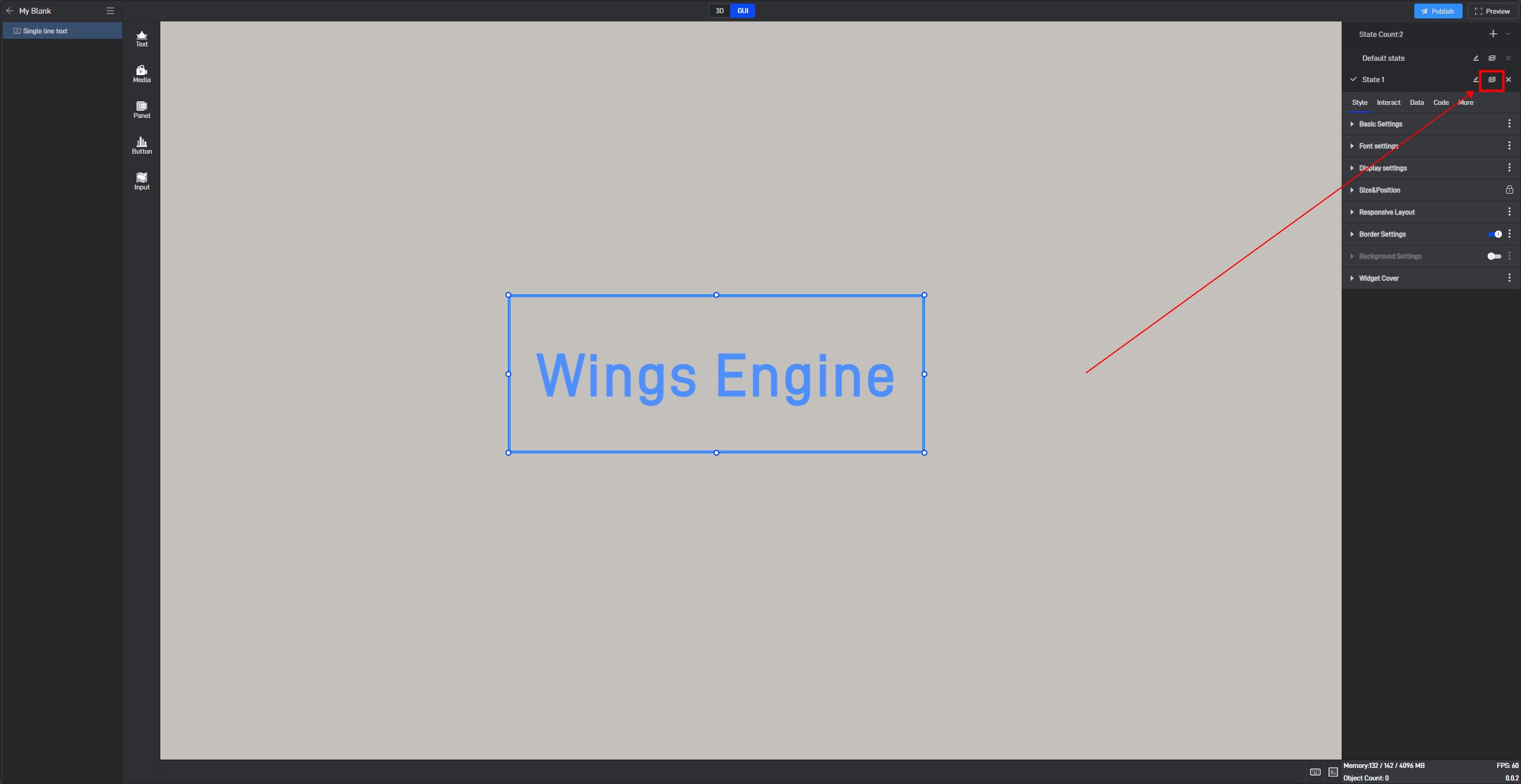
Click the copy button on the right side of the state name to copy the current state to a new state. All settings of the copied new state will be consistent with the copied object state.
6.2 Switch states
When editing a project, we can manually switch widget states by clicking on different states in the state list.

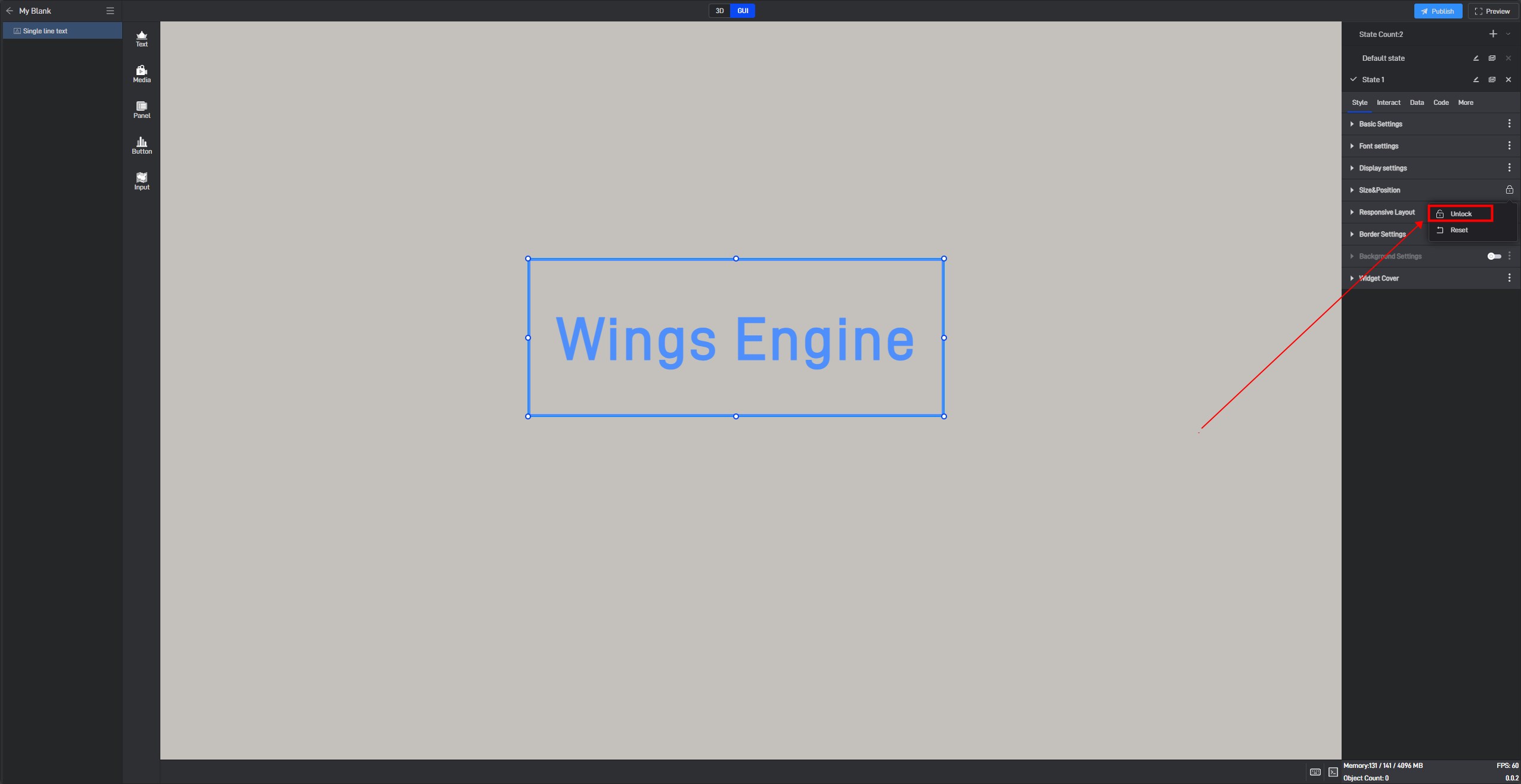
6.3 Locked state
In the style settings, some settings have a lock icon on them, which means that this setting item in all current states has been locked to the default state, which means that if this setting item is modified, this setting item in all states will be modified uniformly.
This is a function that allows you to uniformly modify the same setting items in multiple states in a widget’s multiple states.
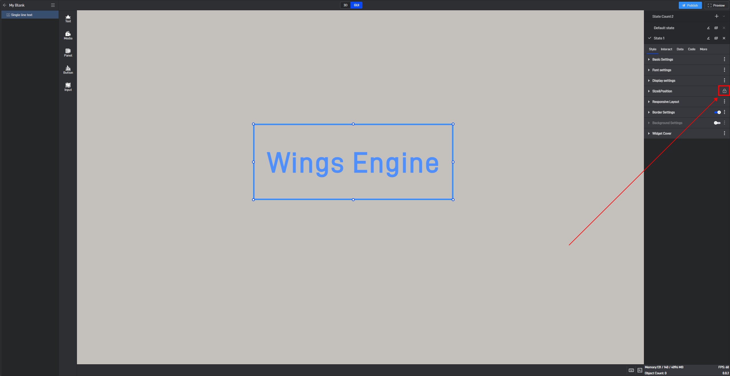
If you don’t want to lock it, you can click to unlock it, and then this setting item in all states will be unlocked.

If you want to lock other settings, you can click the three dots on the right side of the setting item and then lock it.
