Data Changes
In the library, we provide you with a wealth of widgets, and in order to reduce the design complexity of your project production process, we preset some styles for these widgets, but we can still modify their styles on this basis.
Data changes-remains unchanged, Data change-rising, and Data change-down are all preset styles of data change. These preset styles are mainly widget private data, widget graphics shape, color and quantity, but in essence these widgets are data changes.

Let’s take Data changes-rising as an example to introduce the steps of using this widget:
1. Add widgets
If you are not familiar with widgets, you can find the widget in the widget window and add it:

If you are familiar with widgets, you can add widgets by searching, which is more convenient.
Click the search button or press “Ctrl+F” to open the search box, enter the widget name to search, and then click the corresponding widget to add it.

2. Bind data
Step 1: Confirm the data source format
Different widgets are suitable for data in different formats. If the data source format does not meet the requirements of the widget, the content cannot be displayed normally.
Data changes-rising has only one data field, and the data field determines the value displayed by the Data changes-rising widget.
| Score |
|---|
| 0.2 |
Step 2: Set data fields
(1) Use private data
Data change-Rising widget does not contain its own sample data source by default, but you can directly enter values in the private data table for demonstration purposes.

Right-click on the data table header to rename, change type, and delete.
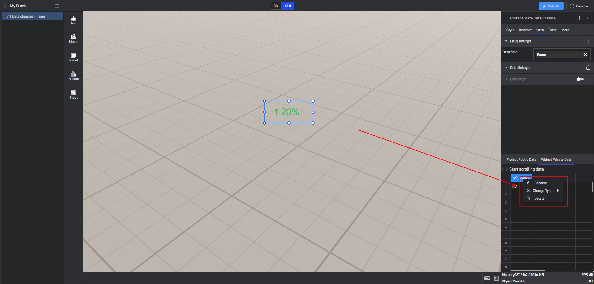
Field types include: string, number and array. Only when the field type is correct can the widget content be displayed normally.

(2) Use local data
Step 1: Add data source
If you have already prepared a local data source, you do not need to use the widget’s own data source.
Click “Data -> Add Data” to add the local data source.

In the “Connect Data” window, select the corresponding data source type.

Here, we will use adding an Excel data source as an example:

Click “Confirm” to complete the addition, and then you can view detailed data in the “Connect Data” window.

Step 2: Set Data Field
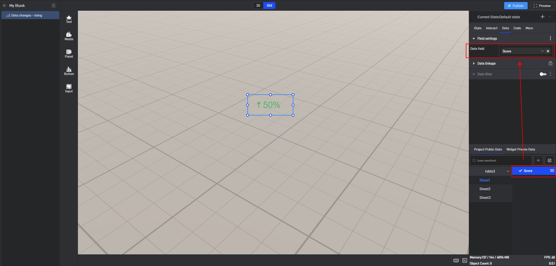
Click to select the widget, then switch to the **”Project Publish Data” **tab in the data settings panel on the right side (all data sources within the same project are shared).

Before modifying data fields, you need to remove any existing custom fields first. Click the “X” on the right side of the field to delete it.

After deleting the current field, the right-side field panel will be empty, and the widget will automatically display default values.

Drag and drop the local data fields into the corresponding field settings of the widget.
3. Set widget Style
Click to select the widget. In the “Style” settings window on the right, you will see various categories of settings. Each category contains different options, and these categories and options will vary depending on the widget.

3.1 Basic Settings
| Configuration items | ** Description ** |
|---|---|
| Opacity | A common use of this setting is to combine conditional styles/interactions/multi-states to show and hide widgets. |
| Default value | When there is no field, the value is displayed, or you can directly fill in a value. |
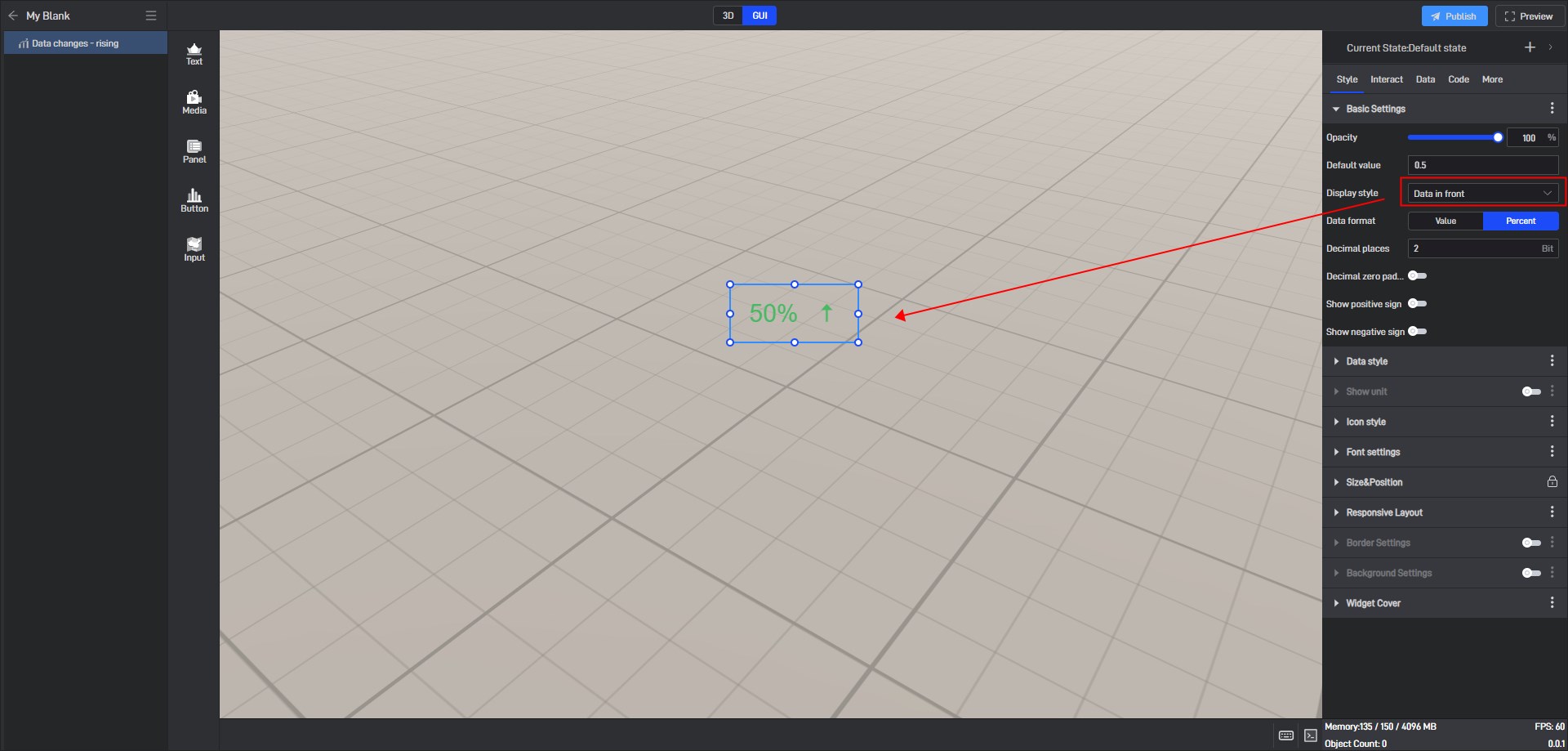
| Display style | 4 styles: icons in front, data in front, data only, icon only. |
| Data format | 2 formats: value, percent. |
| Demical places | Manually fill in the number of digits. If the number of digits exceeds the set limit, it will be rounded off. |
| Demical zero padding | If there are not enough decimal places, the default value is 0. |
| Show positive sign/Show negative sign | Displays the positive/negative sign of the data. |
Data changes - rising opacity changes, as shown below:

Data change - rising data in front style, as shown below:
3.2 Data Style
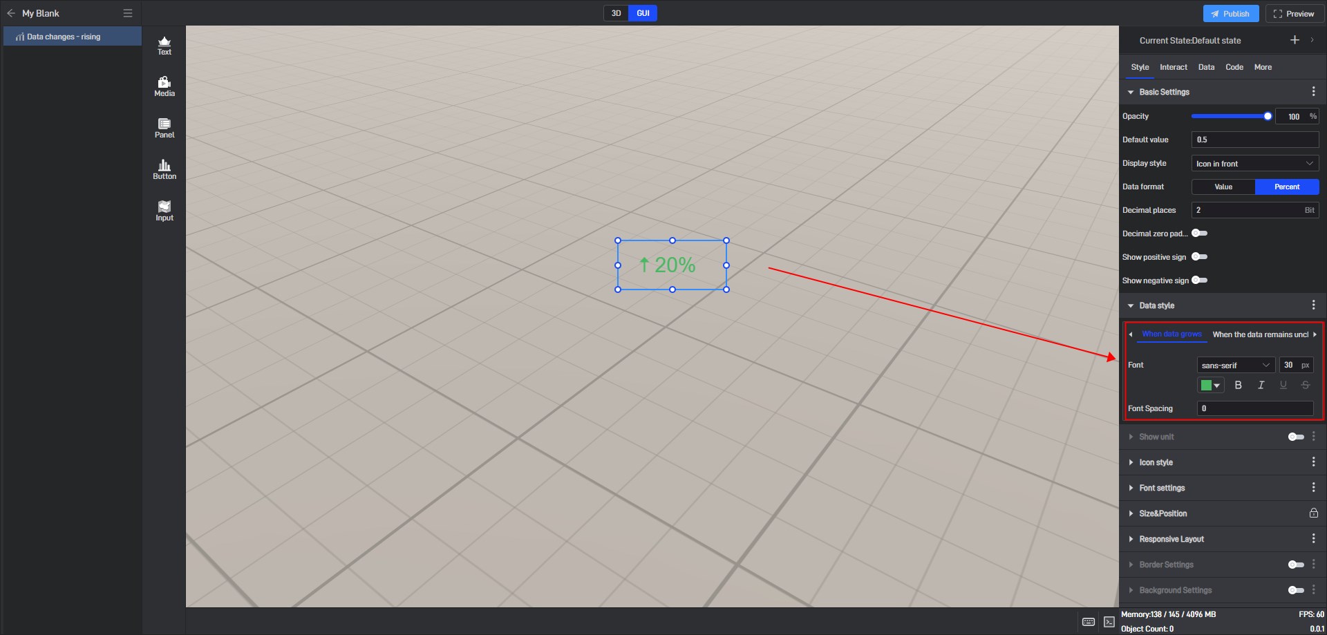
The data change widget can be divided into three trends according to the change of data field values: when data grows, when the data remains unchanged, and when data drops.
Different styles can be set for the values under these three trends.
| Configuration items | ** Description ** |
|---|---|
| Font | Configure the font, font size, color, and other styles of the numerical value. |
Use widget private data and modify the data to a positive growth trend value, as shown in the following figure:

You can see that the widget data shows “When data grows”.
Modify the data to the “When data drops” value, as shown in the following figure:

You can see that the widget data shows “When data drops”.

3.3 Show Unit
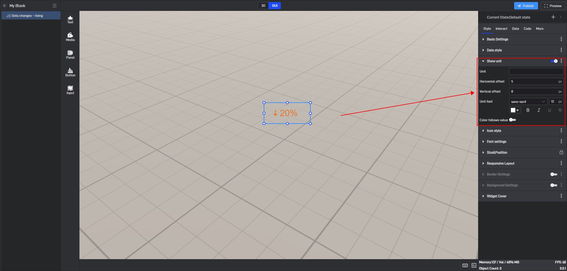
Turning on the “Show Unit” button allows you to customize the units of widget values and set the font and position.
| Configuration items | ** Description ** |
|---|---|
| Unit | The default value is empty, and the input unit can be customized according to the numerical requirements. |
| Horizontal offset | Customize the unit horizontal offset value. The default offset value is “5px”. |
| Vertical offset | Customize the unit vertical offset value. The default offset value is “0px”. |
| Unit font | Configure the unit’s font, font size, color, and other styles. |
| Color follows value | After it is turned on, the unit color changes according to the color set in the data style. |
The data change widget unit setting style is as shown below:
3.4 Icon Style
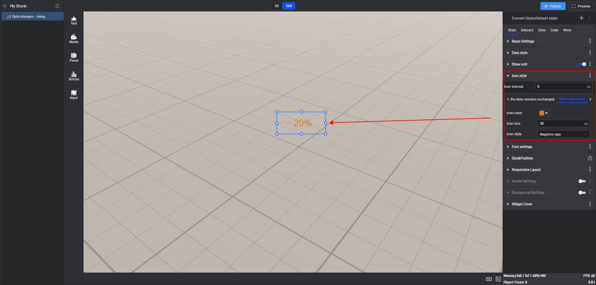
Corresponding to “Data Style”, here you can set the icon color, size and style for the three different trend states of data: “When data grows”, “When the data remains unchanged”, and “When data drops”.
| Configuration items | ** Description ** |
|---|---|
| Icon interval | Customize the distance between the icon and the value. The default distance is “0px”. |
Different configuration items can be set according to the three data change trends. The following is an introduction based on the different trend states of the widgets:
(1) When data grows
| Configuration items | ** Description ** |
|---|---|
| Icon color | The icon color is configured separately when data grows. |
| Icon size | The icon size is set separately when the data grows, and the default icon size is “30px”. |
| Icon style | There are 8 icon styles to choose from: “Straight arrow 1”,** “Straight arrow 2”, “Straight arrow 3”, “Curved arrow”, “Triangle arrow”**, “Polyline arrow”, “Circle point” and “Positive Sign”. |
When data grows, the icon style is a triangular arrow, as shown below:

(2) When the data remains unchanged
| Configuration items | ** Description ** |
|---|---|
| Icon color | The icon color is configured separately when data grows. |
| Icon size | The icon size is set separately when the data grows, and the default icon size is “30px”. |
| Icon style | There are 3 icon styles to choose from: “Straight line”, “Horizontal line” and “Circle point”. |
When the data remains unchanged, the icon style is a horizontal line, as shown below:

(3) When data drops
| Configuration items | ** Description ** |
|---|---|
| Icon color | The icon color is configured separately when data grows. |
| Icon size | The icon size is set separately when the data grows, and the default icon size is “30px”. |
| Icon style | There are 8 icon styles to choose from: “Straight arrow 1”,** “Straight arrow 2”, “Straight arrow 3”, “Curved arrow”, “Triangle arrow”**, “Polyline arrow”, “Circle point” and “Negative Sign”. |
When data drops, the icon style is a negative sign, as shown in the following figure:
3.5 Font Settings
Set the horizontal alignment of the widget.
| Configuration items | ** Description ** |
|---|---|
| Align | You can set the alignment to “Left”, “Center” or “Right”. |
Data Change widget, align left, as Shown Below:

3.6 Size & Position
You can adjust the size and position of the widget by directly clicking and dragging it, or by entering the width, height, X coordinate, and Y coordinate values directly.
| Configuration items | ** Description ** |
|---|---|
| Widget Size | The width and height of the widget are measured in pixels (px). |
| Widget Position | The X and Y coordinates of the widget represent the distance from the top-left corner of the widget to the left edge and the top edge of the page, respectively. |
| Widget Rotate | The X and Y coordinates of the widget represent the distance from the top-left corner of the widget to the left edge and the top edge of the page, respectively. |
Size & Position Parameters for Data Changes widget, as shown in the figure below:

3.7 Border Settings
The border style will only be displayed and configurable for the widget once the **”Border Settings” **option is enabled.
| Configuration items | ** Description ** |
|---|---|
| Color | Configure the color of the widget’s border separately. |
| Width | The thickness of the border can be adjusted, with the default width set to “1px”. |
| Corner Radius | Border shape, the default radius is “0px”. |
| Style | Choose from four border styles: “Solid”, “Dashed”, “Dotted”, and “None”. |
The border style of the data changes widget is as shown below:
3.8 Background Settings
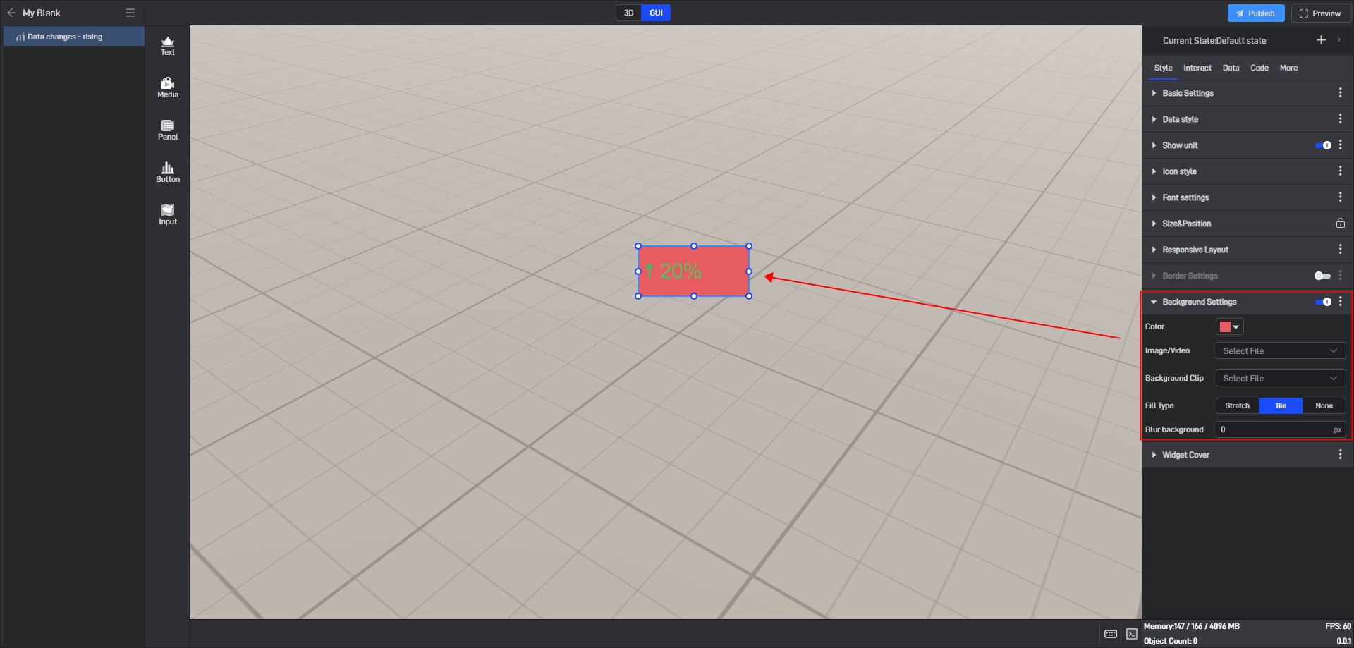
By default, widgets have no background color. To set a background color, you first need to enable the “Background Settings” option.
| Configuration items | ** Description ** |
|---|---|
| Color | Configure the background color of the widget separately. |
| Image/Video | Add local images or videos to serve as the widget’s background. |
| Background Clip | After adding a local image or video, you can crop it. |
| Fill Type | When the background is filled in “Stretch”, the image will be stretched or compressed according to the size of the target area to completely cover the area; when the background is filled in “Tile”, the image will be spread over the entire area in its original size and proportion. |
| Blur background | Blur or soften the background, with the default blur level set to “0px”. |
Tile fill background color, as shown below:
4. Set interaction
Click to select a widget, and in the “Interact” setting window on the right, you can add or delete interactions for the current widget.

5. Secondary Development
Click on the widget to select it, and in the right-side “Code” settings window, you can configure secondary development settings for the widget.
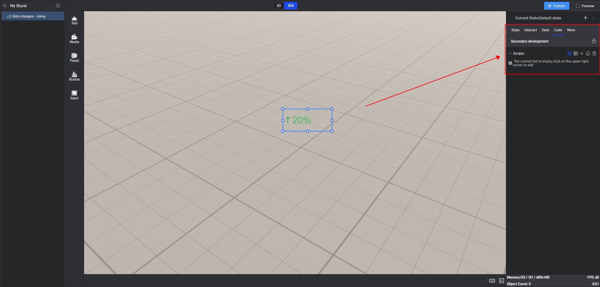
Secondary development needs to be achieved by loading JavaScript script files.
Click “+” to add settings. Multiple scripts can add multiple settings.
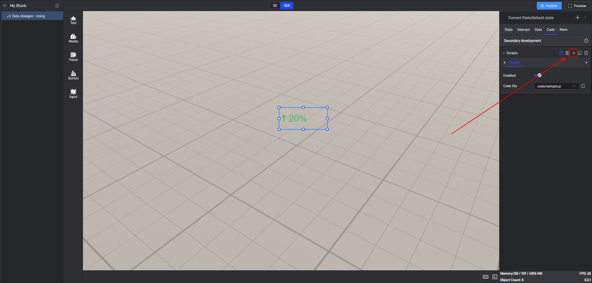
During the secondary development process, we can control the style of the widget. If we want to control a certain setting item, we can first view the secondary development code example of the setting item in the style.
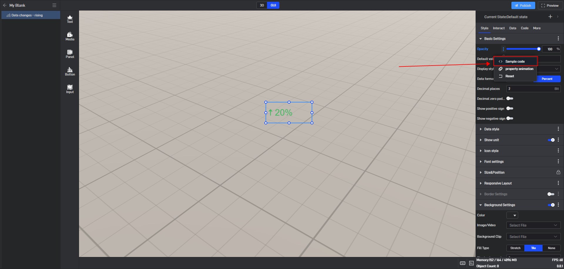
Take the “Opacity” setting item as an example:
Open the pop-up window of the extended settings and click “Sample code”.
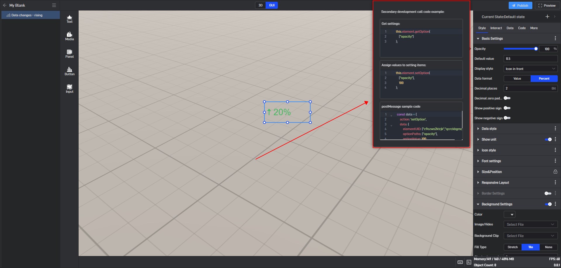
You can see the secondary development code sample for this setting item.
Here is a simple secondary development example:
Secondary development function: widgets automatically move to the right
Sample code:
1 | /** |
Click “Select File” to add the JavaScript file.

6. Set up multi-state switching
6.1 Add states
Each widget has a default state property, which contains all the above settings.
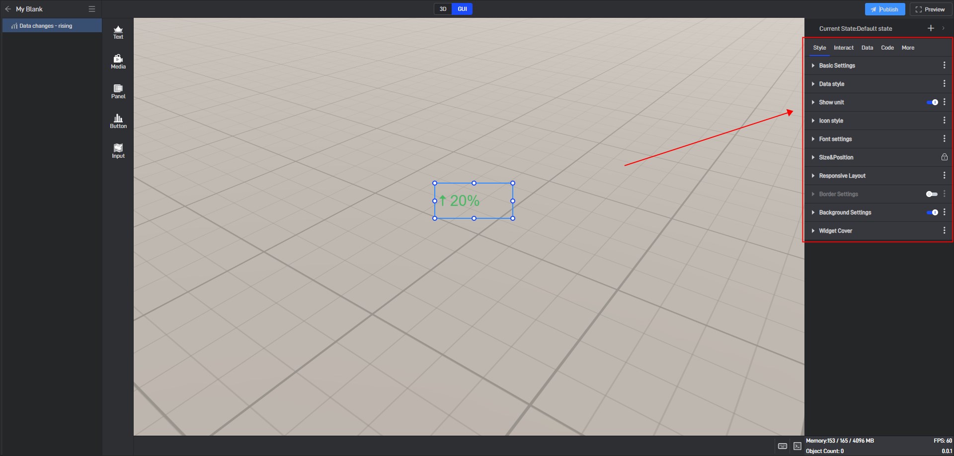
But we can also add multiple states, so that each state will contain all the above settings, and these states are independent of each other.
We can add new states in the following two ways:
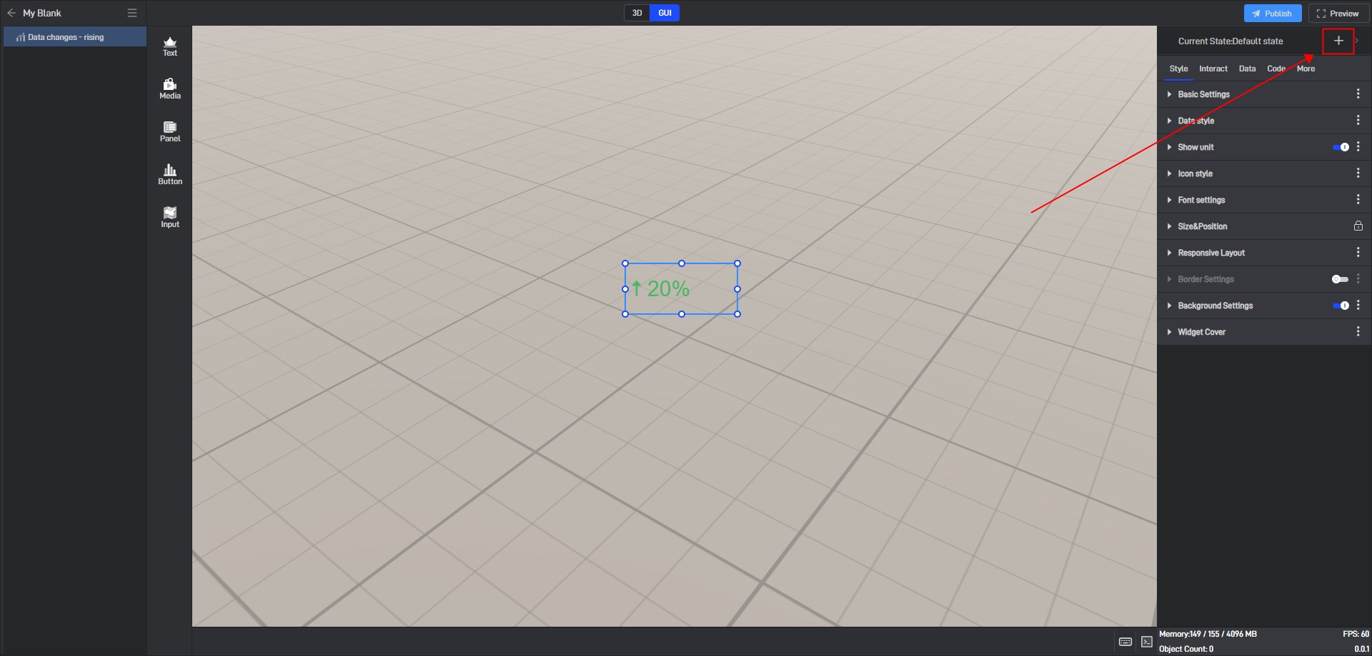
(1) Create a new state
Click the “+” in the upper right corner to add a new widget state.
In the state setting window, we can set the name of the state.
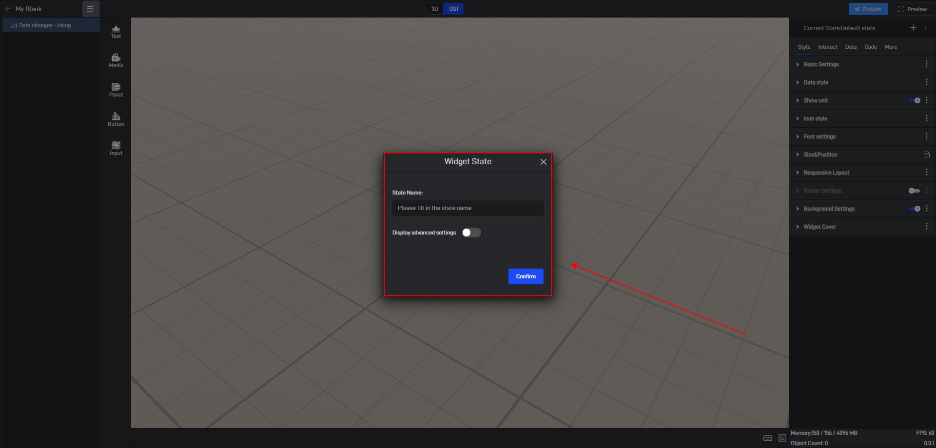
By default, all new states are kept consistent with the default state.
We also open the advanced settings in the window to set the follow object of the new state.
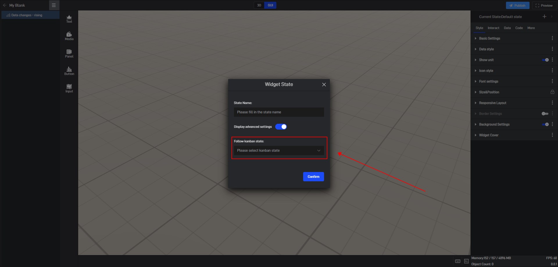
(2) Copy an existing state
Click the state name in the upper right corner to expand the state list. After expanding, you can see all the states of the current widget.

In this state list, we can rename, copy and delete the state.
Click the copy button on the right side of the state name to copy the current state to a new state. All settings of the copied new state will be consistent with the copied object state.
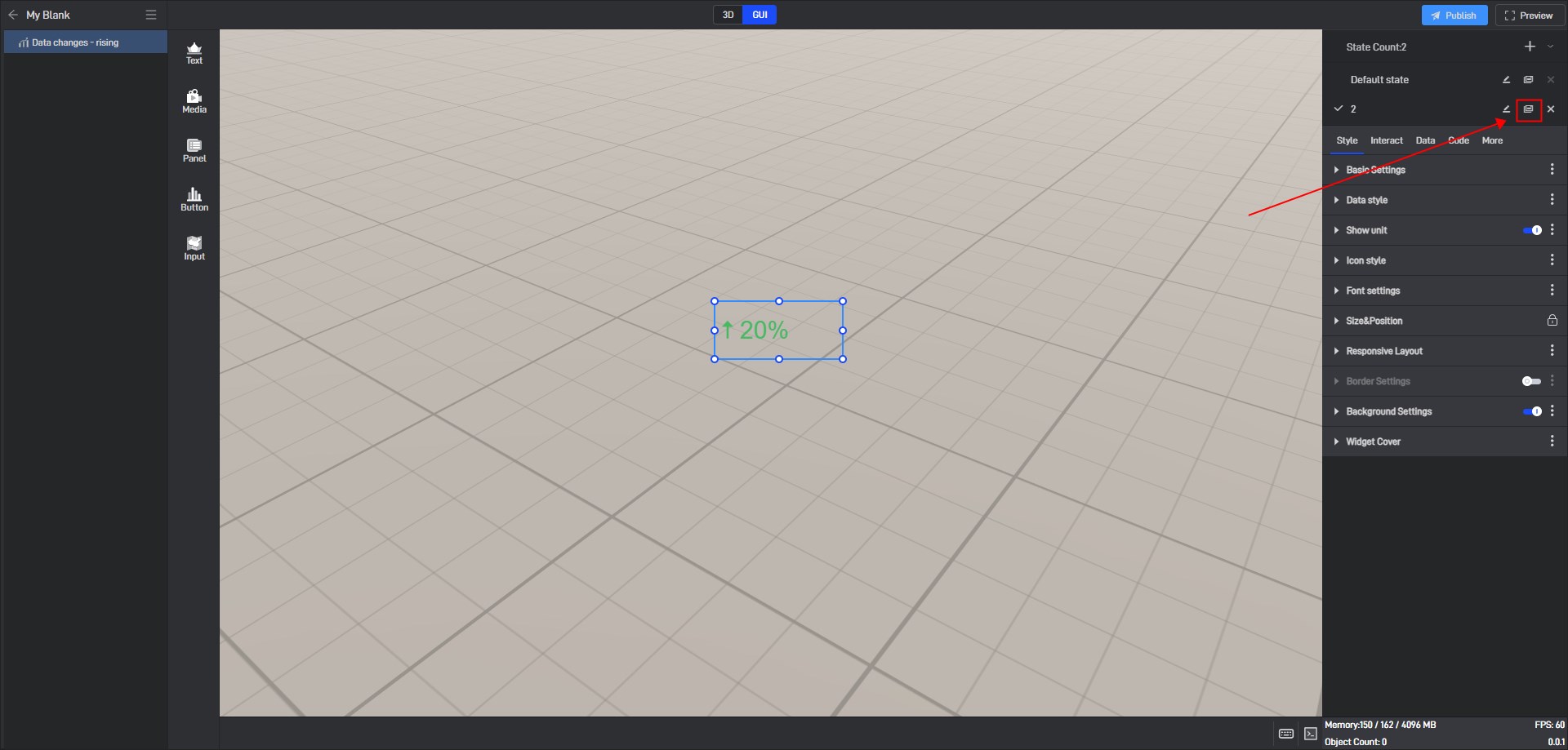
6.2 Switch states
When editing a project, we can manually switch widget states by clicking on different states in the state list.

6.3 Locked state
In the style settings, some settings have a lock icon on them, which means that this setting item in all current states has been locked to the default state, which means that if this setting item is modified, this setting item in all states will be modified uniformly.
This is a function that allows you to uniformly modify the same setting items in multiple states in a widget’s multiple states.
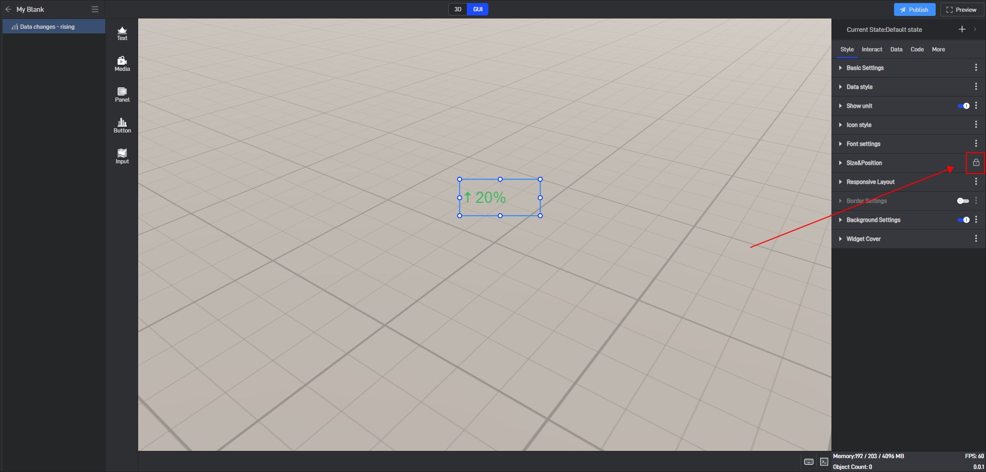
If you don’t want to lock it, you can click to unlock it, and then this setting item in all states will be unlocked.
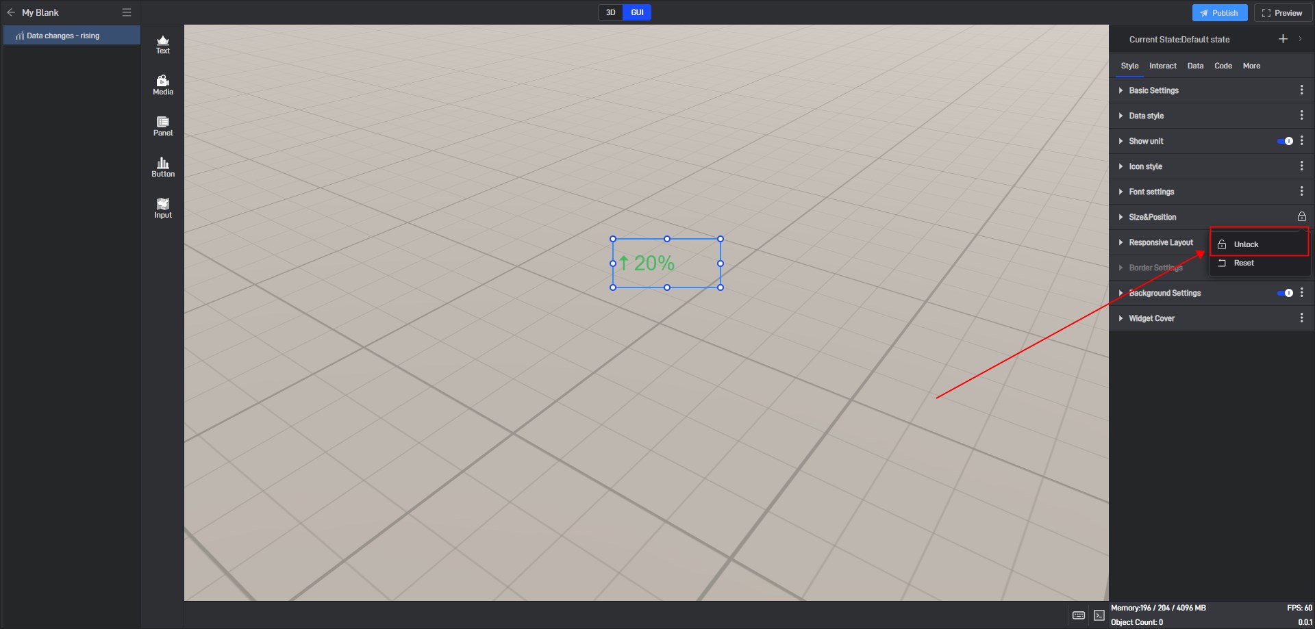
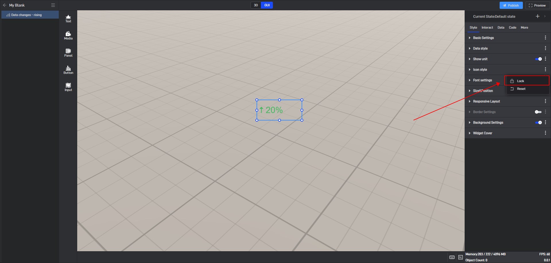
If you want to lock other settings, you can click the three dots on the right side of the setting item and then lock it.
