Indicator Card
In our component library, we offer a wide range of components. To simplify the design process during project development, we have preset some styles for these components. However, you can still modify their styles based on these presets.
The preset styles of the Indicator Card mainly include component-specific data, graphical shapes, colors, and quantities.

Next, let me introduce the steps for using the Indicator card component:
1. Add Components
If you are not very familiar with the components, you can find the component through the Components window and then add it, as shown in the image below:

If you are more familiar with the components, you can open the search box by pressing Ctrl+F on your keyboard and search for the component you want to add.

2. Binding Data
Step 1: Confirm Data Source Format
Different components are suitable for different data formats. If the data source format does not meet the component’s requirements, the content will not display correctly.
The Indicator Card component can be configured to display specific data fields as needed.
| Numeric |
|---|
| 10086 |
Step 2: Set Data Fields
(1) Use Component’s Own Data
Each component comes with a sample data source.
Click on the component, and in the **”Data” **settings window on the right side, you can see that the component has already been configured with data fields, and these fields are from the “Widget Private Data”.
Tip:If you need to create a project, such as a prototype or demo, before the local data sources are ready, you can use the component’s own data directly. The component’s own data conforms to the data source format requirements mentioned above, but may not meet your project’s needs, so you will need to modify it before use.
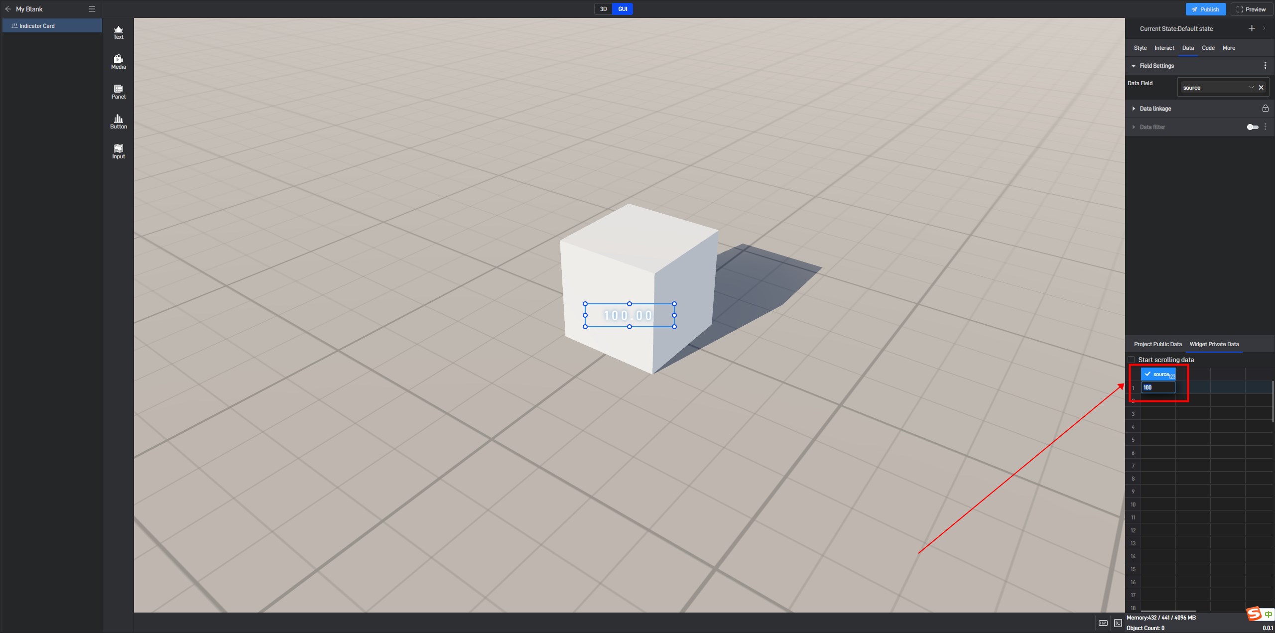
In the “Data” settings interface, you can directly modify the data at the bottom, and the data in the components will be updated in real-time.
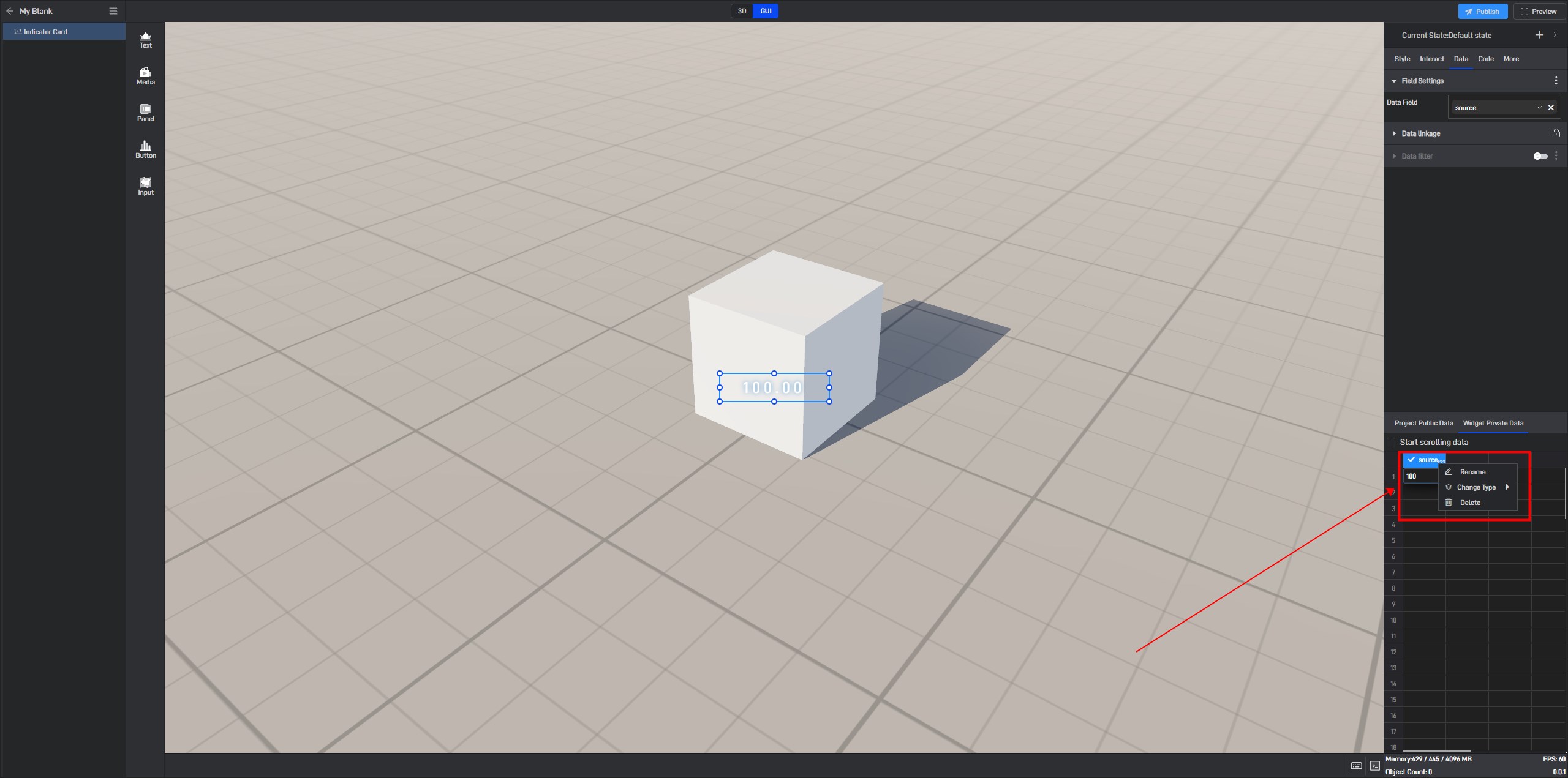
You can right-click on the table header to modify field names, change data types, and delete fields.
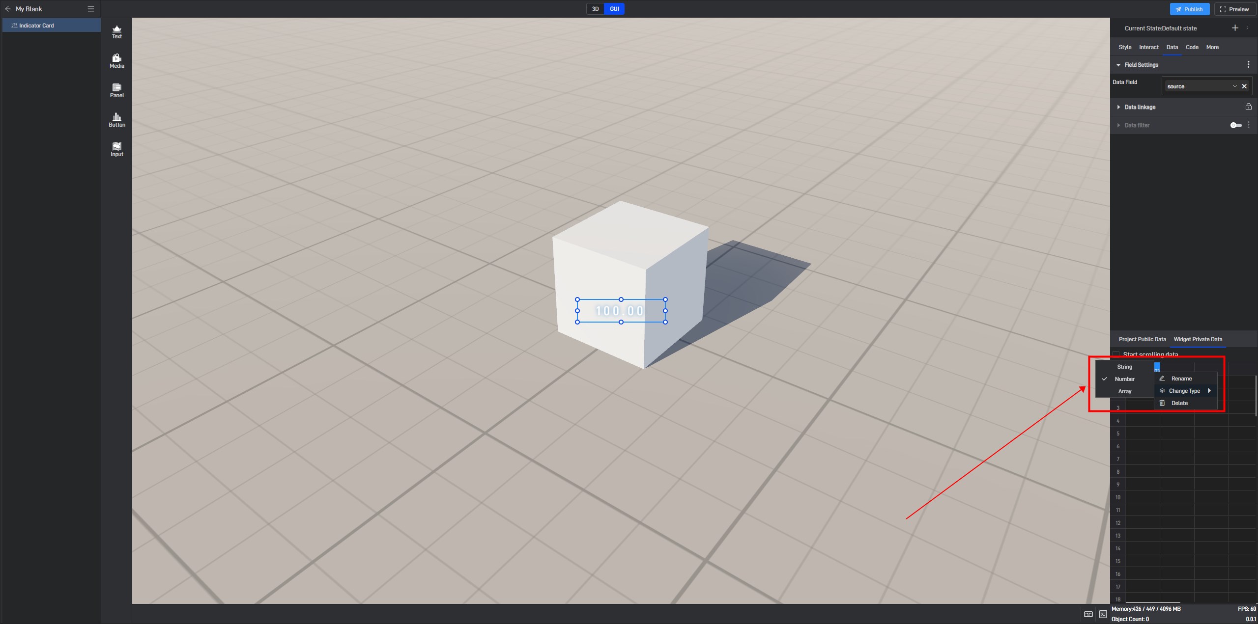
Field types include: strings, numbers, and arrays (X-axis fields and series fields are of string type, Y-axis is of number type, and array type is used for word cloud components). The component content will only display correctly if the field types are correct.
(2) Using Local Data
Step 1: Add Data Source
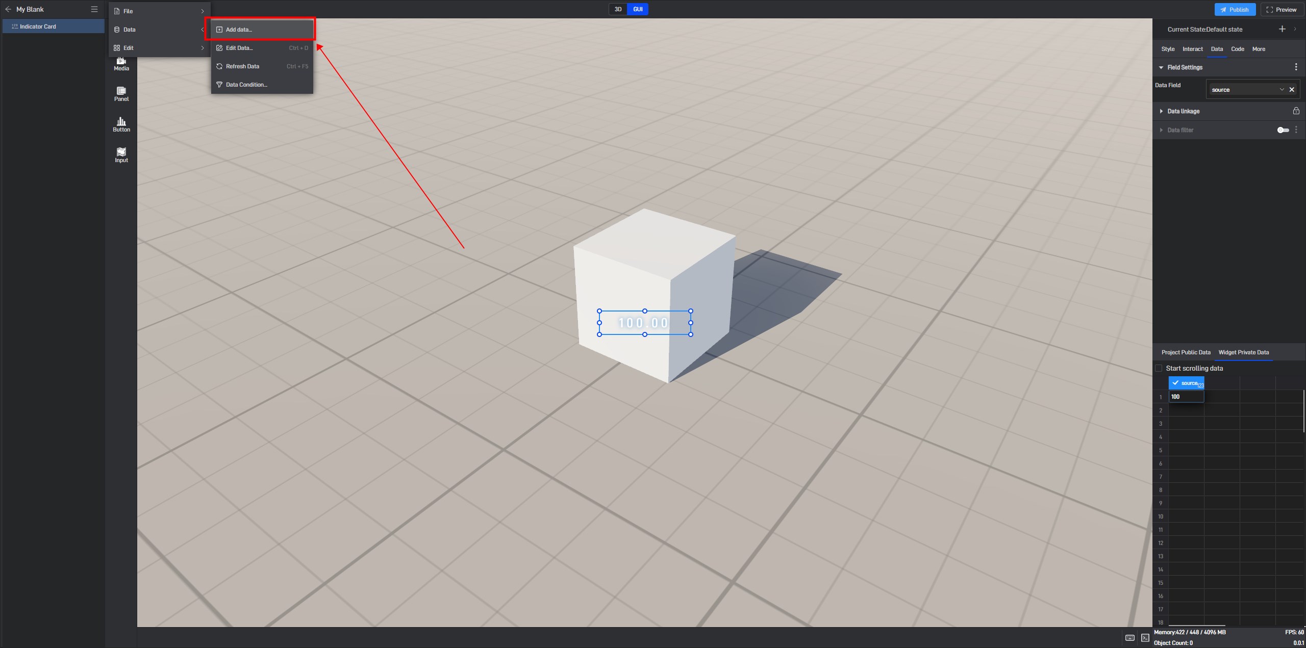
If you have your local data source ready, there’s no need to use the built-in data sources. In the “Data” dropdown menu, click **”Add Data” **to add your local data source.
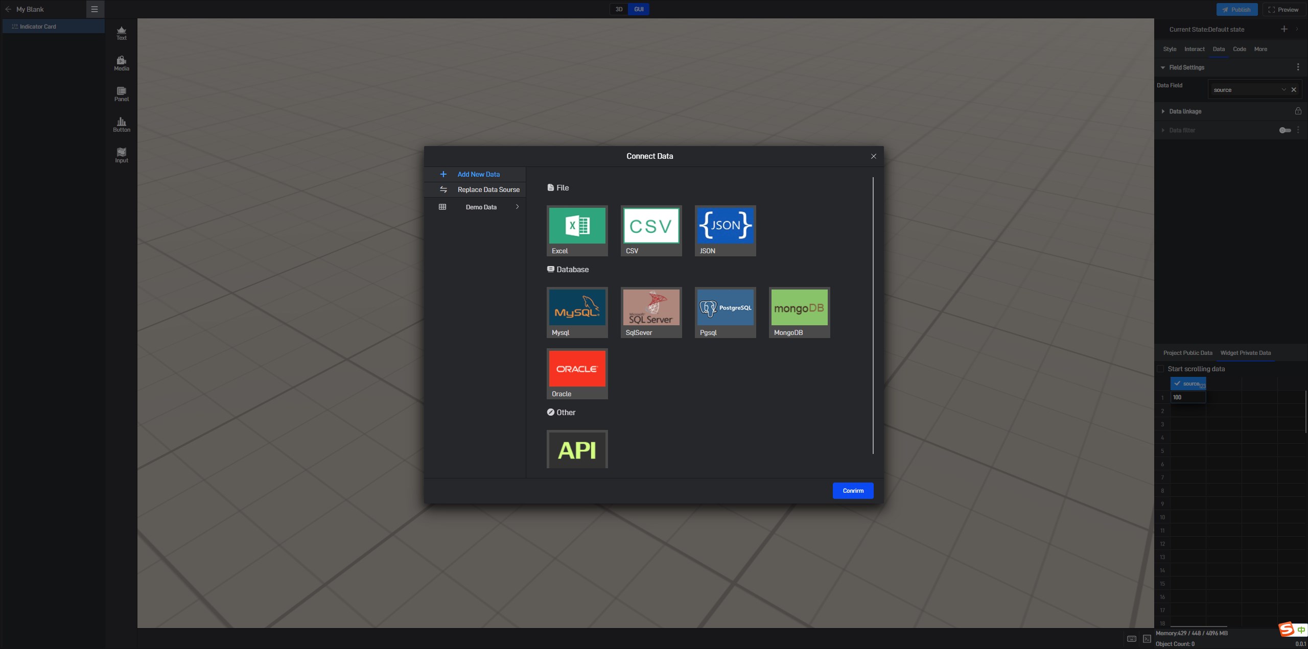
In the “Connect Data” window, select the corresponding data source type.
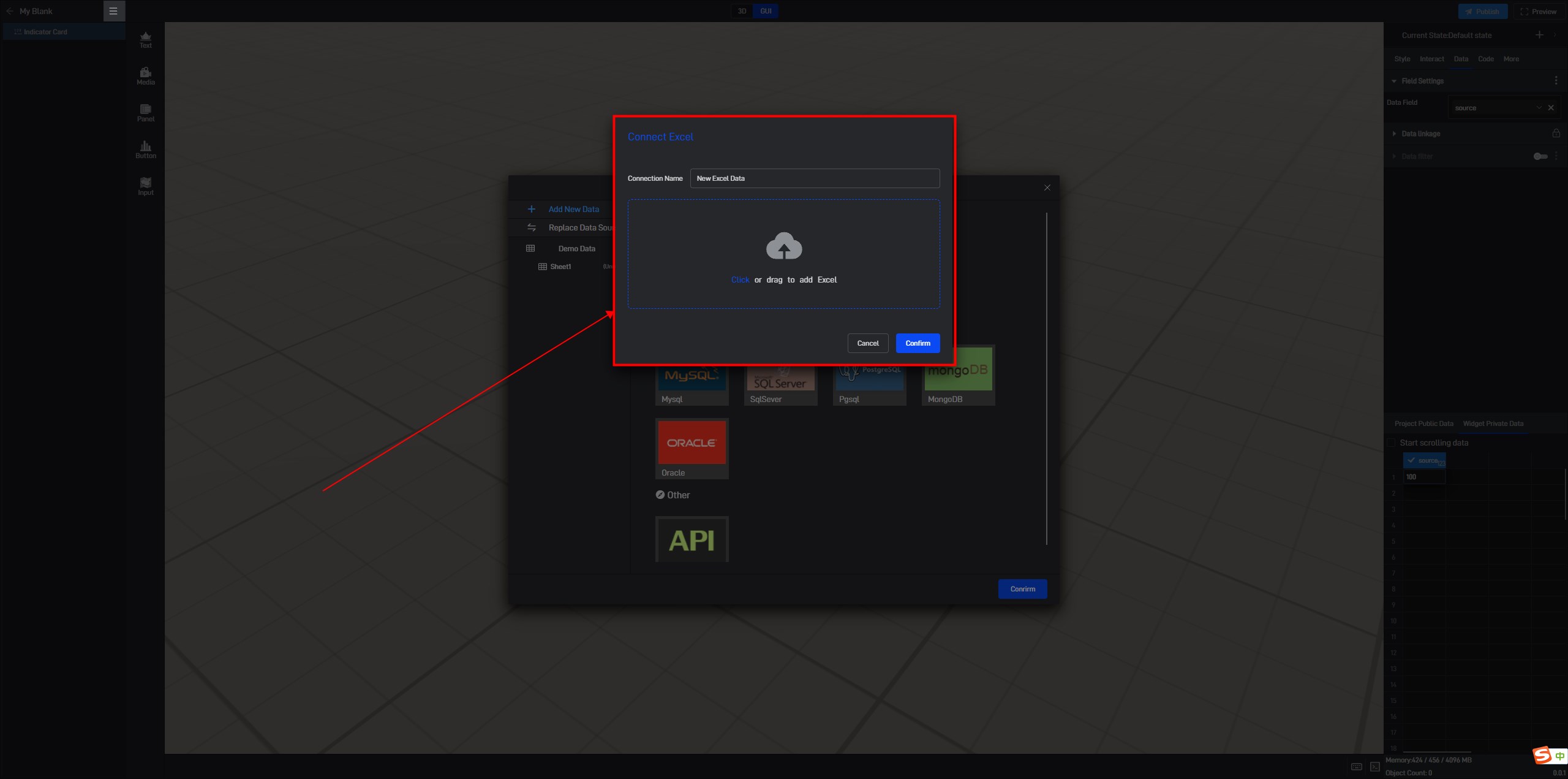
For example, to add an Excel data source: (For more data source connection methods, please refer to the tutorial: Connect Data)
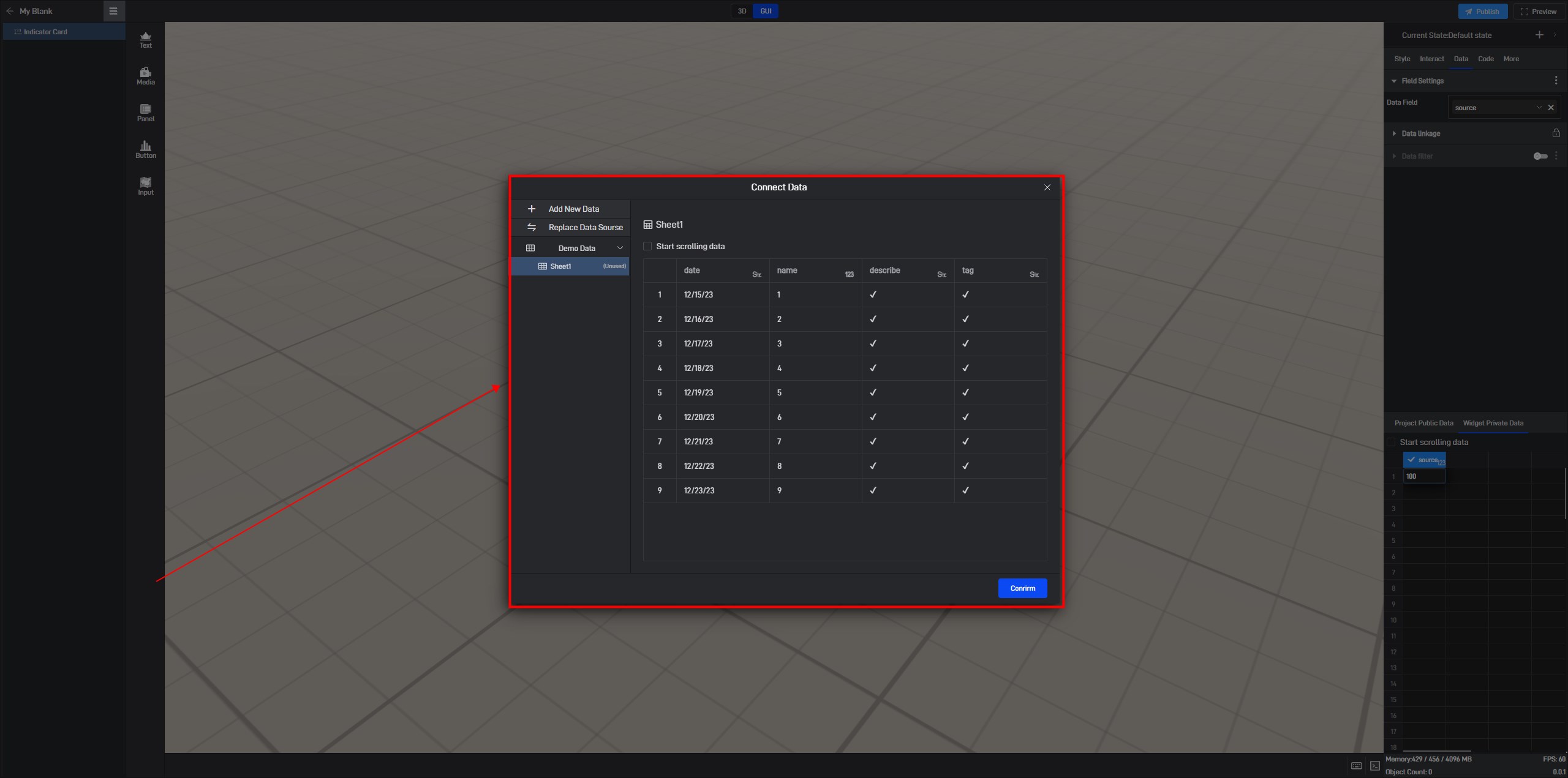
Click “Confirm” to complete the addition. You can then view the detailed data in the “Connect Data” window.
Step 2: Configure Data Fields
Click to select the component, and in the right-side** “Data” **settings window, switch to “Project Public Data” (all data sources within the same project are shared).
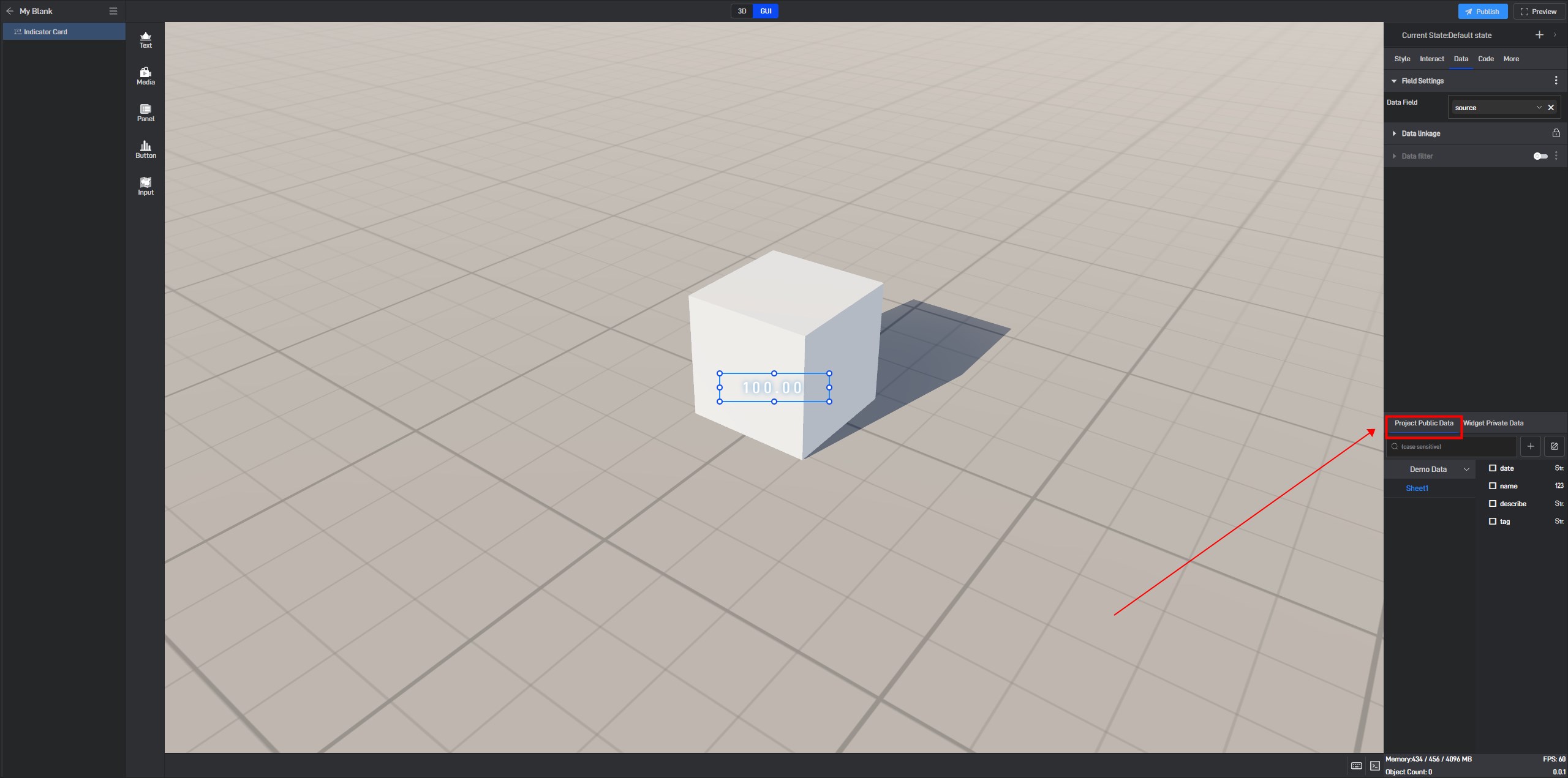
Before modifying the data fields, we need to delete the current fields first. Click the** “X” **on the right side of the field to delete it.
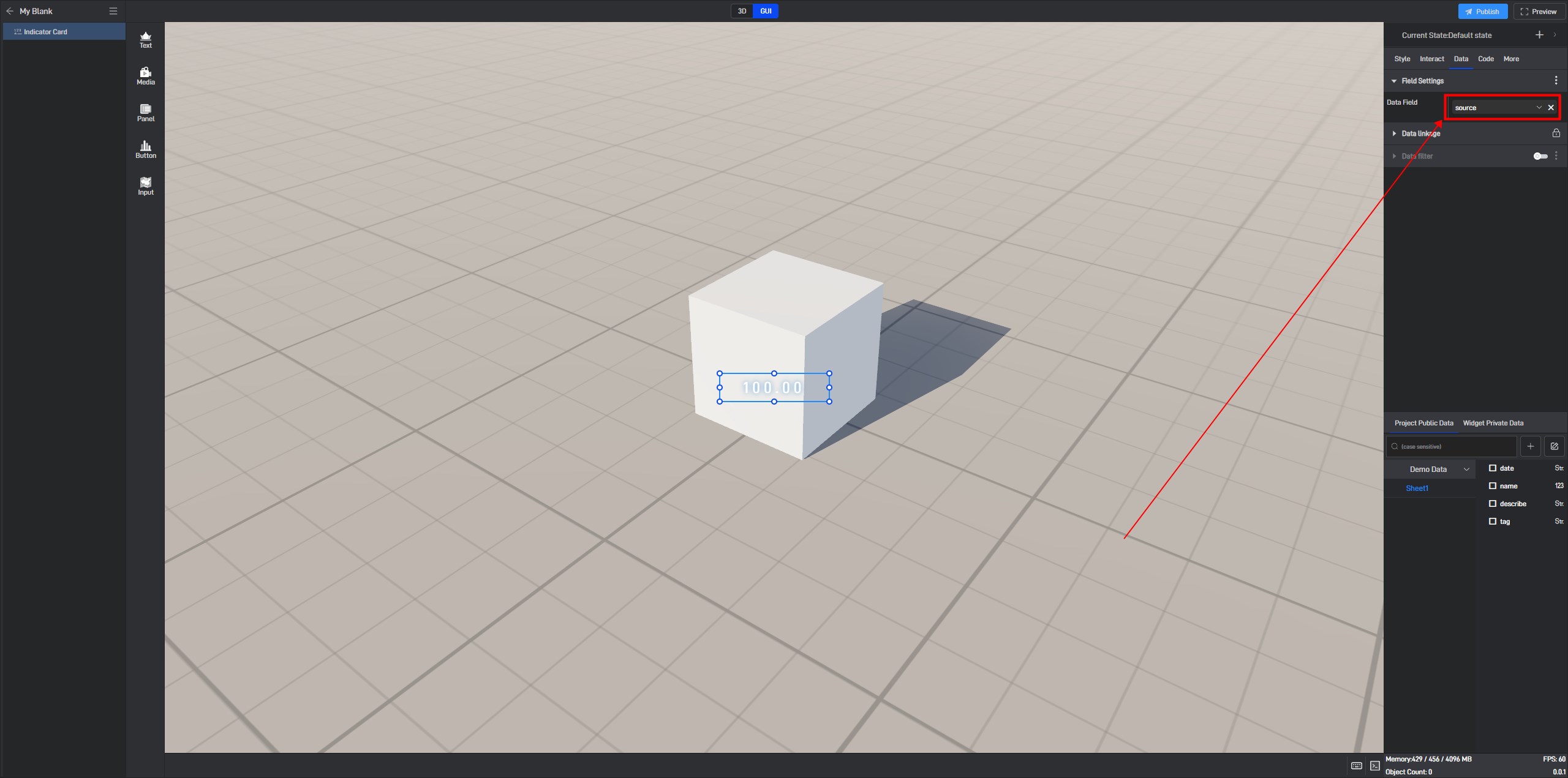
After deleting the current fields, the right-side field panel will be empty, and the component will display “Outlier”.
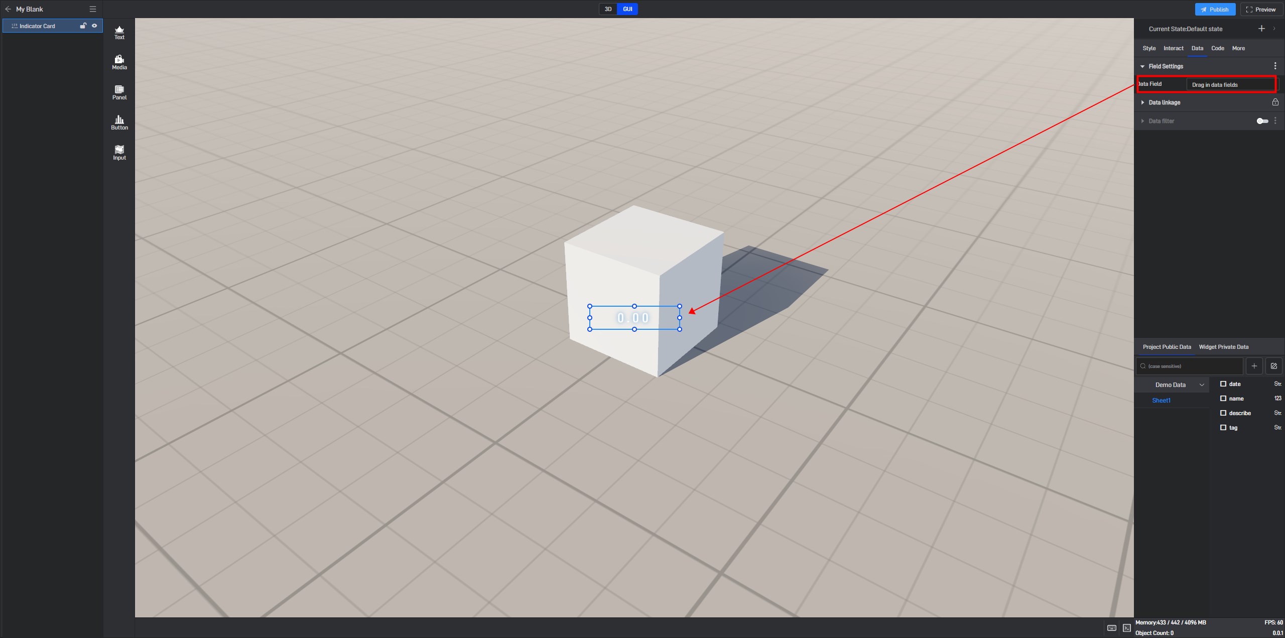
Next, we will add the new data fields to the component’s field settings.

3. Set Component Styles
Click to select the component, and in the right-side “Style” settings window, you will see various categories of settings. Each category contains different settings, which may vary depending on the component.
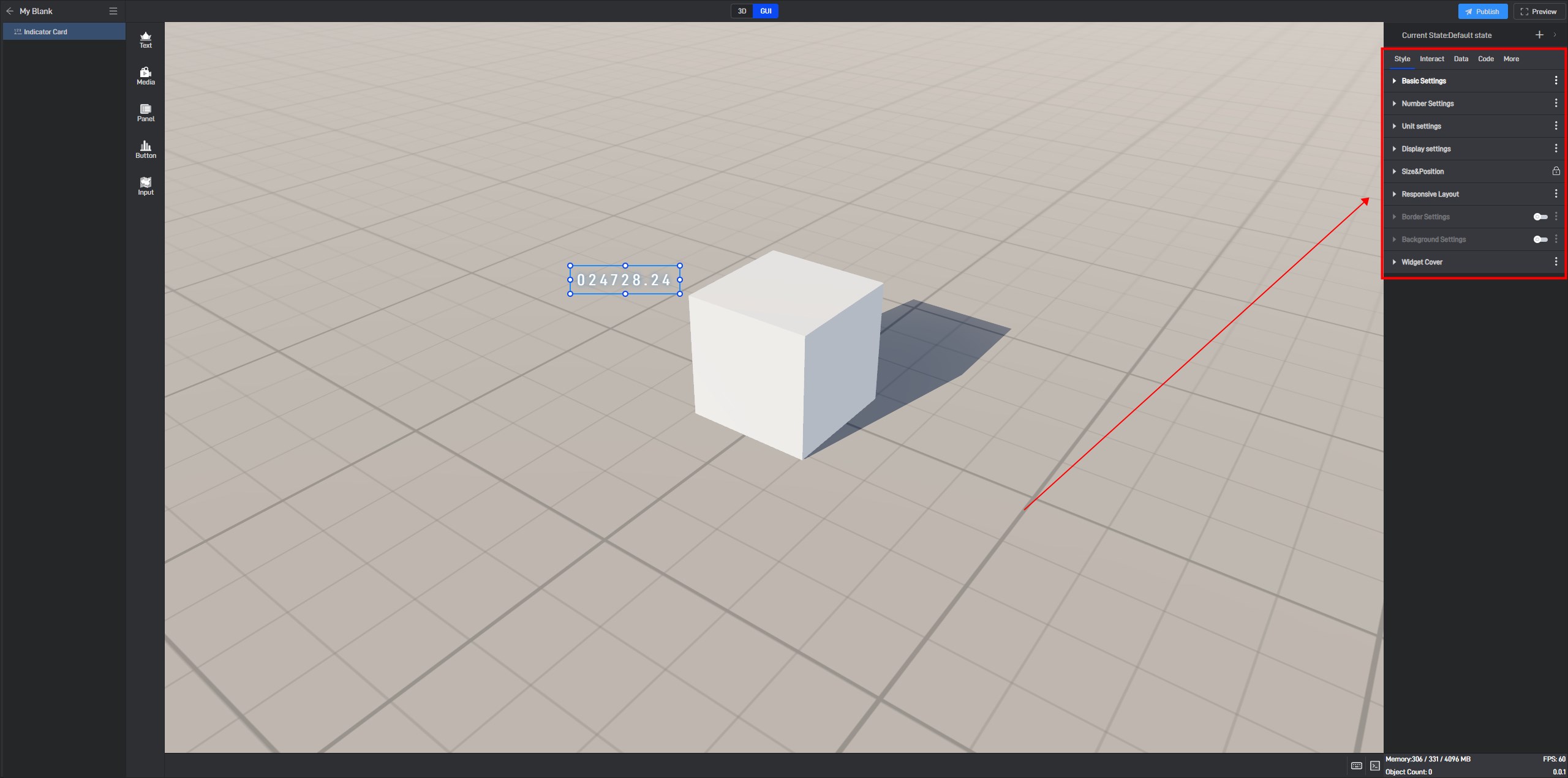
3.1 Fixed Style Settings
Fixed styles refer to the component styles that remain constant once set, in contrast to conditional styles discussed in Section 3.2, which change based on data variations.
In style settings, you can configure the position,** color**, axis,** tooltip**, and animation of Indicator Card components.
Next, we will provide a detailed introduction to each of these settings.
3.1.1 Basic Settings
| ** Configuration item ** | Describe | |
|---|---|---|
| Opacity | 1)Using transparency according to personal preference or overall harmony can make the large screen layout more aesthetically pleasing.; | 2)A common use for this setting is to combine it with conditional styles/interactions/multi-state to achieve the display and hiding of components. |
Transparency changes of the Indicator Card, as shown in the figure below:

3.1.2 Number Settings
(1) Digital Format
| ** Configuration item ** | Describe |
|---|---|
| Outlier | The value displayed when data is abnormal. |
| Comma-separated | Use commas as delimiters to separate data. |
| Data type | Data formats are divided into “Number” and **”Percentage” **types, and should be selected based on the type of data field in the component. |
| Decimal Places | Manually input the number of decimal places based on the specific data in the data field; the default is** “2”**. |
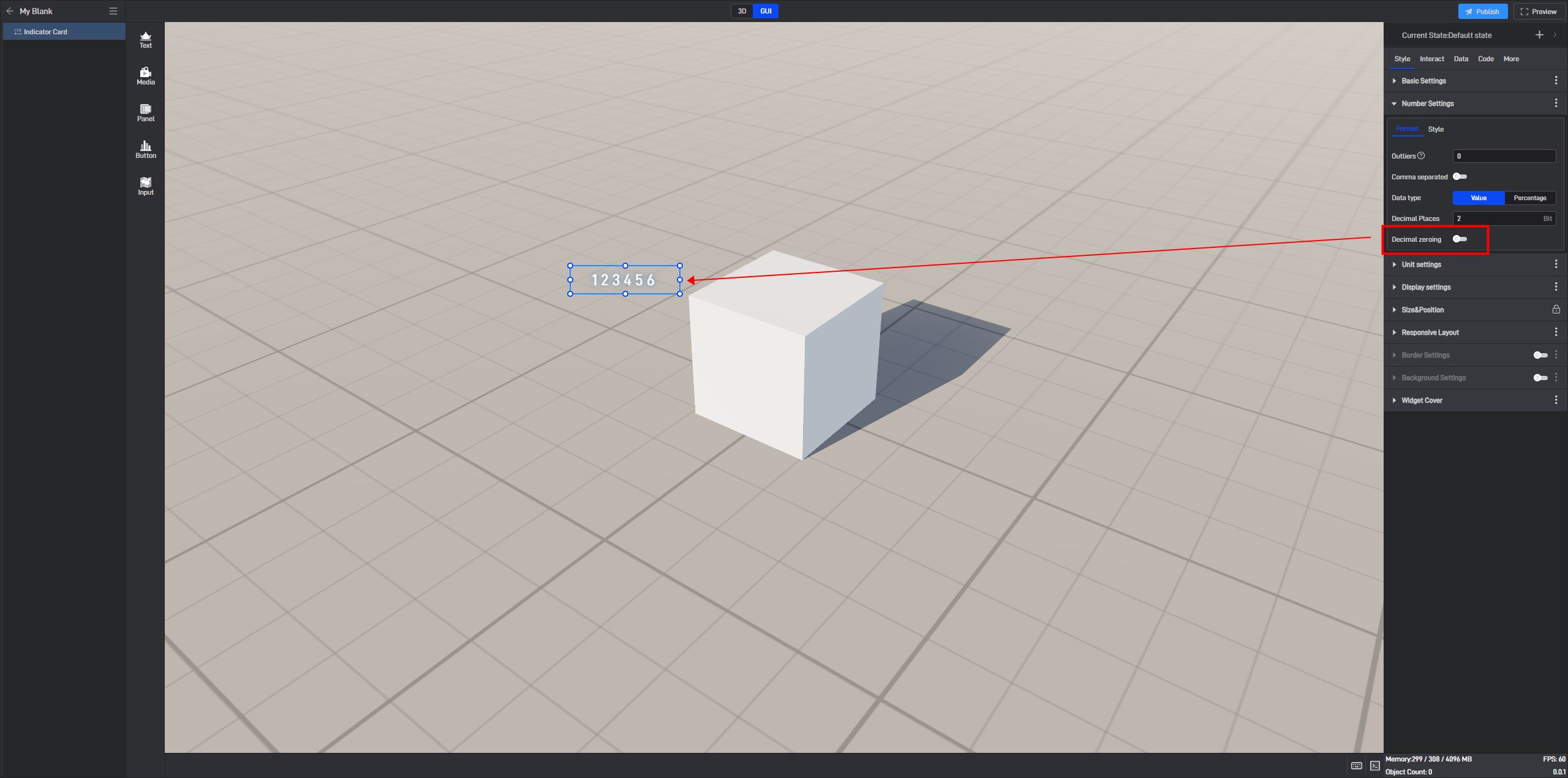
| Decimal zeroing | When enabled, this feature will add “0” after the decimal point according to the manually input “Decimal Places”,** **ensuring the decimal reaches a specific number of places and making the data appear more orderly. |
Indicator Card disable Decimal zeroing, as shown in the Image
3.1.3 Unit Settings
(1) Global
| ** Configuration item ** | Describe |
|---|---|
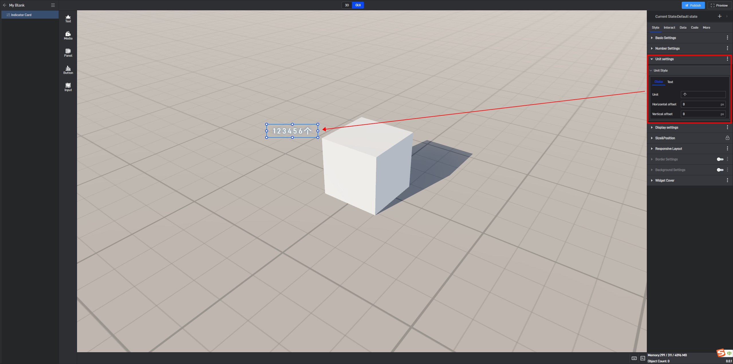
| Unit | You can fill in the unit yourself (it can also be a symbol like %). |
| Horizontal/Vertical Offset | Customizable settings for the horizontal and vertical offset of the unit font. The default value for both is** “0px”**. |
Display units settings for Indicator Card, as shown in the below:
(2) Text
| ** Configuration item ** | Describe |
|---|---|
| Font | Configure the font size, color, and other settings for the unit font here. |
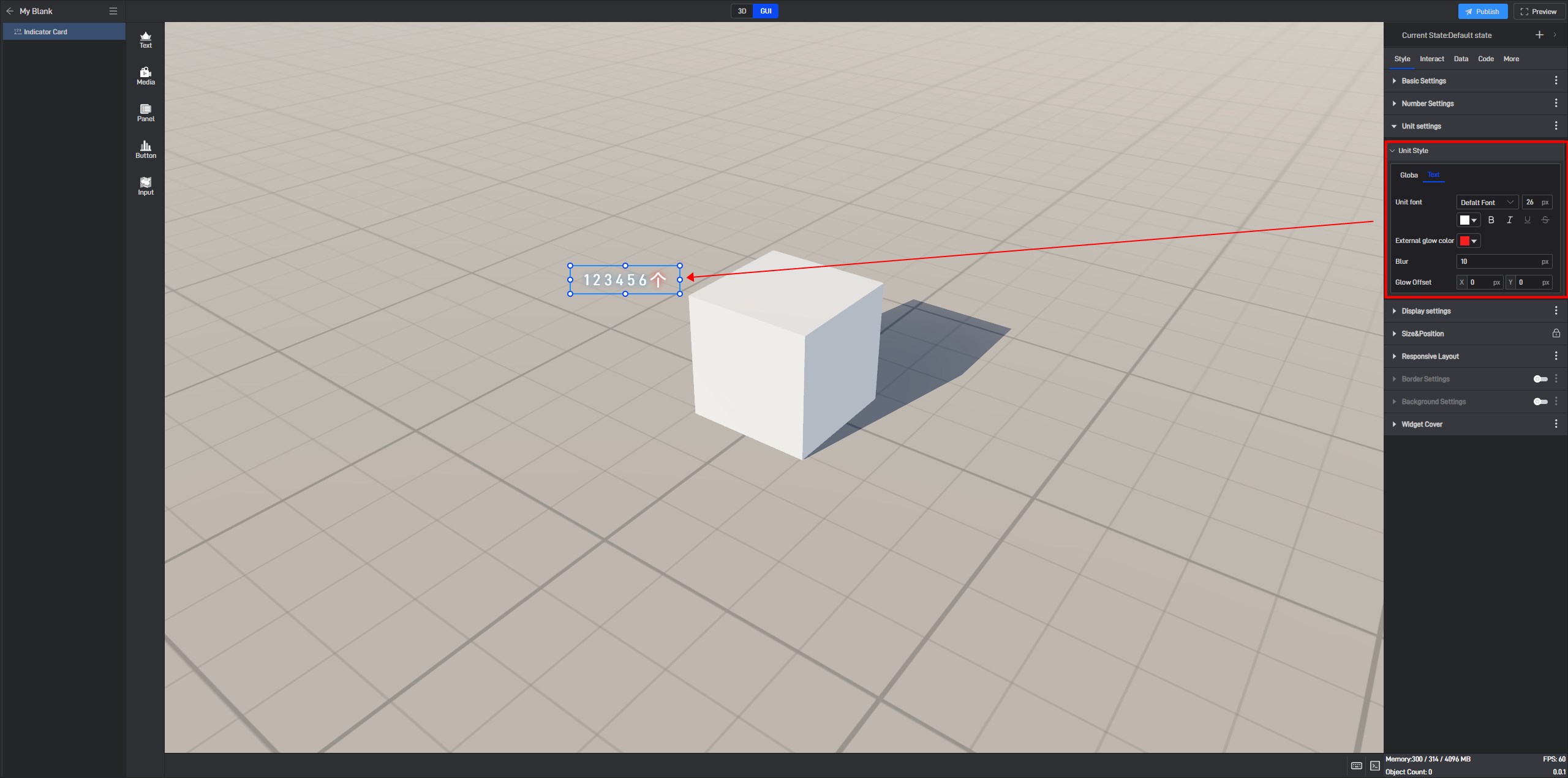
| Glow Color | Configure the color of the glow effect for the unit font. (Refer to the tutorial on setting colors for details.) |
| Glow Intensity | Customize the intensity of the glow effect for the unit font. The default value is “0px”. |
| Glow Horizontal/Vertical Offset | Customize the offset of the glow effect in the horizontal and vertical directions for the unit font. The default values are both “0px”. |
Unit glow settings for the indicator card, as shown in the image below:
3.1.4 Display Settings
Set the display format for the data within the component here.
| ** Configuration item ** | Describe |
|---|---|
| Play Animation | This button must be enabled for the component animations to take effect. |
| Animation Type | You can set the animation to either “Incremental” or “Update” type. |
| Delay | The delay duration before the animation starts, defaulting to “1 second”. |
| Duration | The playback duration of the animation, defaulting to “1 second”. |
| Loop Animation | When this button is not enabled, the animation plays only once when entering fullscreen; when enabled, the animation will loop according to the interval time. |
| Interval | Customizable setting for the animation loop interval, defaulting to “10 seconds”. |
The Indicator Card in incremental style from zero, as shown in the figure below.

Indicator Card update style, as shown in the image below:

3.1.5 Size & Position
You can adjust the size and position by directly clicking and dragging the components, or by directly entering the width, height, X coordinate, and Y coordinate.
| ** Configuration item ** | Describe |
|---|---|
| Widget Size | Refers to the width and height of the component, measured in pixels (px). |
| Widget Position | Refers to the X and Y coordinates of the component. The X coordinate is the distance from the left edge of the page to the left edge of the component, while the Y coordinate is the distance from the top edge of the page to the top edge of the component. |
| Widget Rotation | In three-dimensional space, rotation can be input as any value, with the values corresponding to the angle of rotation around the X and Y axes. |
Basic standard Indicator Card: Size & Position parameter diagram, as shown below:

3.1.6 Border Settings
After enabling the **”Border Settings” **button, the border style will be displayed in the component, and you will be able to configure the overall border style of the component.
| ** Configuration item ** | Describe |
|---|---|
| Color | Configure the color of the component’s border individually. |
| Width | The thickness of the component’s border, with the default width set to “1px”. |
| Corner Radius | The shape of the border, with the default radius set to “0px”. |
| Style | Select from four border styles: “solid” , “dashed” , “dotted” , and “none”. |
Indicator Card border style, as shown in the image below:

3.1.7 Background Settings
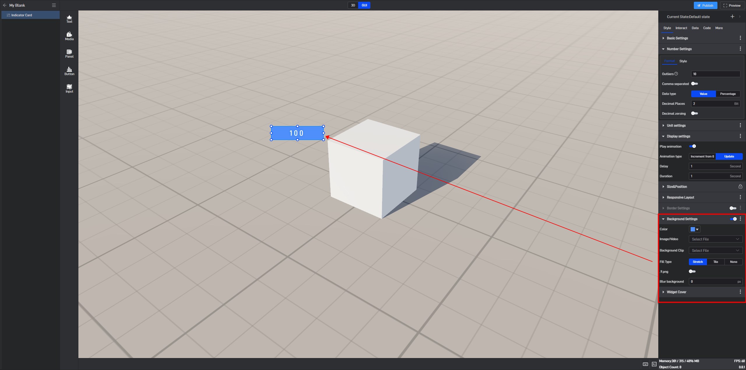
By default, components have no background color. If you need to set a background color, you must first enable the “Background Settings” option.
| ** Configuration item ** | Describe |
|---|---|
| Color | Configure the color of the component’s background separately. |
| Image/Video | Add a local image or video here to serve as the component’s background. |
| Background Clip | Crop the local image/video after adding it. |
| Fill Type | In “Stretch Fill” mode, the image will be stretched or compressed to completely cover the target area based on its size; in “Tile Fill” mode, the image will be tiled across the area while maintaining its original size and proportion. |
| .9. Png | Turn on this button to enable .9 scaling. |
| Edit .9 | Drag the blue pixel borders to edit and specify the area that can be stretched. |
| Blur Background | Make the background blurry or out of focus, with the default blur level set to “0px”. |
Indicator Card use .9 fill background style, as shown in the following image:

The Indicator Card has a background color style, as shown in the image below.
4. Set interaction
Click to select a widget, and in the “Interact” setting window on the right, you can add or delete interactions for the current widget.
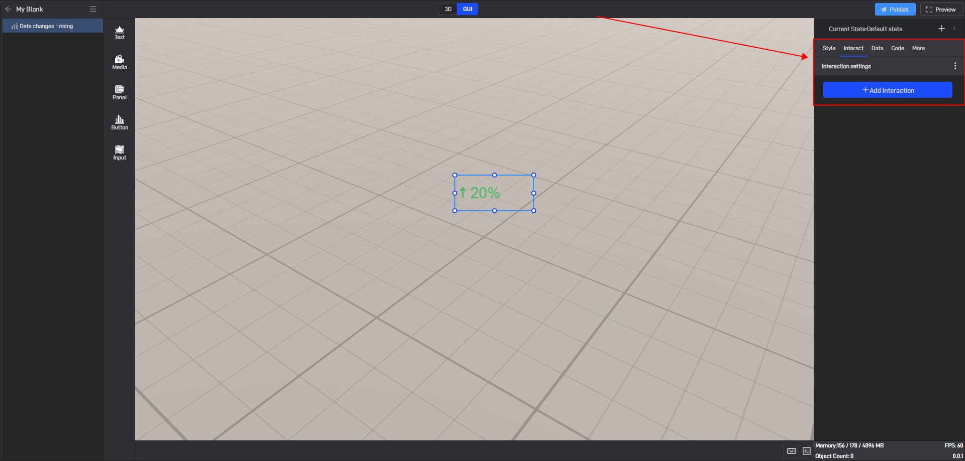
5. Secondary Development
Click on the widget to select it, and in the right-side “Code” settings window, you can configure secondary development settings for the widget.
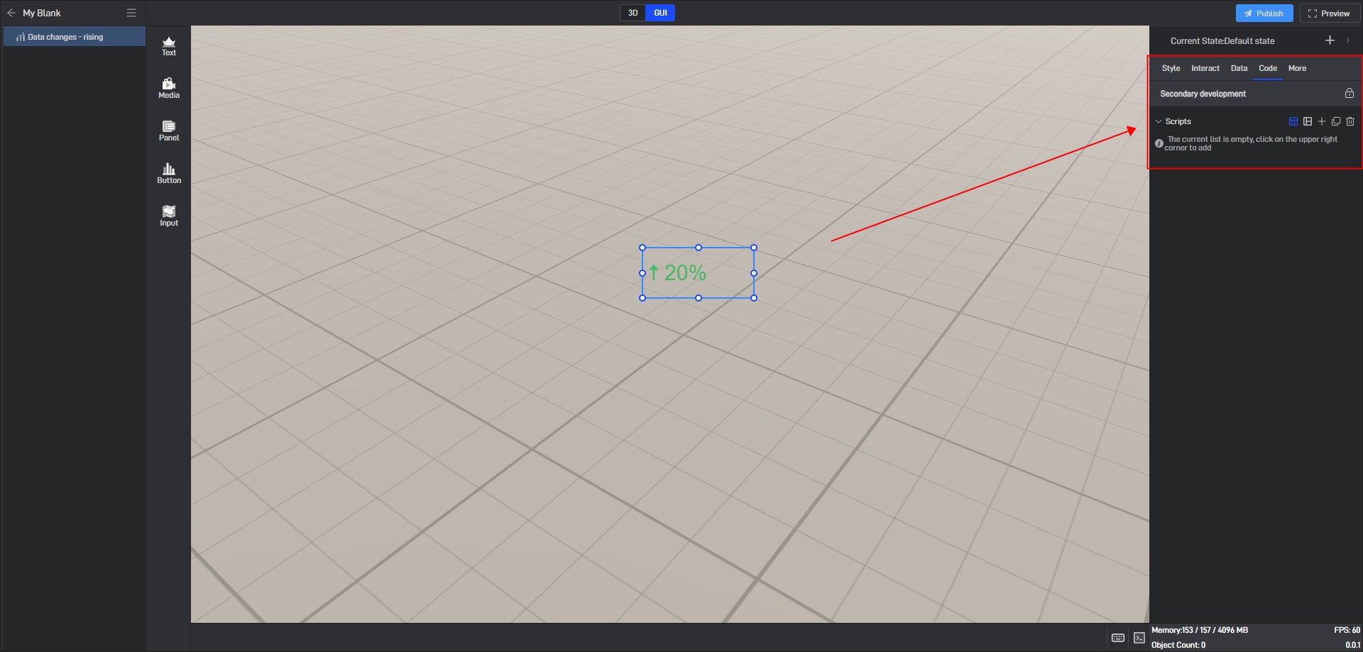
Secondary development needs to be achieved by loading JavaScript script files.
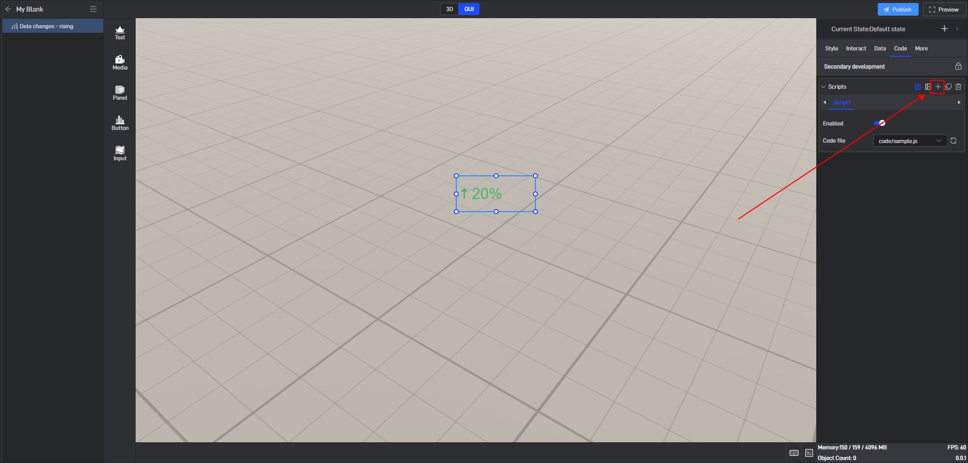
Click “+” to add settings. Multiple scripts can add multiple settings.
During the secondary development process, we can control the style of the widget. If we want to control a certain setting item, we can first view the secondary development code example of the setting item in the style.
Take the “Opacity” setting item as an example:
Open the pop-up window of the extended settings and click “Sample code”.
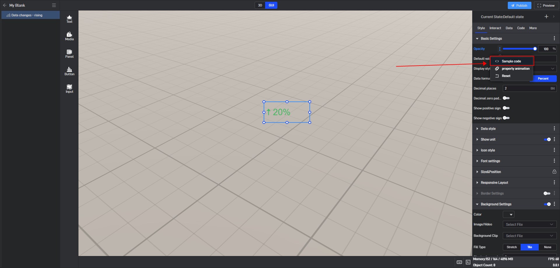
You can see the secondary development code sample for this setting item.
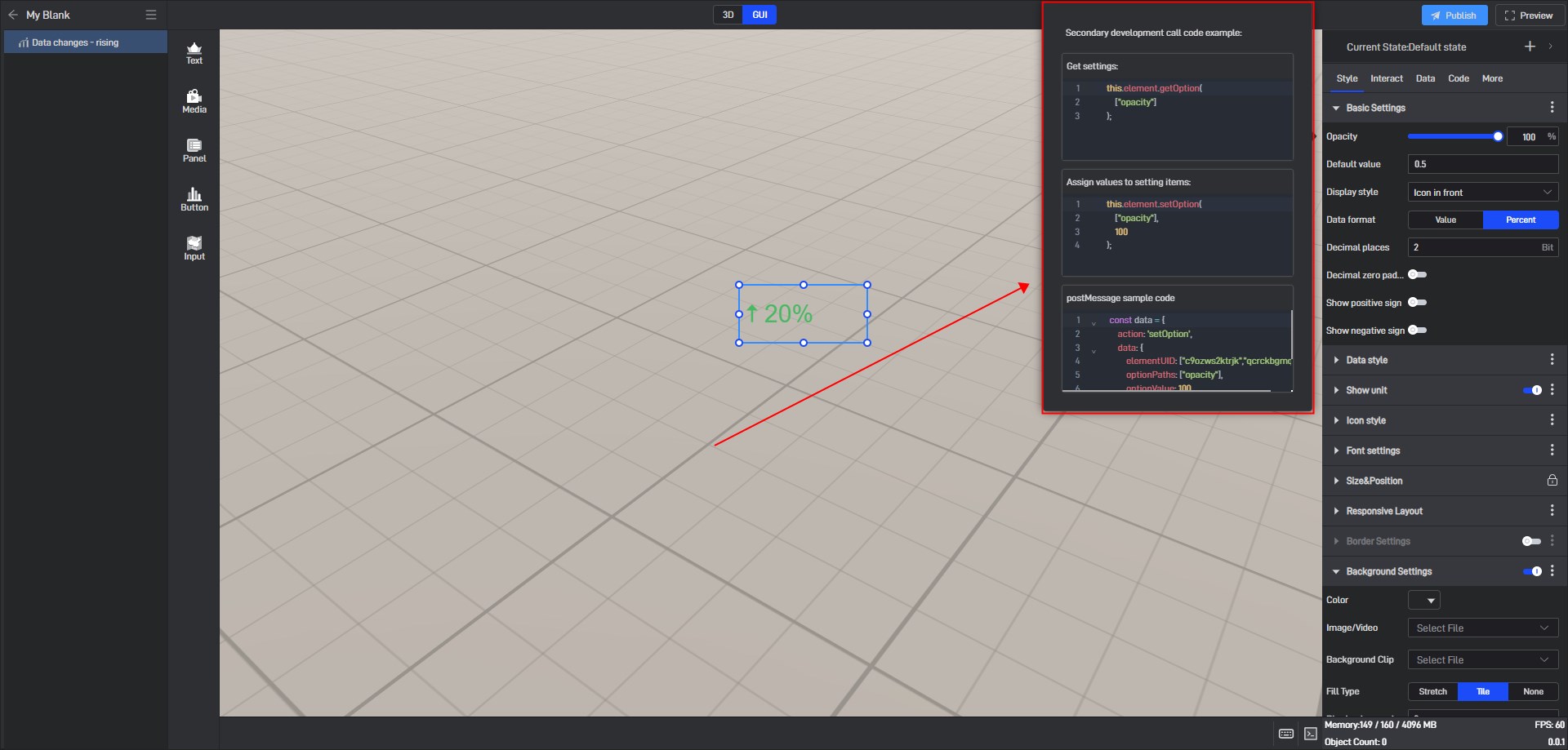
Here is a simple secondary development example:
Secondary development function: widgets automatically move to the right
Sample code:
1 | /** |
Click “Select File” to add the JavaScript file.

6. Set up multi-state switching
6.1 Add states
Each widget has a default state property, which contains all the above settings.
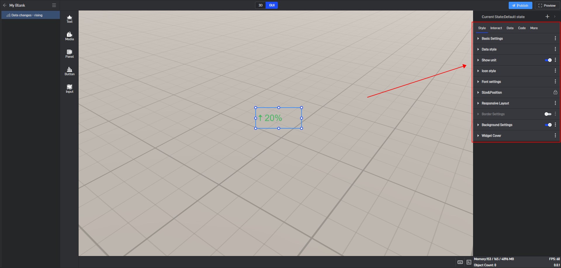
But we can also add multiple states, so that each state will contain all the above settings, and these states are independent of each other.
We can add new states in the following two ways:
6.1.1 Create a new state
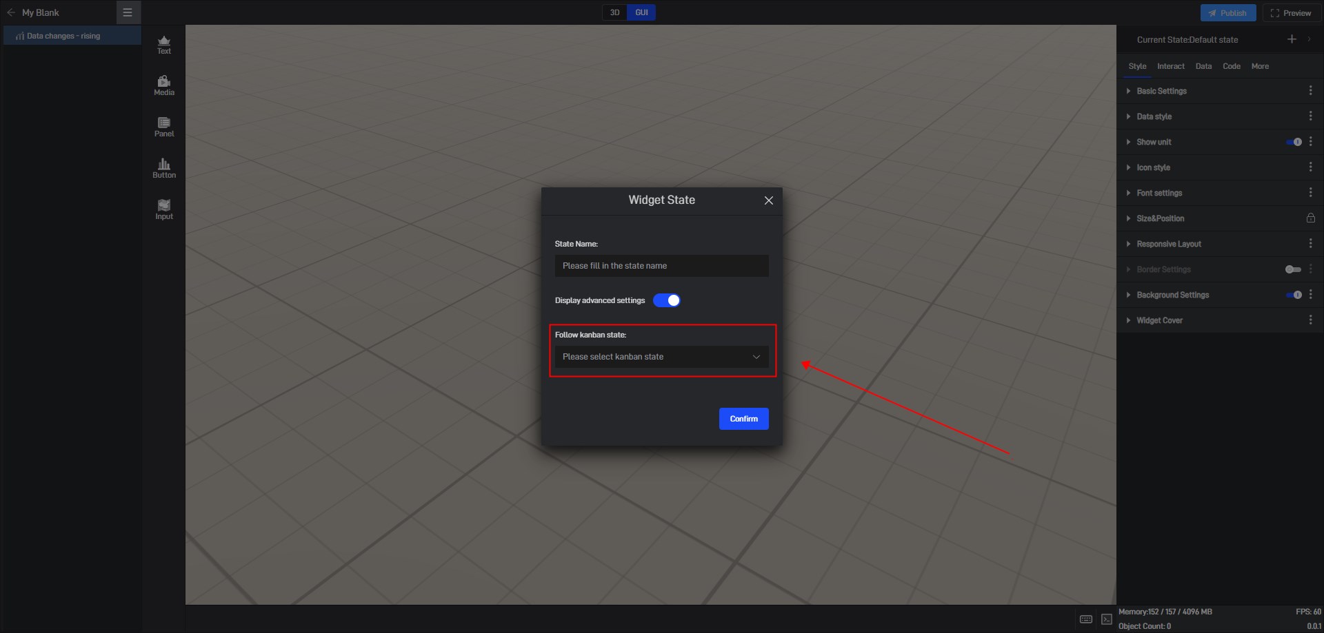
Click the “+” in the upper right corner to add a new widget state.
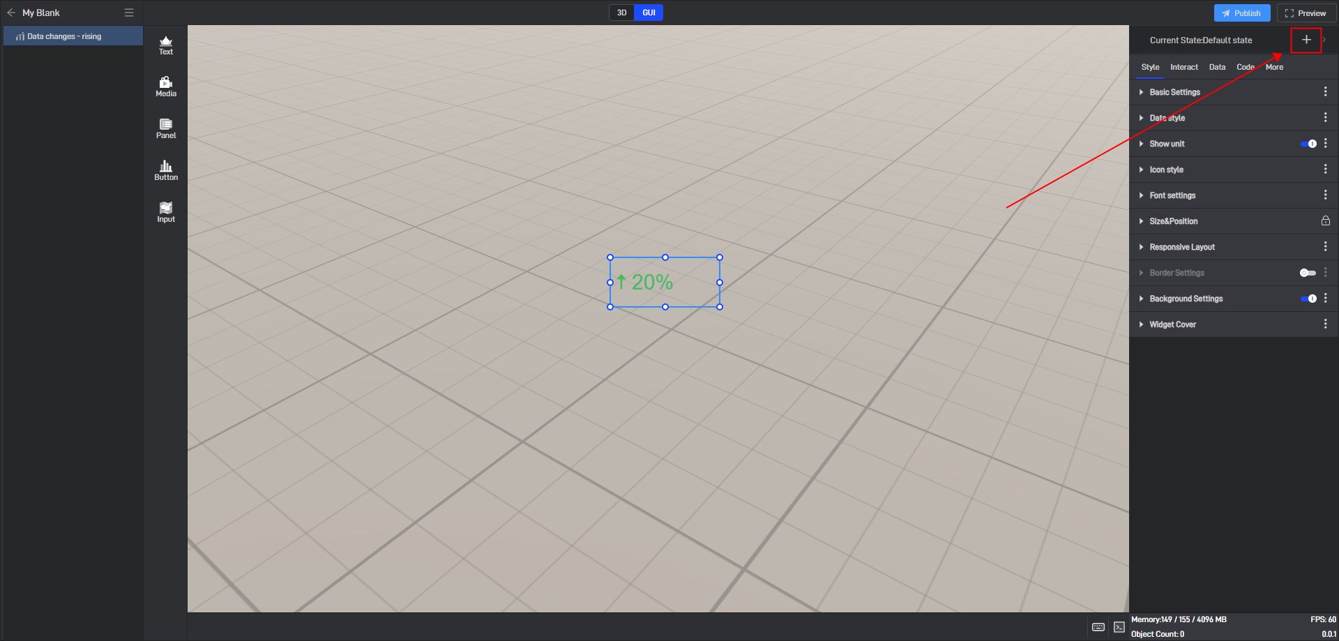
In the state setting window, we can set the name of the state.
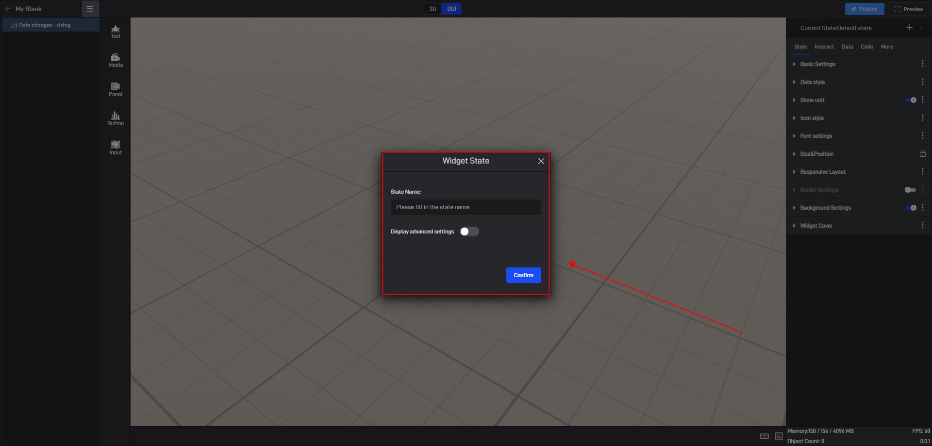
By default, all new states are kept consistent with the default state.
We also open the advanced settings in the window to set the follow object of the new state.
6.1.2 Copy an existing state
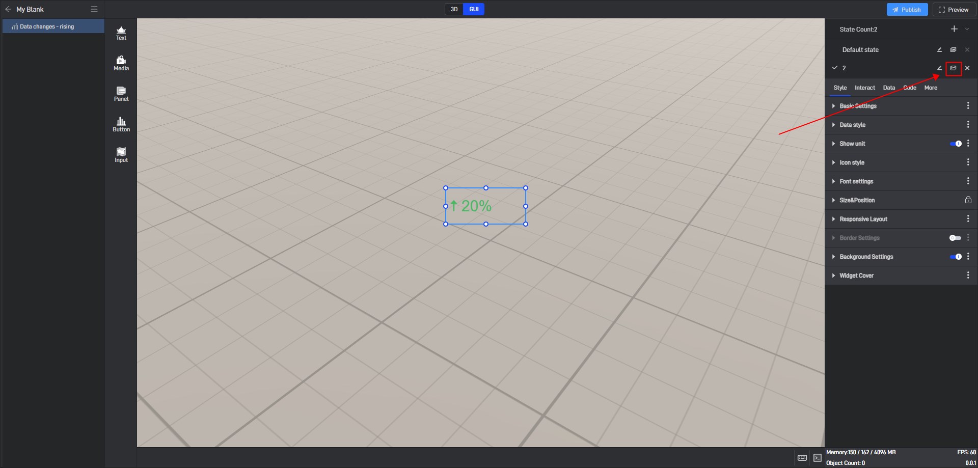
Click the state name in the upper right corner to expand the state list. After expanding, you can see all the states of the current widget.

In this state list, we can rename, copy and delete the state.
Click the copy button on the right side of the state name to copy the current state to a new state. All settings of the copied new state will be consistent with the copied object state.
6.2 Switch states
When editing a project, we can manually switch widget states by clicking on different states in the state list.

6.3 Locked state
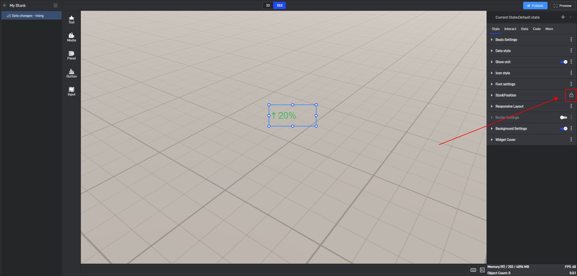
In the style settings, some settings have a lock icon on them, which means that this setting item in all current states has been locked to the default state, which means that if this setting item is modified, this setting item in all states will be modified uniformly.
This is a function that allows you to uniformly modify the same setting items in multiple states in a widget’s multiple states.
If you don’t want to lock it, you can click to unlock it, and then this setting item in all states will be unlocked.
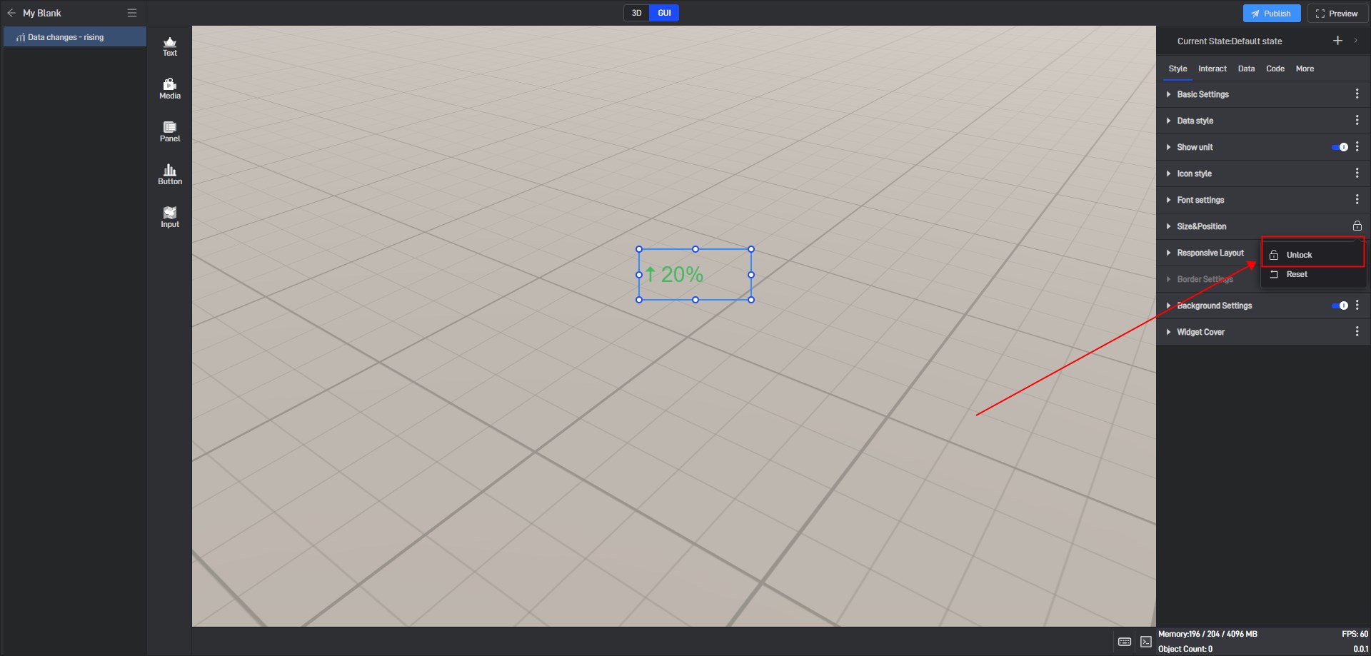
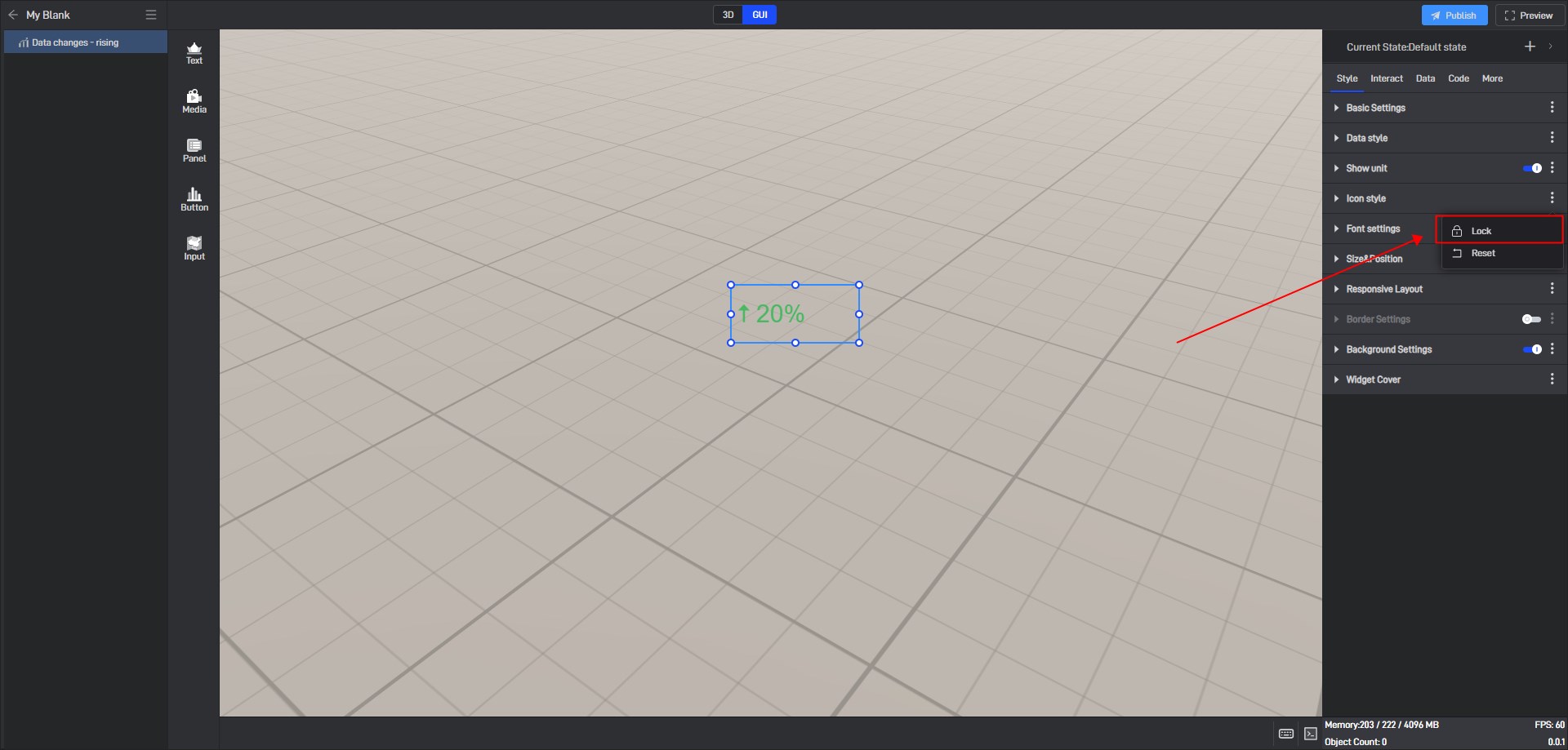
If you want to lock other settings, you can click the three dots on the right side of the setting item and then lock it.
